চিত্র খোঁজা logo review
4/5
Logo score Combination mark category Possible misinterpretation

চিত্র খোঁজা

ankonroylr Essential logo review

Review the detailed scores below to see what is working and what should be refined first.

Symbols recognized:
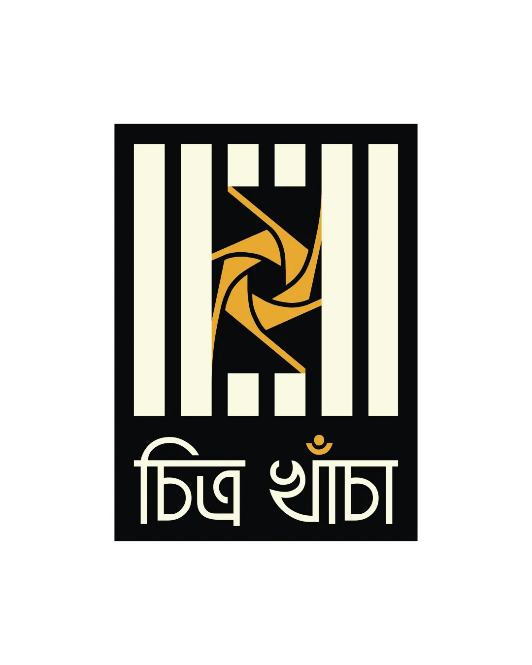
abstract geometric windmill/rotor shape within vertical bars
Legible text:
চিত্র খোঁজা
Combination Mark Modern, Geometric Hospitality
4/5
Legibility
4/5
Originality
4/5
Balance
3/5
Scale
Your next steps

What to fix first

Focus on the changes that matter. Keep what makes the logo work.

1

Check the possible misinterpretation

The vertical bars, combined with the abstract centerpiece, can evoke symbolism of confinement or imprisonment rather than something inviting.
Detailed review

Logo performance breakdown

4/5

Legibility

  • Text is high contrast against the background.
  • Font style is distinctive and pairs well with the geometric icon.
  • Bengali script may not be universally readable to all audiences.
  • Tight spacing within complex letterforms can impact small-size clarity.
4/5

Originality

  • Unconventional use of geometric abstraction in combination with script creates distinctiveness.
  • Central gold motif has a unique, stylized approach.
  • Vertical bars motif is reminiscent of gates or prisons and is not entirely unique to this logo.
  • Abstract centerpiece is visually interesting but difficult to immediately associate with a specific hospitality or creative meaning.
5/5

Color harmony

  • Three-color palette is harmonious and distinctive.
  • Colors support legibility and produce strong visual identity.
Beige#F6F2D3
Raisin Black#1A1815
Goldenrod#F2A736

Estimated colors. Use the original design file for exact values.

Create a full color palette using these colors

Create new palette

4/5

Balance alignment

  • Vertical bar symmetry provides strong structure.
  • Clear central focal point draws the eye.
  • Slight visual heaviness at the top due to unequal negative space above and below icon.
  • Subtitle text alignment feels slightly ‘floaty’ compared to the dense icon section.
Uploaded logoAlignment guide overlay

Inspect spacing with the guide. Optical balance may differ from geometric centering.

3/5

Scalability

  • Blocky geometric elements likely to remain legible at medium-to-large sizes.
  • Simple color scheme aids in reproduction across standard formats.
  • Detailed abstract centerpiece may lose definition at very small scales (e.g., favicons, embroidery).
  • Proportional complexity between bars and central motif may become visually muddy when scaled down.
4/5

Misinterpretations

  • No apparent inappropriate or accidental imagery on first viewing.
  • The vertical bars, combined with the abstract centerpiece, can evoke symbolism of confinement or imprisonment rather than something inviting.
4/5

Symbol & text fit

  • Color harmony ties icon and wordmark together.
  • Geometry of script echoes angularity of logomark.
  • Weight of symbol vs. thinner script could feel slightly mismatched.
Try your own review

Wondering how your logo performs?

Get a clear logo score, key risks, and priority fix ideas before your client or audience sees it.

Review my logo