Concept & direction
A dynamic wordmark paired with a dumbbell and kinetic lines creates clear connections to self-improvement and fitness.
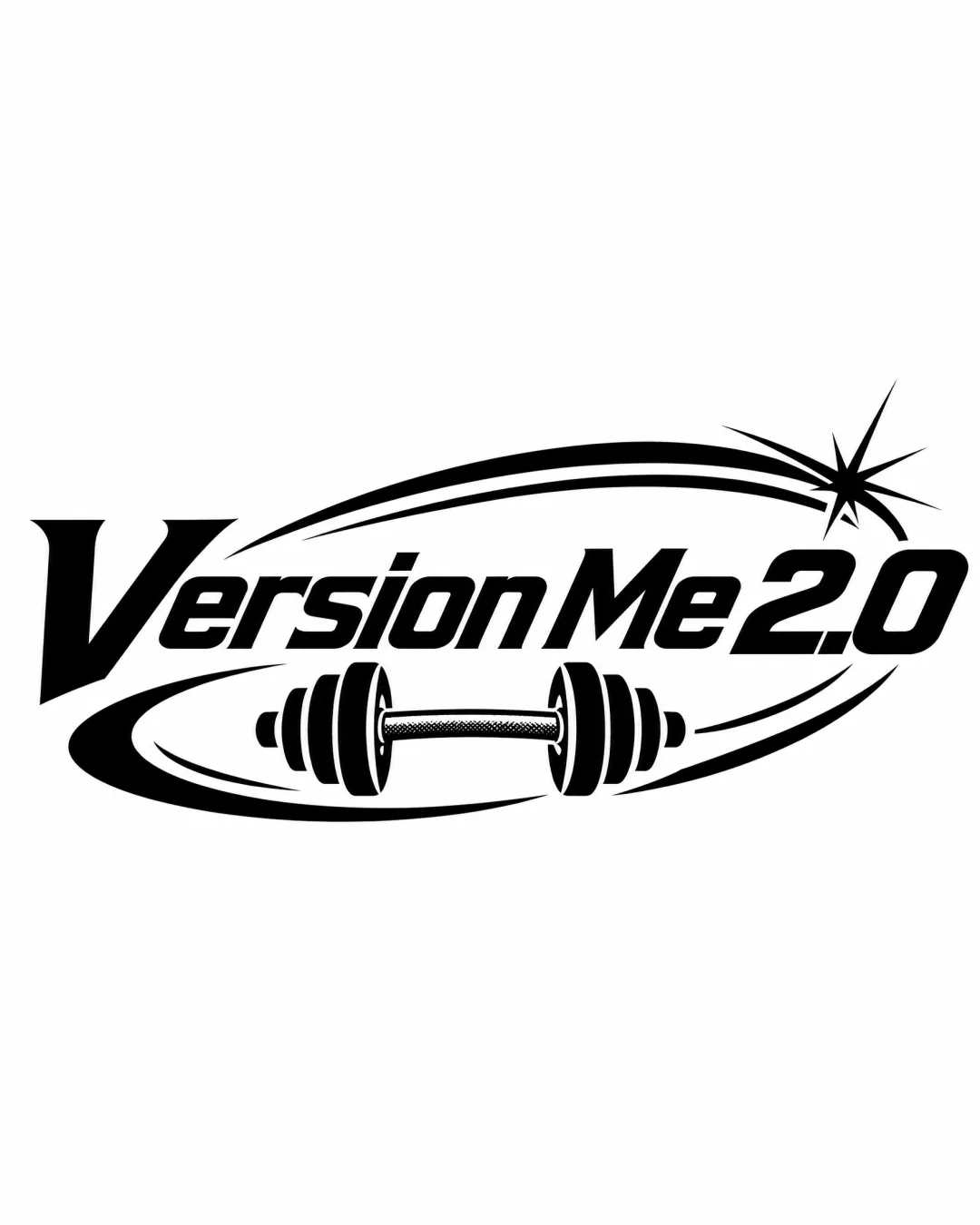
Energetic and highly legible concept that effectively signals fitness, with slight risks in visual complexity and originality; detail optimization is recommended for best results.
This logo lockup has a workable foundation; improving visual balance is the clearest next step.
Focus on the changes that matter. Keep what makes the logo work.
A dynamic wordmark paired with a dumbbell and kinetic lines creates clear connections to self-improvement and fitness.
Logo preview unavailable. The written feedback is still available on this card.
dumbbell and swoosh area
Thin strokes in the dumbbell knurling and starburst may lose detail or blur at small sizes.
See the category reviewThe bold dumbbell, dynamic swooshes, and energetic wordmark clearly fit a fitness or self-improvement context, though common motifs limit distinctiveness.
Wordmark 5/5 · Layout 4/5
Symbol 3/5 · Wordmark 4/5 · Layout 3/5
Thin strokes in the dumbbell knurling and starburst may lose detail or blur at small sizes.
Try: Test at reduced sizes for line clarity and retention of key features.
Logo preview unavailable. The written feedback is still available on this card.
Symbol 3/5 · Wordmark 3/5
Combining a dumbbell with energetic lines and italic text is widely seen in fitness branding; the starburst adds a minor unique touch.
Symbol 3/5 · Wordmark 3/5 · Layout 3/5
The energetic swooshes and starburst add movement but create a busy look, especially with the large italic 'V' and prominent '2.0' creating visual weight at both ends.

Inspect spacing with the guide. Optical balance may differ from geometric centering.
Get a clear logo score, key risks, and priority fix ideas before your client or audience sees it.
More credits needed
Add credits to continue without losing your work.
Then $7/month. Cancel anytime.
Essential logo review with AI
Estimated progress