Legibility
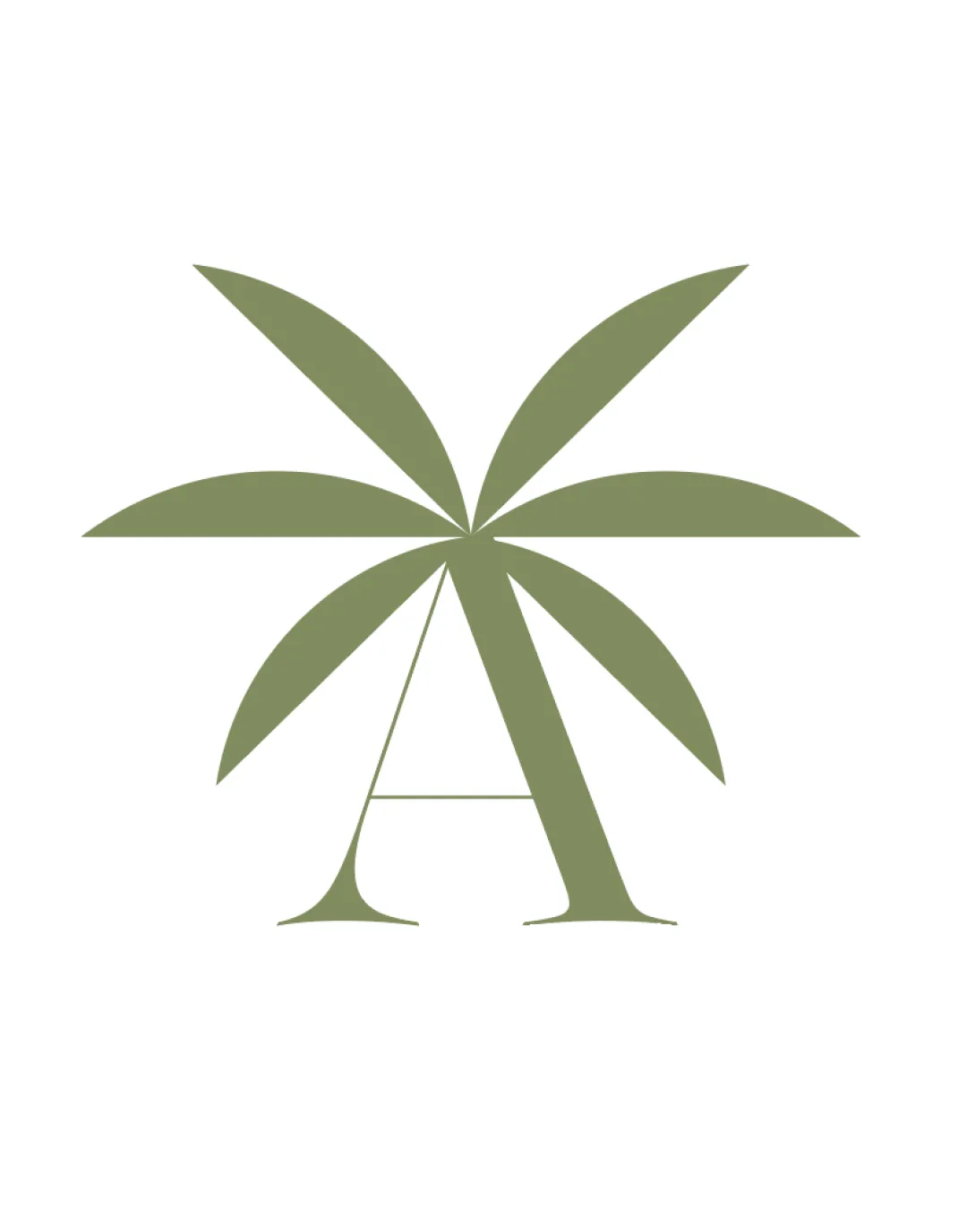
- The 'A' is clearly distinguishable despite the overlaid leaf design.
- Minimalism aids quick recognition.
Review the detailed scores below to see what is working and what should be refined first.
Estimated colors. Use the original design file for exact values.
Create a full color palette using these colors
Create new palette
Inspect spacing with the guide. Optical balance may differ from geometric centering.
Compare the detail at different sizes. Labels show the full image dimensions.
Does the shape still work without color?
Find the surfaces where your logo stays clear.
A 3px blur softens fine details so you can check whether the overall shape stays recognizable. If key gaps close or elements merge, the logo may rely too heavily on detail.
Put the design into words. Use these notes to build your client presentation.
The elements that make up the identity.
This logo cleverly fuses a stylized palm tree with the uppercase letter 'A' using minimal and organic lines in a single muted olive green. The visual integration suggests relaxation, tropical environments, and an eco-conscious mentality, making it a strong fit for hospitality, resorts, eco-lodges, or wellness brands. The leaf motifs radiate from the apex of the letter, creatively forming the horizontal crossbar. The minimalist approach improves flexibility, while the singular color pathway maintains sophistication and visual harmony. The design can be effectively applied across digital or printed mediums, supporting a strong, recognizable brand image.
Get a clear logo score, key risks, and priority fix ideas before your client or audience sees it.
More credits needed
Add credits to continue without losing your work.
Then $7/month. Cancel anytime.