Wondering how your logo performs? 🧐
Get professional logo reviews in seconds and catch design issues in time.
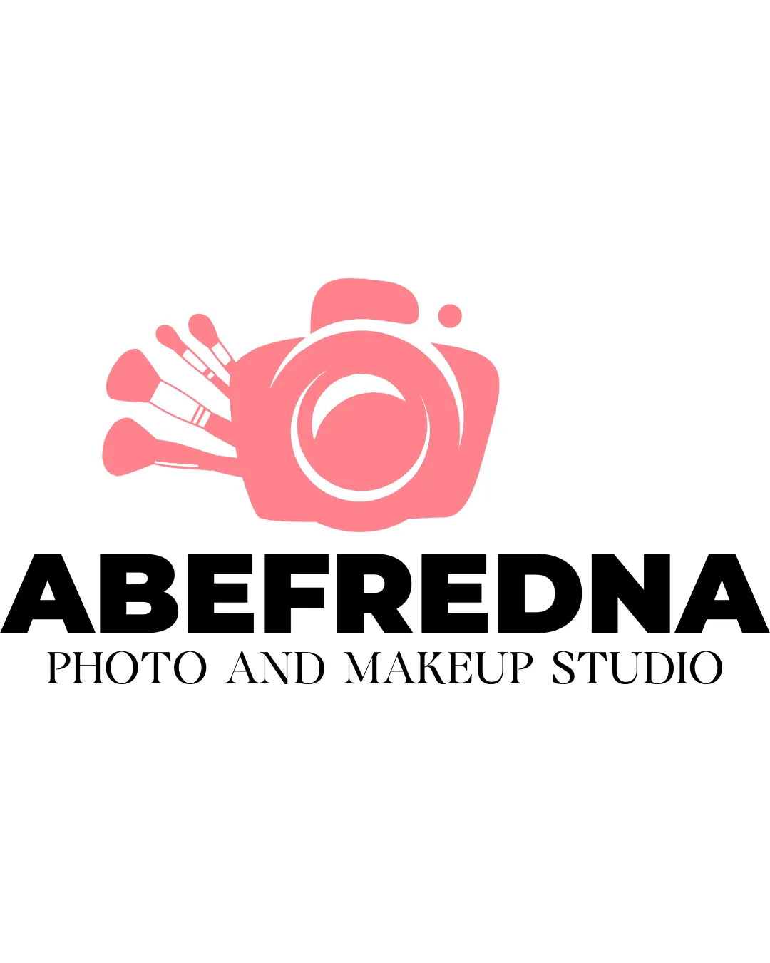
Try it Now!Logo review of ABEFREDNA PHOTO AND MAKEUP STUDIO
 Logo analysis by AI
Logo type:
Style:
Detected symbol:
Detected text:
Business industry:
Review requested by Koya122024
**If AI can recognize or misinterpret it, so can people.
Structured logo review
Legibility
![]() The primary brand name 'ABEFREDNA' is set in a bold, highly readable sans-serif typeface.
The primary brand name 'ABEFREDNA' is set in a bold, highly readable sans-serif typeface.![]() The tagline 'PHOTO AND MAKEUP STUDIO' uses an elegant serif with clear spacing, providing contrast but retaining legibility.
The tagline 'PHOTO AND MAKEUP STUDIO' uses an elegant serif with clear spacing, providing contrast but retaining legibility.
Scalability versatility
![]() The logo's main elements are relatively simple and could work well on larger applications like signage and packaging.
The logo's main elements are relatively simple and could work well on larger applications like signage and packaging.![]() Bold type ensures text remains readable at smaller sizes.
Bold type ensures text remains readable at smaller sizes.
![]() The illustrative camera with makeup brushes has fine lines and overlapping elements that may lose clarity at very small scales (e.g., favicons or embroidery).
The illustrative camera with makeup brushes has fine lines and overlapping elements that may lose clarity at very small scales (e.g., favicons or embroidery).![]() The three makeup brushes add visual complexity that could be problematic in tiny versions.
The three makeup brushes add visual complexity that could be problematic in tiny versions.
200x250 px
100×125 px
50×62 px
Balance alignment
![]() The camera and brushes on top create a visual focal point and the brand name below anchors the mark.
The camera and brushes on top create a visual focal point and the brand name below anchors the mark.![]() The logo achieves a decent vertical alignment overall.
The logo achieves a decent vertical alignment overall.
![]() The left-heavy camera and brushes create slight visual imbalance, making the entire composition feel weighted to the left.
The left-heavy camera and brushes create slight visual imbalance, making the entire composition feel weighted to the left.![]() White space between the logomark and wordmark could be adjusted to increase cohesion.
White space between the logomark and wordmark could be adjusted to increase cohesion.

Originality
![]() Creative integration of a camera with makeup brushes clearly communicates the dual focus on photography and makeup.
Creative integration of a camera with makeup brushes clearly communicates the dual focus on photography and makeup.![]() Combination of industry-relevant icons adds conceptual clarity.
Combination of industry-relevant icons adds conceptual clarity.
![]() While clever, both cameras and makeup brushes are cliché icons in both industries; merging them is less original than a fully abstract or unique approach.
While clever, both cameras and makeup brushes are cliché icons in both industries; merging them is less original than a fully abstract or unique approach.![]() Use of literal symbols risks looking generic among competitors.
Use of literal symbols risks looking generic among competitors.
Logomark wordmark fit
![]() Both logomark and wordmark are bold and modern, aiming for a unified, contemporary look.
Both logomark and wordmark are bold and modern, aiming for a unified, contemporary look.
![]() The playful style of the logomark contrasts slightly with the rigid, geometric wordmark; more visual harmony is needed.
The playful style of the logomark contrasts slightly with the rigid, geometric wordmark; more visual harmony is needed.![]() Brush illustration feels softer and more organic than the stark, heavy typography.
Brush illustration feels softer and more organic than the stark, heavy typography.
Aesthetic look
![]() Clean, inviting color palette with a modern, friendly vibe.
Clean, inviting color palette with a modern, friendly vibe.![]() General layout is neat and immediately communicates industry sector.
General layout is neat and immediately communicates industry sector.
![]() The multiple brushes crowd the left side, making the design busy.
The multiple brushes crowd the left side, making the design busy.![]() The use of two vastly different type styles (bold sans-serif and delicate serif) creates mild aesthetic dissonance.
The use of two vastly different type styles (bold sans-serif and delicate serif) creates mild aesthetic dissonance.
Dual meaning and misinterpretations
![]() No inappropriate shapes or misinterpretations are apparent in the imagery.
No inappropriate shapes or misinterpretations are apparent in the imagery.
Color harmony
![]() Limited, harmonious color scheme with strong contrast between pink and black ensures clarity.
Limited, harmonious color scheme with strong contrast between pink and black ensures clarity.![]() Pink provides warmth associated with makeup and beauty.
Pink provides warmth associated with makeup and beauty.
![]() The pink color may limit perceived professionalism for traditional photography clients.
The pink color may limit perceived professionalism for traditional photography clients.![]() Lack of secondary accent colors slightly reduces sophistication.
Lack of secondary accent colors slightly reduces sophistication.
Pink
#F77C8A
Black
#000000
White
#FFFFFF