 View review
Logo score
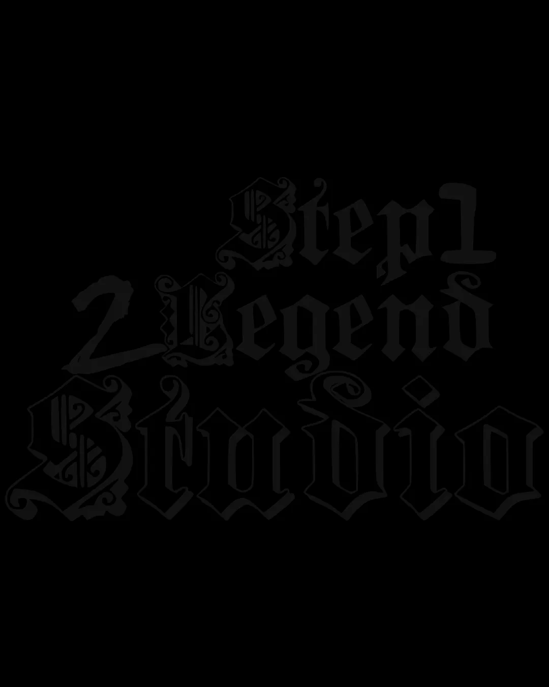
Logo review ofStep1 2 Legend Studio
Review the detailed scores below to see what is working and what should be refined first.
Legibility
Originality
Misread
Balance
Scale
Detailed review
Logo performance breakdown
Legibility
![]() The heavily ornamental blackletter/gothic typography is extremely difficult to read, especially for unfamiliar viewers.
The heavily ornamental blackletter/gothic typography is extremely difficult to read, especially for unfamiliar viewers.![]() Low contrast between dark text and background further reduces legibility.
Low contrast between dark text and background further reduces legibility.![]() Numerical and capital characters blend into each other, making it hard to distinguish words at a glance.
Numerical and capital characters blend into each other, making it hard to distinguish words at a glance.
Originality
![]() Custom blackletter/gothic approach gives some distinctive character.
Custom blackletter/gothic approach gives some distinctive character.
![]() Blackletter type is common and doesn’t uniquely distinguish the brand.
Blackletter type is common and doesn’t uniquely distinguish the brand.![]() Lacks inventive or contemporary twists.
Lacks inventive or contemporary twists.
Color harmony
![]() Single color scheme avoids clashing colors.
Single color scheme avoids clashing colors.
![]() Monotone black on dark background severely harms contrast and visibility.
Monotone black on dark background severely harms contrast and visibility.
Black
#181818
Color may be holding this logo back. Explore stronger palette options with Colorfly.design before updating the logo.
Explore palettesBalance alignment
![]() Attempt at visual hierarchy by stacking and varying text size.
Attempt at visual hierarchy by stacking and varying text size.
![]() Letter sizing and spacing are inconsistent, leading to a visually chaotic and heavy composition.
Letter sizing and spacing are inconsistent, leading to a visually chaotic and heavy composition.![]() Irregular layout creates visual imbalance and crowded negative space.
Irregular layout creates visual imbalance and crowded negative space.

Scalability
![]() Fine ornamental details will be lost or become illegible on small formats (business cards, favicons, embroidery).
Fine ornamental details will be lost or become illegible on small formats (business cards, favicons, embroidery).![]() Only works at large scales, limiting adaptability across diverse touchpoints such as merch, web, or small icons.
Only works at large scales, limiting adaptability across diverse touchpoints such as merch, web, or small icons.![]() Complicated shapes and connected scripts make it hard to use in modern, minimal branding settings.
Complicated shapes and connected scripts make it hard to use in modern, minimal branding settings.
200x250 px
100×125 px
50×62 px
Misinterpretations
![]() No immediately inappropriate or offensive secondary meanings detected.
No immediately inappropriate or offensive secondary meanings detected.
Try your own review
Review my logo
Wondering how your logo performs?
Get a clear logo score, key risks, and priority fix ideas before your client or audience sees it.
Keep exploring


