 View review
Logo score
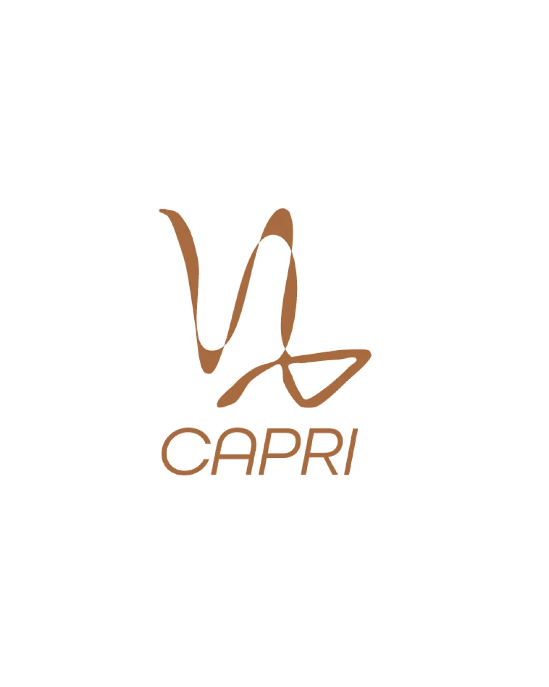
Logo review ofCapri
Review the detailed scores below to see what is working and what should be refined first.
Legibility
Originality
Misread
Balance
Scale
Detailed review
Logo performance breakdown
Legibility
![]() The wordmark 'CAPRI' is clear, evenly spaced, and highly legible.
The wordmark 'CAPRI' is clear, evenly spaced, and highly legible.![]() The sans-serif font complements the monogram without unnecessary complexity.
The sans-serif font complements the monogram without unnecessary complexity.
![]() Slight thinness in some strokes may affect reading at very small sizes.
Slight thinness in some strokes may affect reading at very small sizes.
Originality
![]() Custom monogram visually hints at a goat (capri) and is distinctively drawn.
Custom monogram visually hints at a goat (capri) and is distinctively drawn.![]() Abstract calligraphic approach adds uniqueness.
Abstract calligraphic approach adds uniqueness.
![]() The abstract form may verge on being ambiguous if not supported contextually.
The abstract form may verge on being ambiguous if not supported contextually.![]() Somewhat derivative of common fashion logo approaches, though still recognizable.
Somewhat derivative of common fashion logo approaches, though still recognizable.
Color harmony
![]() Color choice is suitable for luxury or fashion and is used consistently.
Color choice is suitable for luxury or fashion and is used consistently.![]() The warm brown shade exudes sophistication and works across backgrounds.
The warm brown shade exudes sophistication and works across backgrounds.
Teak
#B7996E
White
#FFFFFF
Balance alignment
![]() Wordmark and monogram are reasonably aligned vertically, creating a cohesive unit.
Wordmark and monogram are reasonably aligned vertically, creating a cohesive unit.
![]() Freeform style of the symbol creates a slight imbalance with the strong geometric wordmark.
Freeform style of the symbol creates a slight imbalance with the strong geometric wordmark.![]() Visual weight feels top-heavy due to tall loops in the monogram.
Visual weight feels top-heavy due to tall loops in the monogram.

Scalability
![]() The minimalist approach aids in adaptiveness to various applications like fashion labels, shop signage, and packaging.
The minimalist approach aids in adaptiveness to various applications like fashion labels, shop signage, and packaging.![]() Logo can work well against both light and dark backgrounds.
Logo can work well against both light and dark backgrounds.
![]() Organic, thin strokes in the monogram may lose clarity when reduced to icon or favicon size.
Organic, thin strokes in the monogram may lose clarity when reduced to icon or favicon size.![]() Line thickness might be difficult to reproduce clearly on embroidery or business cards.
Line thickness might be difficult to reproduce clearly on embroidery or business cards.
200x250 px
100×125 px
50×62 px
Misinterpretations
![]() The form is sufficiently abstract to avoid inappropriate or unintended interpretations.
The form is sufficiently abstract to avoid inappropriate or unintended interpretations.![]() No inadvertent negative symbolism detected.
No inadvertent negative symbolism detected.
Symbol & text fit
![]() Color and style are harmonious, both using the same brown tone.
Color and style are harmonious, both using the same brown tone.
![]() Both elements are minimal and contemporary.
Both elements are minimal and contemporary.
![]() Stylistic mismatch due to the flamboyant, organic monogram versus the rational, geometric wordmark.
Stylistic mismatch due to the flamboyant, organic monogram versus the rational, geometric wordmark.
![]() The contrast in weight and formality may create visual dissonance.
The contrast in weight and formality may create visual dissonance.
Try your own review
Review my logo
Wondering how your logo performs?
Get a clear logo score, key risks, and priority fix ideas before your client or audience sees it.
Keep exploring


