 View review
Logo score
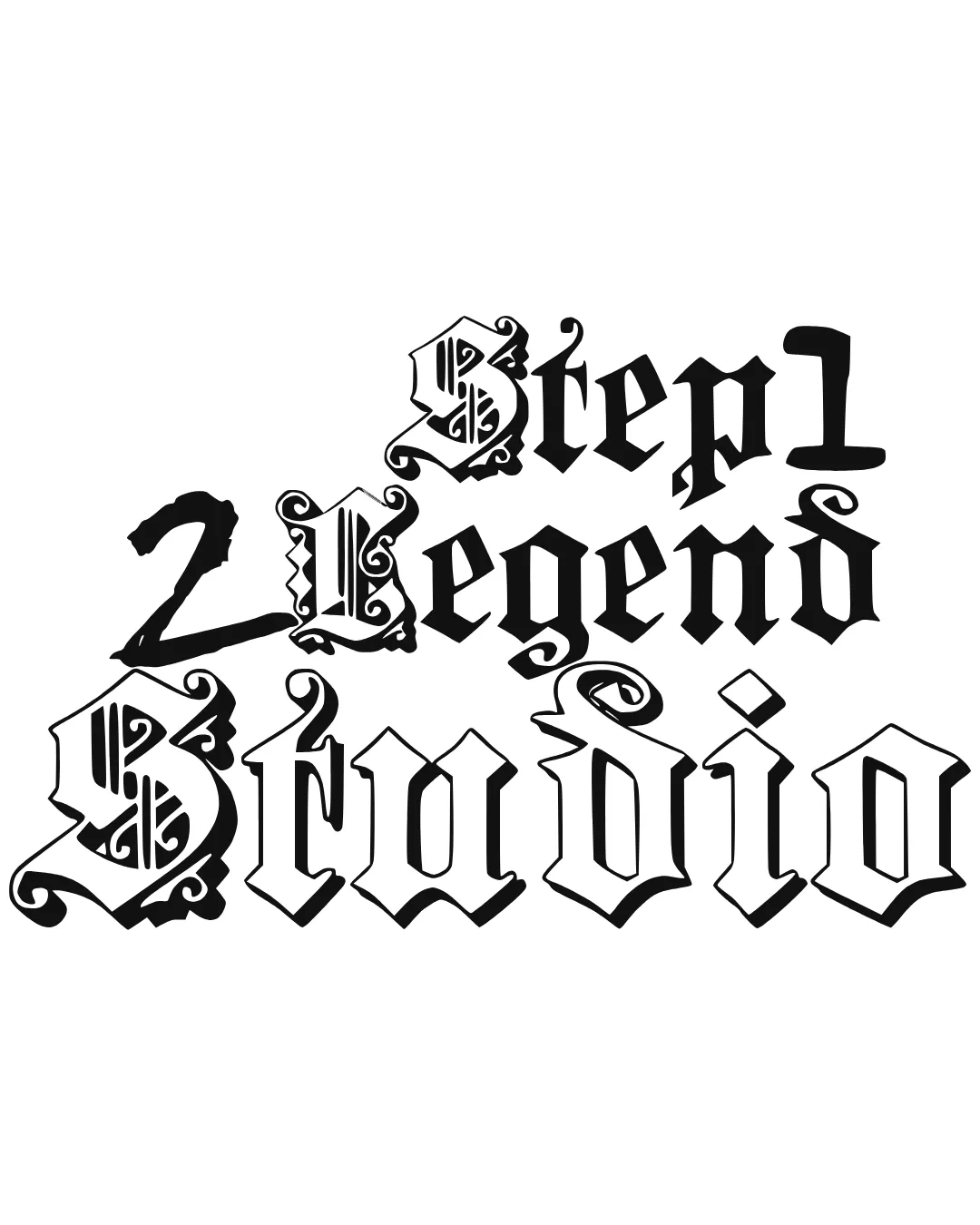
Logo review ofStep1 2 Legend Studio
Review the detailed scores below to see what is working and what should be refined first.
Legibility
Originality
Misread
Balance
Scale
Detailed review
Logo performance breakdown
Legibility
![]() Large, bold letters stand out and grab attention.
Large, bold letters stand out and grab attention.
![]() Extreme decorative blackletter style makes the text challenging to read, especially at smaller sizes.
Extreme decorative blackletter style makes the text challenging to read, especially at smaller sizes.![]() Highly ornamental glyphs in 'S', 'L', and other characters further hinder readability.
Highly ornamental glyphs in 'S', 'L', and other characters further hinder readability.![]() Variation in type weights and flourishes creates additional confusion.
Variation in type weights and flourishes creates additional confusion.
Originality
![]() Distinctive, memorable gothic style is visually bold.
Distinctive, memorable gothic style is visually bold.![]() Blackletter-font dominance is less common among mainstream studios, adding some originality.
Blackletter-font dominance is less common among mainstream studios, adding some originality.
![]() Relies entirely on a very classic blackletter aesthetic; no new twists or inventive motif or symbol.
Relies entirely on a very classic blackletter aesthetic; no new twists or inventive motif or symbol.![]() Stylistic font alone does not substitute for brand-defining originality.
Stylistic font alone does not substitute for brand-defining originality.![]() No unique logomark or creative negative space application.
No unique logomark or creative negative space application.
Color harmony
![]() Simple black-and-white palette ensures maximum contrast.
Simple black-and-white palette ensures maximum contrast.![]() Color selection appropriate for strong, impactful branding.
Color selection appropriate for strong, impactful branding.
Black
#000000
White
#FFFFFF
Balance alignment
![]() Striking gothic visual motif is consistent throughout the three lines.
Striking gothic visual motif is consistent throughout the three lines.
![]() No clear alignment—text is staggered and inconsistent, breaking formal balance.
No clear alignment—text is staggered and inconsistent, breaking formal balance.![]() Headers ('Step1', '2 Legend', 'Studio') vary in size and emphasis, not harmoniously organized.
Headers ('Step1', '2 Legend', 'Studio') vary in size and emphasis, not harmoniously organized.![]() Decorative swashes and glyph expansions on some letters (especially S and L) throw off balance.
Decorative swashes and glyph expansions on some letters (especially S and L) throw off balance.

Scalability
![]() Works in large formats such as posters, murals, or digital banners where detail can be appreciated.
Works in large formats such as posters, murals, or digital banners where detail can be appreciated.
![]() Ornate details and tight spacing will be lost or turn into visual clutter at smaller sizes, such as business cards, favicons, or merchandise embroidery.
Ornate details and tight spacing will be lost or turn into visual clutter at smaller sizes, such as business cards, favicons, or merchandise embroidery.![]() Not suitable for multi-application use—hard to simplify for stickers, app icons, or letterheads.
Not suitable for multi-application use—hard to simplify for stickers, app icons, or letterheads.
200x250 px
100×125 px
50×62 px
Misinterpretations
![]() No major inappropriate symbols or problematic forms detected.
No major inappropriate symbols or problematic forms detected.
Try your own review
Review my logo
Wondering how your logo performs?
Get a clear logo score, key risks, and priority fix ideas before your client or audience sees it.
Keep exploring


