What to preserve
The logo integrates a stylized circular arrow and modern lettering to convey creativity and movement in the 'abi' wordmark, reinforced by a clear 'Creative Designer' descriptor.
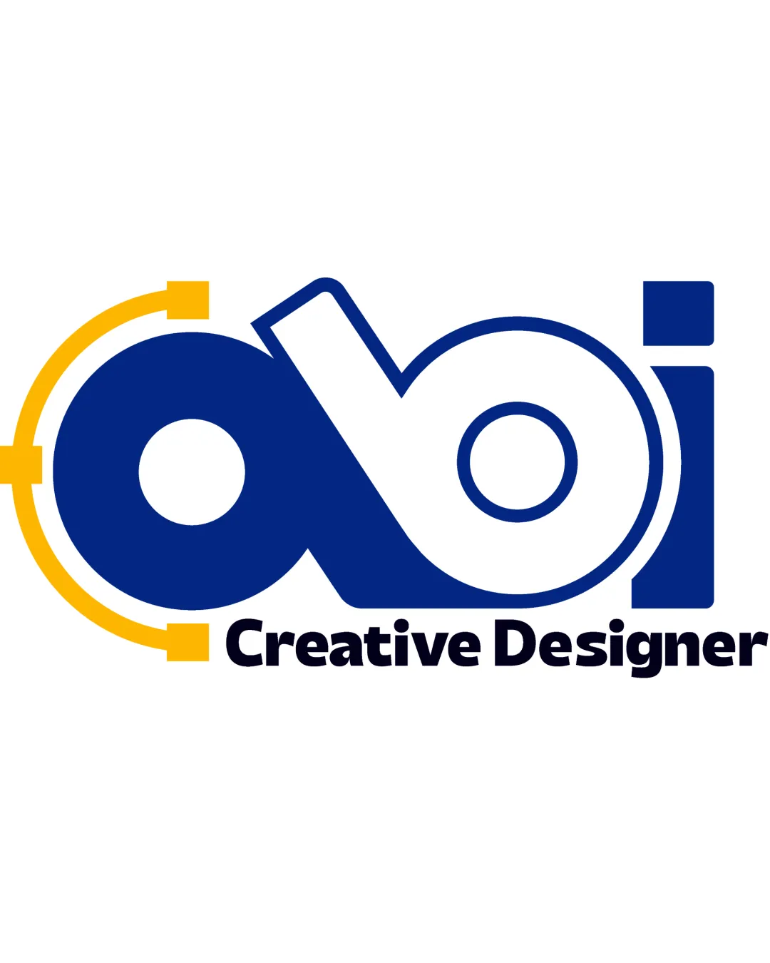
Highly usable and visually engaging for a creative design brand, but adjustment of arrow spacing and small-scale clarity should be addressed for optimal polish.
This logo lockup shows solid execution, supported by text readability and text hierarchy; improving distinctiveness is the clearest next step.
Focus on the changes that matter. Keep what makes the logo work.
The logo integrates a stylized circular arrow and modern lettering to convey creativity and movement in the 'abi' wordmark, reinforced by a clear 'Creative Designer' descriptor.
Logo preview unavailable. The written feedback is still available on this card.
wordmark/top left band
The yellow circular arrow's terminals nearly touch the blue 'a', creating a crowded effect and a slight imbalance on the left side relative to the rest of the wordmark.
See the category reviewThe bold, modern layout and movement motif are well suited for a creative design brand, with only minor improvements needed for distinction and balance.
Wordmark 4/5 · Layout 5/5
Estimated colors. Use the original design file for exact values.
Create a full color palette using these colors
Create new paletteWordmark 3/5 · Layout 4/5
The yellow circular arrow's terminals nearly touch the blue 'a', creating a crowded effect and a slight imbalance on the left side relative to the rest of the wordmark.
Try: Slightly adjust the distance between the yellow arrow terminals and the 'a' to provide more visual breathing space and improve overall balance.
Logo preview unavailable. The written feedback is still available on this card.

Inspect spacing with the guide. Optical balance may differ from geometric centering.
The generic circular arrow is a familiar motif in creative/tech logos, slightly limiting distinctiveness despite the custom letter shapes.
Wordmark 3/5 · Layout 3/5
The partial outlines and negative spaces within the 'a' and 'b' could merge or reduce clarity at smaller sizes, especially when reproduced with lower fidelity.
Get a clear logo score, key risks, and priority fix ideas before your client or audience sees it.
More credits needed
Add credits to continue without losing your work.
Then $7/month. Cancel anytime.
Essential logo review with AI
Estimated progress