Concept & direction
An abstract mark using two organic triangles facing away from one another, conveying motion, duality, or interaction.
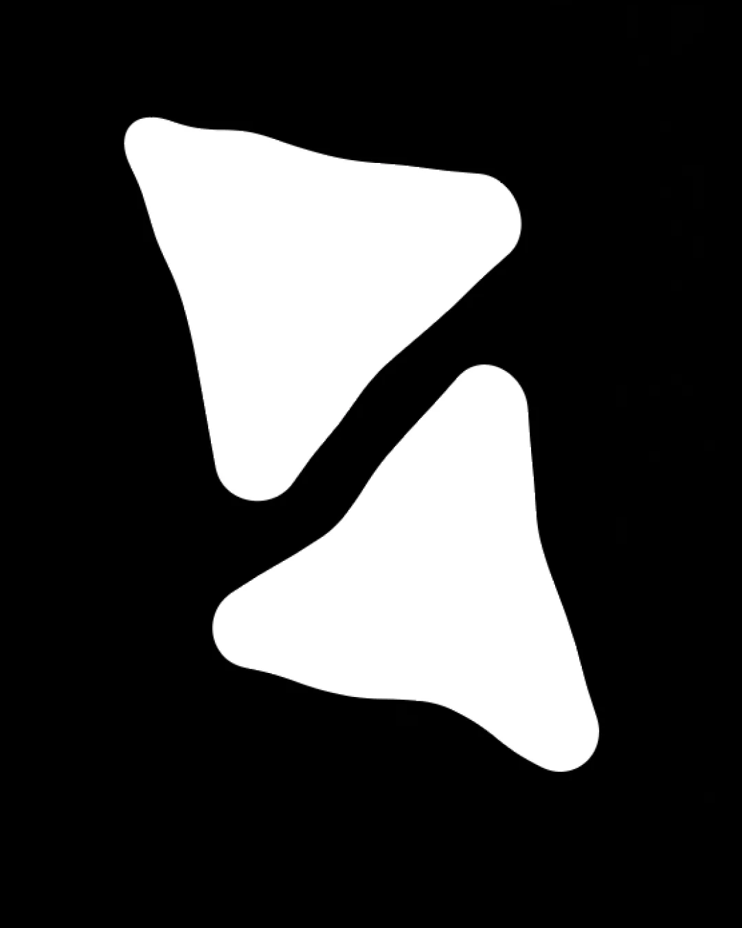
A bold, visually balanced abstract symbol offering strong versatility but moderate originality; main concern is similarity to common directional motifs.
This logomark shows solid execution, supported by clarity at smaller sizes and visual balance; improving distinctiveness is the clearest next step.
Focus on the changes that matter. Keep what makes the logo work.
An abstract mark using two organic triangles facing away from one another, conveying motion, duality, or interaction.
overall shape
The dual asymmetric triangle motif is an abstract yet broadly familiar approach, visually reminiscent of play/pause/media icons or directional signaling.
Compare against common icon libraries and industry examples.
There isn't enough brand context to assess the match.

Inspect spacing with the guide. Optical balance may differ from geometric centering.
The dual asymmetric triangle motif is an abstract yet broadly familiar approach, visually reminiscent of play/pause/media icons or directional signaling.
Try: Test for memorability and risk of confusion with common media or navigation symbols.
Check: Compare against common icon libraries and industry examples.
Get a clear logo score, key risks, and priority fix ideas before your client or audience sees it.
More credits needed
Add credits to continue without losing your work.
Then $7/month. Cancel anytime.
Essential logo review with AI
Estimated progress