 View review
Logo score
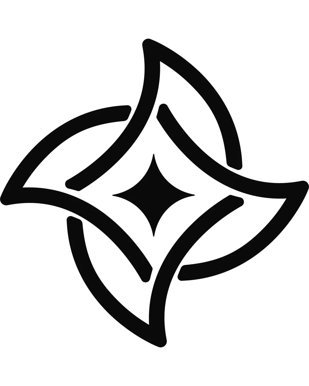
Logo review ofAbstract Four Pointed Star, Diamond Motif, Interlo..
Review the detailed scores below to see what is working and what should be refined first.
Originality
Misread
Balance
Scale
Detailed review
Logo performance breakdown
Originality
![]() The intersecting shapes and negative space create a distinct diamond star form.
The intersecting shapes and negative space create a distinct diamond star form.![]() Balanced use of negative space in the center is thoughtful.
Balanced use of negative space in the center is thoughtful.
![]() Abstract four-pointed star motifs are relatively common in tech and consulting industries.
Abstract four-pointed star motifs are relatively common in tech and consulting industries.![]() Lacks a truly unique or memorable twist to differentiate from similar geometric logos.
Lacks a truly unique or memorable twist to differentiate from similar geometric logos.
Color harmony
![]() Single color approach is strong, highly versatile, and ensures maximum legibility.
Single color approach is strong, highly versatile, and ensures maximum legibility.![]() Contrast between black symbol and white background is perfect.
Contrast between black symbol and white background is perfect.
Black
#000000
White
#FFFFFF
Balance alignment
![]() The logo exhibits strong visual harmony, with symmetrical proportions and evenly spaced elements.
The logo exhibits strong visual harmony, with symmetrical proportions and evenly spaced elements.![]() Weight distribution appears consistent in all quadrants.
Weight distribution appears consistent in all quadrants.
![]() Slight thickness variation in strokes upon close inspection may impact perceived refinement.
Slight thickness variation in strokes upon close inspection may impact perceived refinement.

Scalability
![]() Simple shapes and bold lines ensure the logo scales perfectly across small and large formats.
Simple shapes and bold lines ensure the logo scales perfectly across small and large formats.![]() Works for favicons, app icons, business cards, signage, and digital applications.
Works for favicons, app icons, business cards, signage, and digital applications.
200x250 px
100×125 px
50×62 px
Misinterpretations
![]() No inappropriate or ambiguous shapes present; composition is clean and safe.
No inappropriate or ambiguous shapes present; composition is clean and safe.
Try your own review
Review my logo
Wondering how your logo performs?
Get a clear logo score, key risks, and priority fix ideas before your client or audience sees it.
Keep exploring


