View review
Tifira
Review the detailed scores below to see what is working and what should be refined first.
Objective AI feedback. Your creative decision.
Logo performance breakdown
Legibility
Text is crisp and highly readable.
Font choice is distinctive but maintains clarity.
Originality
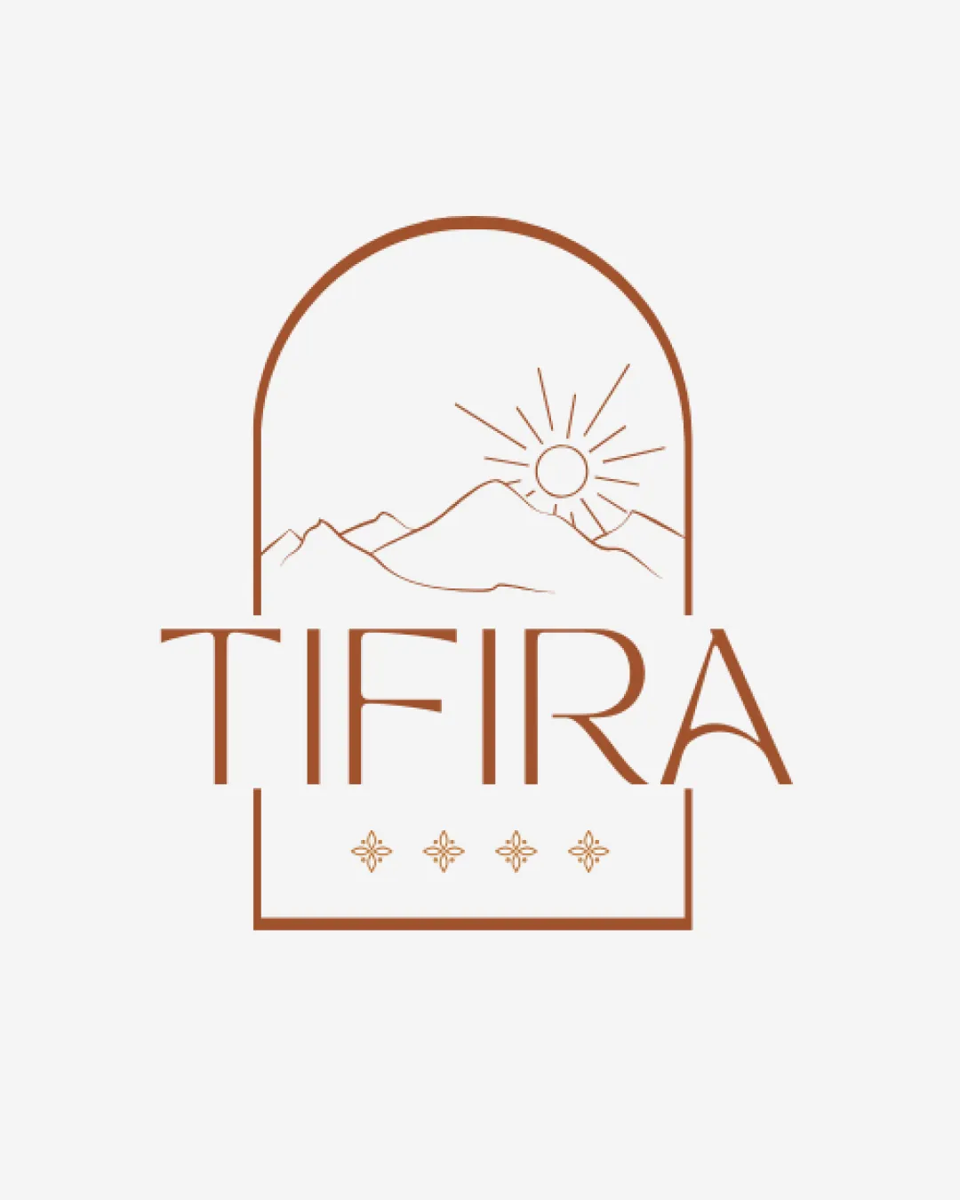
Combines sun, mountains, and arched window for a specific, serene feeling.
Mountains and sun in an arch motif are commonly seen in hospitality and travel logos.
Floral dots are decorative but not highly original.
Color harmony
Single-color design ensures visual unity and harmony.
Contrast is high and consistent.
Coffee
#9C6848
White
#FFFFFF
Balance alignment
Central composition feels balanced overall.
Elements within the arched frame are visually well-aligned.
The wordmark slightly extends beyond the arch framework, causing minor visual imbalance.
The floral elements beneath add an extra layer that can feel slightly crowded.
Scalability
Minimalist lines allow for moderate scalability.
Should translate decently to medium-sized prints like business cards or menus.
Thin lines in the mountains and sun may disappear at smaller sizes (e.g., favicons or embroidery).
Complexity of the floral decorative row is likely to be lost when reduced.
200x250 px
100×125 px
50×62 px
Misinterpretations
No inappropriate imagery or accidental symbolism detected.
Symbolism is clearly related to nature/travel/hospitality.
Symbol & text fit
Color and line weight between the logomark and wordmark are consistent.
Both elements use the same visual language.
The different type size and width of the wordmark versus the vertical logomark creates mild disharmony.
Wordmark's A leans heavily to the right, which slightly disrupts cohesion.
Wondering how your logo performs?
Get a clear logo score, key risks, and priority fix ideas before your client or audience sees it.




