View review
Logo score
Logo review of
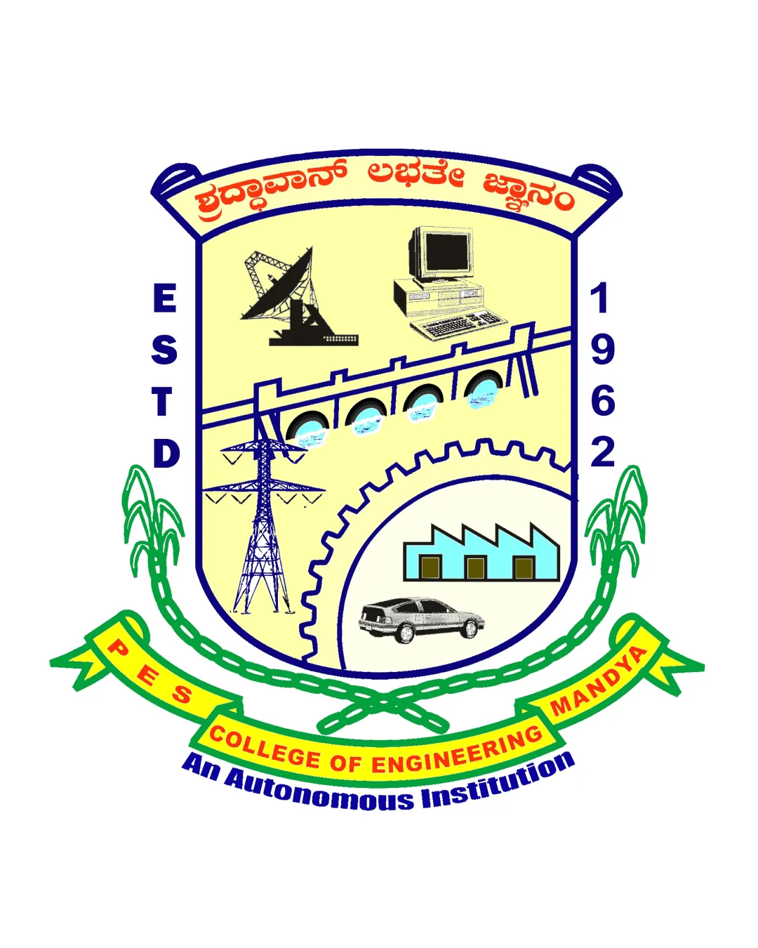
Pes College Of Engineering Mandya Estd 1962 An Aut..
Review the detailed scores below to see what is working and what should be refined first.
Objective AI feedback. Your creative decision.
Legibility
Originality
Misread
Balance
Scale
Detailed review
Logo performance breakdown
Legibility
 Main English text on ribbon is bold and readable. Contrast is decent in most text sections.
 Text in the red ribbon is tight and distorted by the ribbon curves. Different fonts, sizes, and orientations cause visual chaos. Text in the banner at top (regional language) and on 'An Autonomous Institution' has moderate readability issues due to color and placement.
Originality
Inclusion of multiple engineering symbols specific to the college's discipline.
Relies on generic, literal icons for each engineering stream, not a unique or synthesized symbol. Arrangement of elements is cluttered and lacks creative or innovative composition. No clever use of negative space or abstractions.
Color harmony
Colors are mostly distinct.
Over five strong, contrasting colors create an overwhelming, unharmonious palette. Background color feels disconnected from other design elements. Color transitions are abrupt with little harmony.
Sand
#E3E198
Dark Blue
#112870
Yellow
#F8FD02
Red
#E31B25
Green
#04AF2F
Black
#000000
Color may be holding this logo back. Build a stronger strategic palette before updating the logo.
Build brand colorsBalance alignment
Attempts symmetry with shield and plant stalks framing the mark.
Elements feel crowded and unbalanced inside the shield. Text, icons and shapes lack consistent alignment; some items feel randomly placed and out of proportion. Ribbon placement does not follow shield shape harmoniously.

Scalability
Might work on large banners and academic certificates where every detail is visible.
Logo is extremely detailed — will lose legibility, clarity and recognizability at small sizes (e.g., website favicons, mobile app icons, business cards, or embroidery). Thin lines and small illustrations become illegible and messy when scaled down. Color gradients and complex artwork do not reproduce well in monotone applications.
200x250 px
100×125 px
50×62 px
Misinterpretations
No inappropriate imagery present.
Symbol & text fit
Wordmark and symbolic imagery are clearly separated.
No consistent style or integration between illustration style and wordmark ribbons.
Disparity between modern (car, computer) and archaic (gear, dam) imagery adds to visual clash.
Wordmark dominates by its size and color, clashing with illustrative detail.
Try your own review
Review my logo
Wondering how your logo performs?
Get a clear logo score, key risks, and priority fix ideas before your client or audience sees it.
Keep exploring