TIFIRA logo review
4.1 / 5
Logo score
Logo review of

Tifira

Review the detailed scores below to see what is working and what should be refined first.

Objective AI feedback. Your creative decision.

Combination Mark Minimalist, Line Art, Modern Travel
5/5
Legibility
3/5
Originality
5/5
Misread
4/5
Balance
3/5
Scale
Detailed review

Logo performance breakdown

5/5

Legibility

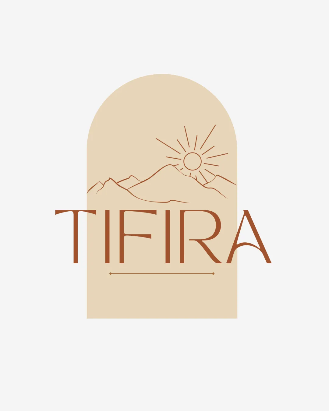
Checkmark icon Text 'TIFIRA' is easy to read with clean, sans-serif typography.
Checkmark icon High contrast between text and background enhances clarity.
3/5

Originality

Checkmark icon Use of a sun and mountain motif inside an arch is visually pleasing.

Warning icon Sunrise/mountain line art is a common trope in travel, outdoor, wellness, and lifestyle branding, making the concept less unique.
Warning icon No distinctive twist or custom iconography beyond standard minimalist illustration.

5/5

Color harmony

Checkmark icon Monochrome palette with harmonious earthy tones.
Checkmark icon Excellent simplicity—no overwhelming or clashing hues.

Beige
#E4C9A2

Brown
#8D4F28

White
#FFFFFF

4/5

Balance alignment

Checkmark icon Good visual alignment between the arched frame and the wordmark.
Checkmark icon Text is centered with respect to the symbol.

Warning icon The arch slightly outweighs the thin wordmark, resulting in a small imbalance. The visual weight of the symbol could overpower the text.

logo 200x250 pixels scalability test alignment grid overlay
3/5

Scalability

Checkmark icon Simple line art generally scales well.
Checkmark icon Works on digital and most print mediums like brochures or cards.

Warning icon Fine lines in the mountains and sun details may get lost or blurred at very small sizes (favicons or embroidery).
Warning icon Complexity of the arched background plus illustration may not translate well on tiny merchandise or product tags.

logo 200x250 pixels scalability test

200x250 px

logo 100x125 pixels scalability test

100×125 px

logo 50x62 pixels scalability test

50×62 px

5/5

Misinterpretations

Checkmark icon No inappropriate or confusing shapes detected in the composition.

4 / 5

Symbol & text fit

Checkmark icon Style and color of the wordmark matches the line-art feel of the logomark.

Warning icon Moderate size discrepancy between the detailed arched symbol and lighter text may reduce cohesion at some scales.

Try your own review

Wondering how your logo performs?

Get a clear logo score, key risks, and priority fix ideas before your client or audience sees it.

Review my logo




