 View review
Logo score
Logo review ofAbstract Shapes Forming A Stylized House Roof, A S..
Review the detailed scores below to see what is working and what should be refined first.
Originality
Misread
Balance
Scale
Detailed review
Logo performance breakdown
Originality
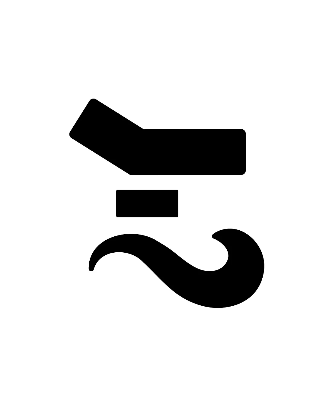
![]() Attempt at unique symbolism by combining disparate elements (roof and mustache).
Attempt at unique symbolism by combining disparate elements (roof and mustache).
![]() Mustache and roof icons are both common and lack a creative twist.
Mustache and roof icons are both common and lack a creative twist.![]() The composition feels forced—merging two industry clichés without clever integration.
The composition feels forced—merging two industry clichés without clever integration.
Color harmony
![]() Simple black-and-white palette ensures strong contrast and adaptability.
Simple black-and-white palette ensures strong contrast and adaptability.![]() Highly versatile for backgrounds and reversals.
Highly versatile for backgrounds and reversals.
Black
#000000
White
#FFFFFF
Balance alignment
![]() Central composition creates basic balance.
Central composition creates basic balance.![]() Horizontal alignment is stable.
Horizontal alignment is stable.
![]() Upper roof shape is visually heavier than the mustache curve, leading to top-heavy composition.
Upper roof shape is visually heavier than the mustache curve, leading to top-heavy composition.![]() Negative space around the square feels awkwardly placed, reducing visual harmony.
Negative space around the square feels awkwardly placed, reducing visual harmony.

Scalability
![]() Highly simplified, geometric forms maintain clarity at all sizes.
Highly simplified, geometric forms maintain clarity at all sizes.![]() Solid black shapes ensure strong reproduction in print and digital formats.
Solid black shapes ensure strong reproduction in print and digital formats.![]() Works well in mono-color and on various backgrounds.
Works well in mono-color and on various backgrounds.
200x250 px
100×125 px
50×62 px
Misinterpretations
![]() No overtly inappropriate or suggestive imagery detected.
No overtly inappropriate or suggestive imagery detected.
Try your own review
Review my logo
Wondering how your logo performs?
Get a clear logo score, key risks, and priority fix ideas before your client or audience sees it.
Keep exploring


