Refine tagline for legibility at small sizes or create a lockup variant without it
Tagline loses readability under common reproduction sizes.
Improves usability across applications

Polished and adaptable for the design industry, but could be strengthened with either a more flexible symbol or improved tagline execution for broad deployment.
Focus on the changes that matter. Keep what makes the logo work.
Tagline loses readability under common reproduction sizes.
Improves usability across applications
Current typographic lockup may lack visual icon recognition.
Increases versatility and memorability; supports small or social use
Blocky text tightly fills container, risking 'cramped' impression.
Improves optical balance and premium feel
Compressed style fits creative, design-driven context
Multiple lockups and clear color swatches increase usability
Name is distinctive but block letter approach is less memorable
Estimated colors. Use the original design file for exact values.
Create a full color palette using these colors
Create new palette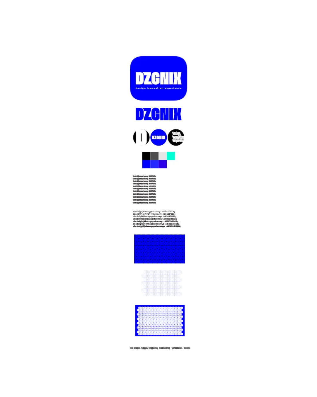

Inspect spacing with the guide. Optical balance may differ from geometric centering.
Compare the detail at different sizes. Labels show the full image dimensions.
Does the shape still work without color?
Find the surfaces where your logo stays clear.
Compare the mark and lettering on each surface.
Shows the lower-contrast areas of the logo (5th percentile). Tiny details may have lower contrast. Good ≥ 4.5:1 · Medium ≥ 3:1 · Bad < 3:1. A visual guide, not an accessibility rating.
A 3px blur softens fine details so you can check whether the overall shape stays recognizable. If key gaps close or elements merge, the logo may rely too heavily on detail.
Look for clear separation between shapes and a distinctive outline.
Competitive but not highly differentiated
Delivers industry-appropriate boldness with clarity, but risks blending in among other geometric wordmarks without a unique symbol or graphic twist.
Matches visual codes for creative and design consultancies
Appropriate and functional for industry standards.
Somewhat generic geometric sans-serif trend
Could be mistaken for other creative agencies or studios.
Strong, confident, modern appearance
Conveys professionalism and contemporary flair.
How the logo may work in practice, and what to check before production.
Main lockup reads cleanly; tagline should be sized up or omitted
Wordmark works in header, but consider favicon-friendly symbol
High contrast and bold style good for large formats
Abbreviation in block works, but tagline should not be used here
Strong blue and block mark allow flexible applications
The logo versions to prepare before sending final files to a client or team.
A mark and wordmark are both visible in the uploaded asset.
Multiple logo versions are visible in the uploaded presentation.
Export the wordmark separately, without the symbol or tagline, for narrow placements and smaller sizes.
Export the existing symbol, mascot, or monogram on its own for avatars, favicons, and compact placements. Check its clarity at small sizes.
Only if the brand uses a tagline: prepare a wordmark with it for larger placements, alongside the tagline-free version.
Prepare a monochrome version for restricted print and production methods.
Prepare a light version for dark brand backgrounds.
Put the design into words. Use these notes to build your client presentation.
The elements that make up the identity.
A bold block-shaped wordmark 'DZGNIX' in geometric sans-serif, placed in a rounded blue square, often with the tagline 'design innovation experience' below.
Condensed, all-caps DZGNIX lettering using a modern sans-serif typeface, designed for high contrast and impact.
Deep blue dominates with supporting black, white, cyan, and mid gray, supporting both monochrome and colorful brand contexts.
The story and thinking behind the design.
A modern, bold identity tailored for design and innovation consultancy, instantly legible and adaptable across diverse media.
Get a clear logo score, key risks, and priority fix ideas before your client or audience sees it.
More credits needed
Add credits to continue without losing your work.
Then $7/month. Cancel anytime.