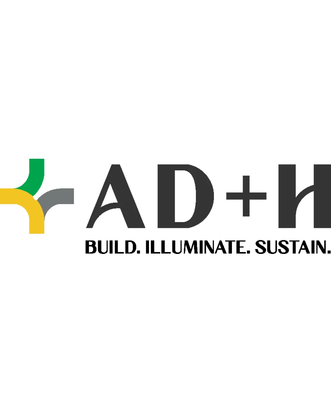
AD+H BUILD. ILLUMINATE. SUSTAIN. logo review
3.6 / 5
Logo score

Logo review ofAd+h Build. Illuminate. Sustain.

Not yet client-ready—requires refinement of balance and small-size usability.

Combination Mark Modern Geometric Architecture/construction
4/5
Legibility
3/5
Originality
5/5
Misread
3/5
Balance
4/5
Scale
Review next
Action plan

What to fix first

The most important fixes to handle before polishing the full presentation.

1

Increase the visual weight of the mark or reduce emphasis on the text for better balance.

High priority

Current alignment feels text-dominant, diluting the symbol's effect.

Impact: Improves Overall Harmony And Professional Impact Of The Logo. · Effort: Medium

2

Slightly increase letter spacing in 'AD+H' and thicken the tagline for small-scale legibility.

Medium priority

Prevents loss of clarity at reduced sizes.

Impact: Boosts Readability And Adaptability On Various Applications. · Effort: Low

Detailed review

Logo performance breakdown

4/5

Legibility

Checkmark icon Main text 'AD+H' and tagline are readable and clear

Warning icon Spacing between '+' and 'H' slightly tight

3/5

Originality

Checkmark icon Custom geometric join shape gives some uniqueness

Warning icon Abstract geometric cross/junction is moderately generic

4/5

Color harmony

Checkmark icon Yellow, green, and gray create a balanced, professional palette

Warning icon Symbol's multi-color approach may complicate one-color applications

Yellow
#FFD600

Green
#43A047

Gray
#818181

Black
#222222

Your palette is close. Explore sharper color combinations with Colorfly.design before updating the logo.

Explore palettes
3/5

Balance alignment

Checkmark icon Strong left-right relationship between mark and text

Warning icon Logo mark weight is weaker than bold text, causing slight imbalance

logo 200x250 pixels scalability test alignment grid overlay
4/5

Scalability

Checkmark icon Geometric symbol and bold text maintain clarity when scaled

Warning icon Thin tagline may lose readability at small sizes

logo 200x250 pixels scalability test

200x250 px

logo 100x125 pixels scalability test

100×125 px

logo 50x62 pixels scalability test

50×62 px

5/5

Misinterpretations

Checkmark icon No inappropriate or embarrassing shapes observed

3 / 5

Logo structure & brief match

Checkmark icon Colorful mark provides contrast to black wordmark

Warning icon Connection between abstract mark and letterforms not visually clear

Checkmark icon Architecture/construction Industry: Modern geometric style and slogan support a construction/architecture brand identity.

Try your own review

Wondering how your logo performs?

Get a clear logo score, key risks, and priority fix ideas before your client or audience sees it.

Review my logo