What to preserve
The logo effectively combines agrarian landscape and sun motifs to convey natural heritage and reliability, with a modern geometric execution suited to professional B2B audiences.
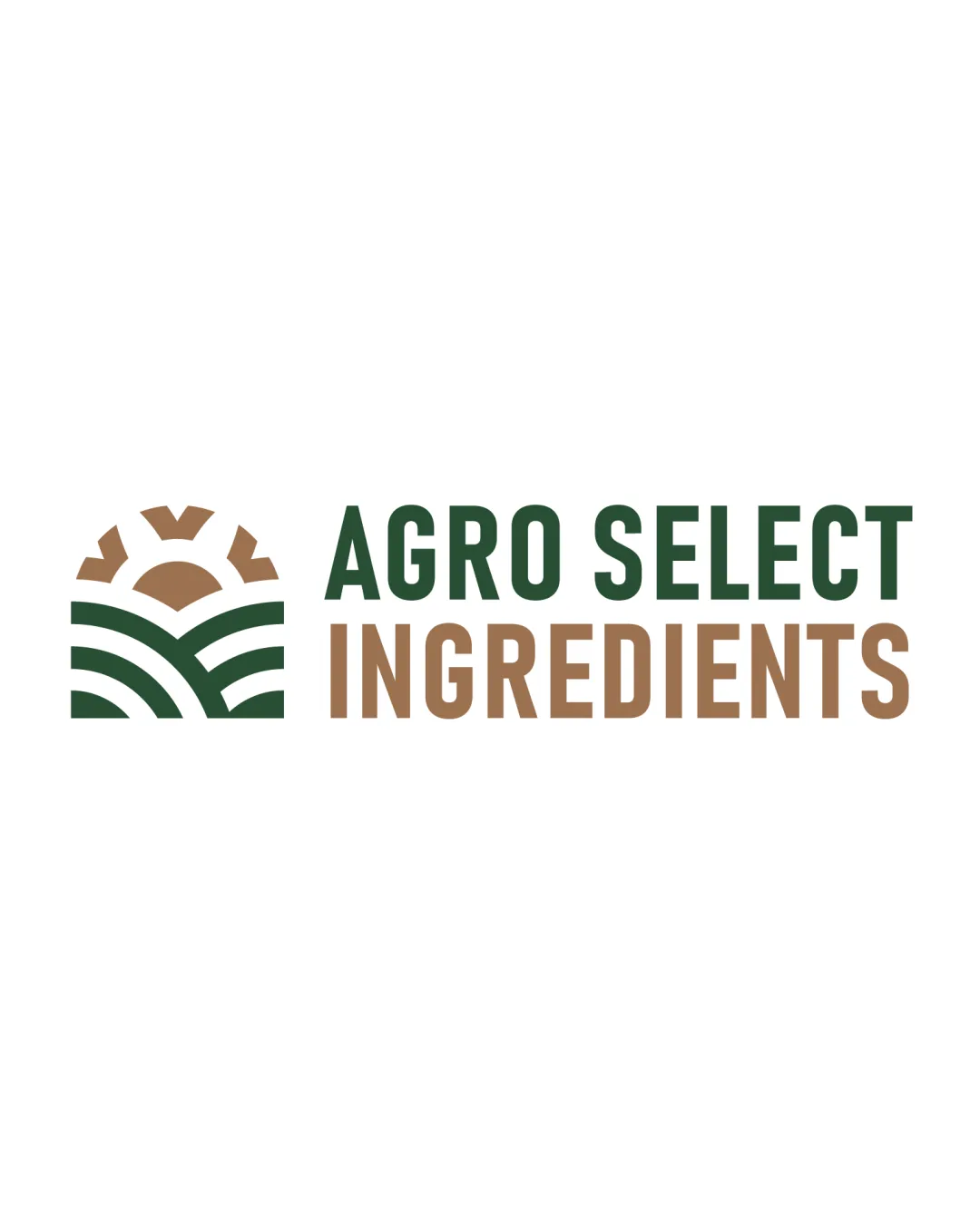
A professionally constructed, versatile logo well-suited to communicating reliability, heritage, and quality in the agri-ingredients sector.
This logo lockup shows strong execution, supported by visual balance and distinctive construction.
Focus on the changes that matter. Keep what makes the logo work.
The logo effectively combines agrarian landscape and sun motifs to convey natural heritage and reliability, with a modern geometric execution suited to professional B2B audiences.
Logo preview unavailable. The written feedback is still available on this card.
Standalone mark
The icon’s negative space and inner sun rays are clear but may merge when drastically reduced, a common issue for geometric agricultural motifs.
See the category reviewThe logo’s modern sun-over-field symbol and robust wordmark communicate natural heritage, reliability, and quality at a professional B2B level, matching the brief for stationery, packaging, and digital use.
Wordmark 5/5 · Layout 5/5
Symbol 4/5 · Wordmark 5/5 · Layout 4/5
The icon’s negative space and inner sun rays are clear but may merge when drastically reduced, a common issue for geometric agricultural motifs.
Try: Test the logomark at very small sizes (e.g., packaging stamps or delivery slips) for negative space clarity.
Logo preview unavailable. The written feedback is still available on this card.
Symbol 4/5 · Wordmark 4/5
Symbol 4/5 · Wordmark 4/5
The earthy palette is harmonious and supports the agriculture theme, though further testing in grayscale/monochrome may be warranted for industrial applications.
Estimated colors. Use the original design file for exact values.
Create a full color palette using these colors
Create new paletteSymbol 4/5 · Wordmark 4/5 · Layout 4/5

Inspect spacing with the guide. Optical balance may differ from geometric centering.
The wordmark uses two colors to emphasize 'INGREDIENTS,' creating a functional hierarchy, but the color split is a strong cue; minor balance tweaks could help equalize line weight and perceived emphasis.
Get a clear logo score, key risks, and priority fix ideas before your client or audience sees it.
More credits needed
Add credits to continue without losing your work.
Then $7/month. Cancel anytime.
Essential logo review with AI
Estimated progress