Concept & direction
The monogram uses abstract, soft forms that appear inviting and playful, aligning partially with the goal of being welcoming for all ages.
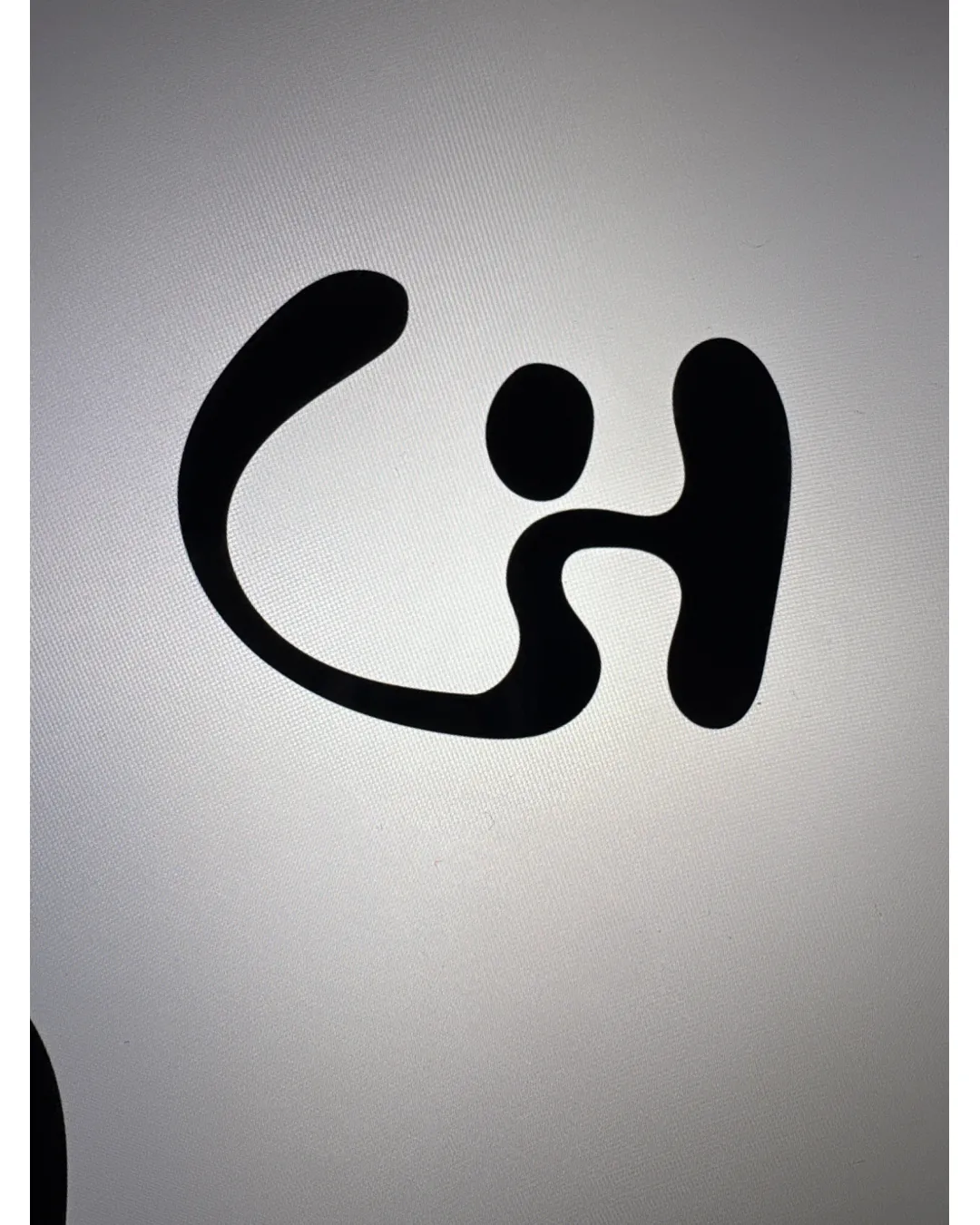
Solid foundation in playful, smooth shapes, but must be enhanced with fitting color to achieve brand intent and strengthen distinctiveness.
This monogram shows solid execution, supported by clarity at smaller sizes and visual balance; improving distinctiveness is the clearest next step.
Focus on the changes that matter. Keep what makes the logo work.
The monogram uses abstract, soft forms that appear inviting and playful, aligning partially with the goal of being welcoming for all ages.
Check the logo in its intended applications before delivery, and review any optional refinements below.
The monogram's friendly abstract forms partly address the welcoming atmosphere goal, but the lack of bright, calming color and distinctive thermal pool reference limits full alignment with the brand brief.

Inspect spacing with the guide. Optical balance may differ from geometric centering.
The shapes are abstract; while a 'C' and 'h' can be perceived, viewers may not immediately associate these with the brand or name.
The forms are playful and abstract, but the design is somewhat generic and does not have a memorable or distinctive element specific to thermal pools or the Chalmová identity.
Get a clear logo score, key risks, and priority fix ideas before your client or audience sees it.
More credits needed
Add credits to continue without losing your work.
Then $7/month. Cancel anytime.
Essential logo review with AI
Estimated progress