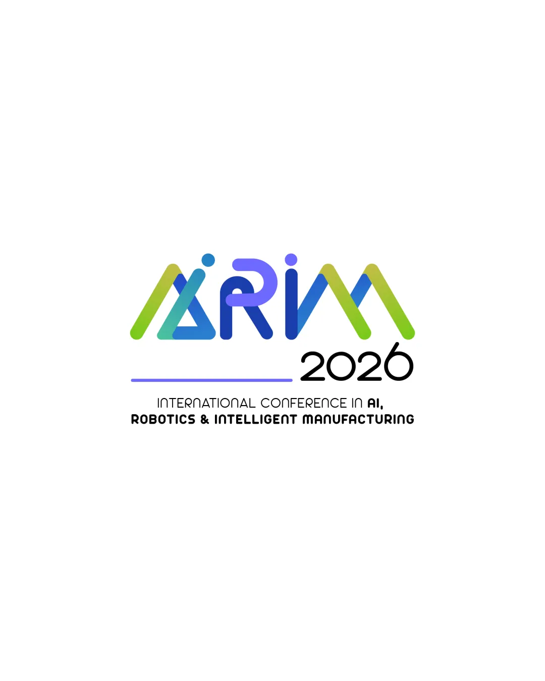
AIRIM 2026 INTERNATIONAL CONFERENCE IN AI, ROBOTIC.. logo review
3.7/5
Logo score
Logo review of

Airim 2026 International Conference In Ai, Robotic..

A distinctive, apt, and contemporary event logo with notable visual energy; refinement for clarity will elevate it further.

Combination Mark Modern Geometric Tech Technology / Conference
3/5
Legibility
4/5
Originality
4/5
Misread
4/5
Balance
3/5
Scale
Action plan

What to fix first

The most important fixes to handle before polishing the full presentation.

1

Improve legibility of the 'AIRIM' acronym (especially the A and I forms) for clarity at all sizes.

High priority

Current abstraction risks misreading, especially at small scale or quick glance.

Impact: Will Make The Logo More Readable And Accessible In All Conference Applications. · Effort: Medium

2

Test simplified or single-color versions for small-scale and single-color reproduction.

Medium priority

Logo contains gradient-like or color-separated letterforms that could blur or merge in some uses.

Impact: Ensures The Logo Remains Recognizable And Functional Across All Event Materials. · Effort: Low

Detailed review

Logo performance breakdown

3/5

Legibility

Checkmark icon Main acronym is mostly readable.
Checkmark icon Tagline is clear and easy to read.

Warning icon Highly stylized 'AIRIM' causes slight confusion between 'A' and 'I', and legibility suffers at small sizes.

4/5

Originality

Checkmark icon Unusual letter interconnection is visually memorable and connected to tech themes.

Warning icon Style risks blending with generic tech conference branding.

4/5

Color harmony

Checkmark icon Bright blue/green/purple palette clearly signals a tech-driven event, with strong contrast.

Warning icon Gradient or hue transitions between letters may introduce minor print/color separation risks.

Green
#6BC386

Blue
#2E99F0

Purple
#7355E9

Black
#000000

Your palette is close. Refine the color roles and combinations before updating the logo.

Build brand colors
4/5

Balance alignment

Checkmark icon Cohesive centering and intentional separation between acronym, year, and tagline.
Checkmark icon Even horizontal weight across main elements.

Warning icon Slight unevenness between the organic/angled forms and strict tagline.

logo 200x250 pixels scalability test alignment grid overlay
3/5

Scalability

Checkmark icon Simple color fills and bold lines enhance reproduction at medium sizes.

Warning icon Thin gaps and icon-style structure risk losing clarity on smaller scales.

logo 200x250 pixels scalability test

200x250 px

logo 100x125 pixels scalability test

100×125 px

logo 50x62 pixels scalability test

50×62 px

4/5

Misinterpretations

Checkmark icon No negative shapes or symbols with unwanted associations.

4/5

Logo structure & brief match

Checkmark icon The logomark integrates directly into the wordmark, and style is consistent across all text lines.

Warning icon Letterform abstraction could create minor disconnect for first-time readers.

Checkmark icon Industry: The design's stylized geometry and color scheme effectively match an AI, robotics, and manufacturing conference.
Checkmark icon Event Year: Year is clearly presented and well-integrated.

Try your own review

Wondering how your logo performs?

Get a clear logo score, key risks, and priority fix ideas before your client or audience sees it.

Review my logo