Test symbol and tagline clarity at small sizes and across varied backgrounds
Maintain readability in digital and print collateral.
Ensures legibility and impact across uses
Distinctive, elegant, and effective; aligns strongly with upscale restaurant positioning and celebration-focused branding.
Focus on the changes that matter. Keep what makes the logo work.
Maintain readability in digital and print collateral.
Ensures legibility and impact across uses
Prevents loss of key concept in shrunken applications.
Improves quick recognition of intended forms
Maintaining elegance and contrast across materials is crucial for fine dining brands.
Ensures logo remains effective in all settings
Logo style and color communicate sophistication and refinement.
The hand gesture and glass suggest toasting, which supports the association with celebration and memorable experiences.
Estimated colors. Use the original design file for exact values.
Create a full color palette using these colors
Create new palette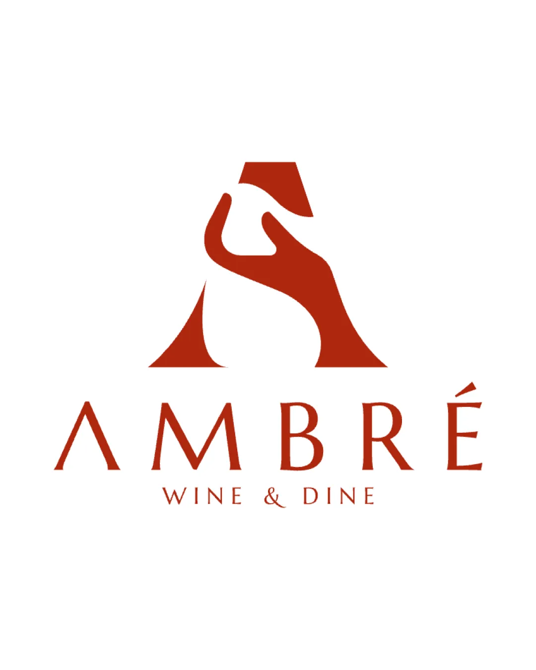

Inspect spacing with the guide. Optical balance may differ from geometric centering.
Compare the detail at different sizes. Labels show the full image dimensions.
Does the shape still work without color?
Find the surfaces where your logo stays clear.
Compare the mark and lettering on each surface.
Shows the lower-contrast areas of the logo (5th percentile). Tiny details may have lower contrast. Good ≥ 4.5:1 · Medium ≥ 3:1 · Bad < 3:1. A visual guide, not an accessibility rating.
A 3px blur softens fine details so you can check whether the overall shape stays recognizable. If key gaps close or elements merge, the logo may rely too heavily on detail.
Look for clear separation between shapes and a distinctive outline.
Well positioned in upscale dining sector, with distinctive but category-relevant concept.
Sophisticated integration of symbol and letter works for high-end restaurants, though hand-glass motif is not wholly unique in hospitality.
Elegantly reinforces upscale restaurant context; instantly signals fine dining and wine focus.
No major disconnects with luxury restaurant market.
Monogram and celebration theme help distinguish, but hand/glass idea has moderate category usage.
Possible echo of similar celebratory iconography in sector.
Communicates premium, welcoming, and celebratory environment suited to brand brief.
Single-color approach may be less eye-catching in certain visual environments.
How the logo may work in practice, and what to check before production.
Strong legibility and impact for digital masthead.
Compact mark functions well as profile icon.
May require simplified mark-only variant for clarity.
Bold form holds up at signage scale.
Single-color scheme is inherently adaptable.
A practical checklist of the logo versions to prepare before sending the final files to a client or team.
Central logo solution for brand.
Essential for social, favicon, and condensed spaces.
Useful for landscape-oriented placements.
Required for print and merchandising flexibility.
Gives extra flexibility for small spaces or when tagline is redundant.
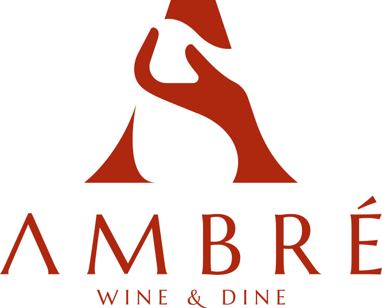
The main logo features a custom monogram 'A' formed by an elegant hand cradling a wine glass in negative space, paired with a refined wordmark 'AMBRÉ' and the subline 'WINE & DINE.'
'AMBRÉ' is set in a modern, high-contrast serif font with well-spaced, elevated letterforms, communicating luxury.
The monogram integrates a stylized hand gesture into the form of the letter 'A', cleverly incorporating a wine glass through negative space to evoke celebration.
This logo elevates the AMBRÉ brand, fusing a memorable hand-monogram with wine-glass negative space for a refined, celebratory identity.
The integrated hand and glass form symbolizes toasting, aligning with the restaurant's focus on special moments.
A singular warm palette conveys elegance and hospitality.
Get a clear logo score, key risks, and priority fix ideas before your client or audience sees it.
More credits needed
Add credits to continue without losing your work.
Then $7/month. Cancel anytime.