 View review
Logo score
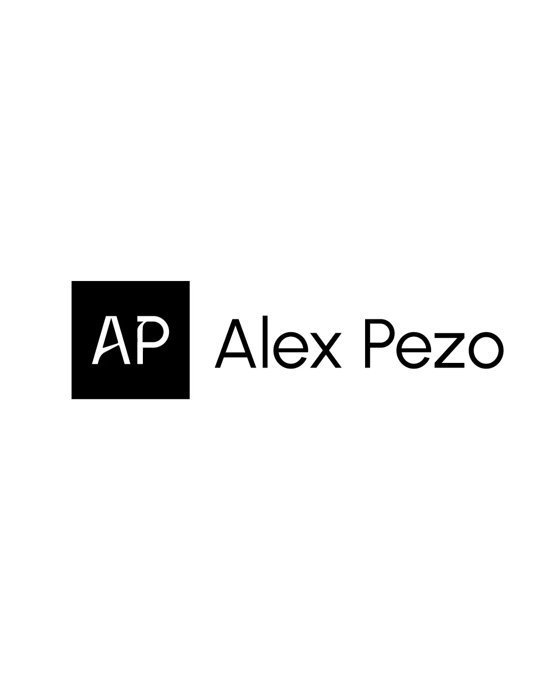
Logo review ofAp, Alex Pezo
Review the detailed scores below to see what is working and what should be refined first.
Legibility
Originality
Misread
Balance
Scale
Detailed review
Logo performance breakdown
Legibility
![]() All text elements are highly legible, with excellent contrast.
All text elements are highly legible, with excellent contrast.![]() Font choices are clean and easy to read.
Font choices are clean and easy to read.
Originality
![]() Lettermark inside geometric shape offers some uniqueness.
Lettermark inside geometric shape offers some uniqueness.
![]() The combination of initials inside a square is highly generic and overused in personal branding.
The combination of initials inside a square is highly generic and overused in personal branding.![]() No distinctive custom elements or creative twists present.
No distinctive custom elements or creative twists present.
Color harmony
![]() Simple black-and-white color scheme exhibits perfect contrast and visual harmony.
Simple black-and-white color scheme exhibits perfect contrast and visual harmony.![]() Will reproduce well in monochrome formats.
Will reproduce well in monochrome formats.
Black
#000000
White
#FFFFFF
Balance alignment
![]() Alignment between the square icon and wordmark is visually clean.
Alignment between the square icon and wordmark is visually clean.![]() Overall balance between block (AP) and type (Alex Pezo) is solid.
Overall balance between block (AP) and type (Alex Pezo) is solid.
![]() The 'AP' block feels slightly heavy compared to the lightness of the text; minor adjustments could further refine weight distribution.
The 'AP' block feels slightly heavy compared to the lightness of the text; minor adjustments could further refine weight distribution.

Scalability
![]() Simple shapes and minimal details allow for good scaling and clarity at small sizes.
Simple shapes and minimal details allow for good scaling and clarity at small sizes.![]() Would work well on digital and print formats such as business cards, website headers, and personal stationary.
Would work well on digital and print formats such as business cards, website headers, and personal stationary.
![]() Thin lines in 'AP' could be problematic when embroidered or reduced to extremely small icons.
Thin lines in 'AP' could be problematic when embroidered or reduced to extremely small icons.
200x250 px
100×125 px
50×62 px
Misinterpretations
![]() No dual meanings or inappropriate visual interpretations detected.
No dual meanings or inappropriate visual interpretations detected.
Symbol & text fit
![]() The font styles are consistent between the symbol and text, maintaining a unified appearance.
The font styles are consistent between the symbol and text, maintaining a unified appearance.
![]() The stroke and weight of 'AP' compared to 'Alex Pezo' could be better harmonized for improved cohesiveness.
The stroke and weight of 'AP' compared to 'Alex Pezo' could be better harmonized for improved cohesiveness.
Try your own review
Review my logo
Wondering how your logo performs?
Get a clear logo score, key risks, and priority fix ideas before your client or audience sees it.
Keep exploring


