AP .studio logo review
4/5
Logo score
Logo review of

Ap .studio

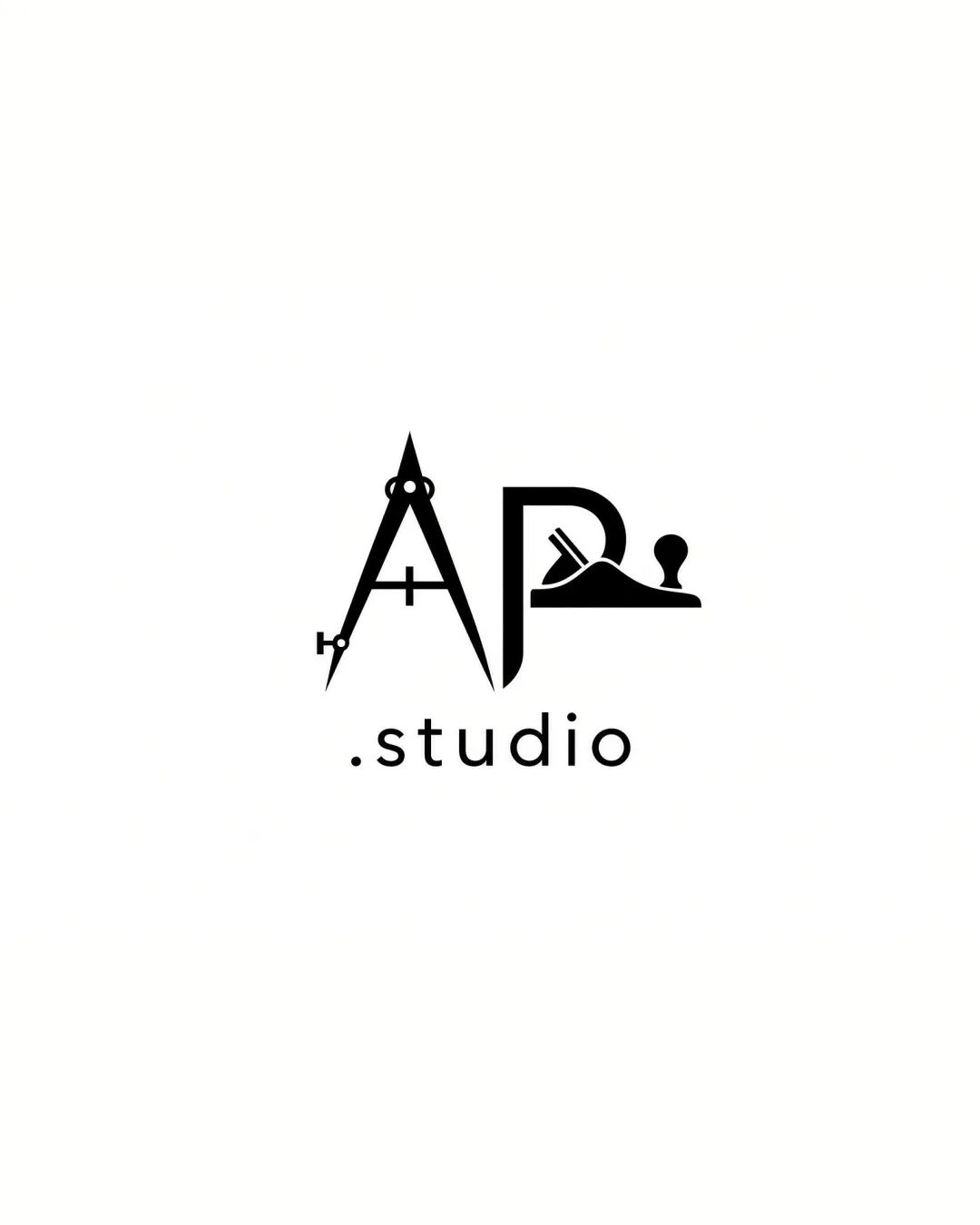
A creative and distinctive monogram for a studio, merging discipline-specific tools into recognizable initials; justifiable minor tweaks could boost immediate readability and overall hierarchy.

Combination Mark Minimalist, Geometric, Symbolic Architecture, Crafts, Design Studio
3/5
Legibility
4/5
Originality
5/5
Misread
3/5
Balance
4/5
Scale
Your next steps

What to fix first

Focus on the changes that matter. Keep what makes the logo work.

1

'A' and 'P' monogram

Optimize the integration so that the letterforms are even more immediately recognizable without losing the tool references.

Visible issue High priority Medium effort
Area to inspectApproximate location

The compass and hand plane, while visually engaging, may cause slower initial reading of the letters 'A' and 'P' for some viewers.

How to check

Ask target users to quickly identify the initials on first glance and note hesitation.

See the category review
2

Monogram and wordmark spacing

Increase the gap between the logomark and wordmark for better visual separation.

Optional refinement Medium priority Low effort
Area to inspectApproximate location

The vertical spacing between the monogram and the '.studio' wordmark could be taller for improved breathing room and hierarchy.

How to check

Adjust spacing and compare decision clarity and sense of balance.

See the category review
Detailed review

Logo performance breakdown

4/5

Brief & logo match

Based on an inferred industry
Compared with

Industry is likely architecture, crafts, or design based on tool iconography and studio label.

The logo thoughtfully combines symbolic tools with bold initials, suiting a specialized studio while retaining clarity.

  • Industry Relevance

    The logo clearly uses drafting and woodworking symbols, fitting architecture, craft, or design studio roles.

  • Distinctiveness

    Blending tools with custom letters makes the logo distinctive among typical wordmarks or generic marks.

3/5

Legibility

  • Distinct concept merging tools with initials
  • Readable secondary wordmark
  • The compass and hand plane, while visually engaging, may cause slower initial reading of the letters 'A' and 'P' for some viewers.

    Visible issue 'A' and 'P' monogram

    Try: Optimize the integration so that the letterforms are even more immediately recognizable without losing the tool references.

    Check: Ask target users to quickly identify the initials on first glance and note hesitation.
    Area to inspectApproximate location
4/5

Originality

  • Inventive use of tool iconography within letters
3/5

Balance alignment

  • Overall well-aligned elements
  • The vertical spacing between the monogram and the '.studio' wordmark could be taller for improved breathing room and hierarchy.

    Optional refinement Monogram and wordmark spacing

    Try: Increase the gap between the logomark and wordmark for better visual separation.

    Check: Adjust spacing and compare decision clarity and sense of balance.

    Area to inspectApproximate location
Uploaded logoAlignment guide overlay

Inspect spacing with the guide. Optical balance may differ from geometric centering.

4/5

Scalability

  • Monochrome ensures reproduction ease
  • Solid shapes aid scaling
Uploaded logo at 200 pixels wide
200 × 250 px
Uploaded logo at 100 pixels wide
100 × 125 px
Uploaded logo at 50 pixels wide
50 × 63 px

Compare the detail at different sizes. Labels show the full image dimensions.

5/5

Misinterpretations

  • No apparent misreadings
  • Clever tool/initial integration
4/5

Symbol & text fit

  • Wordmark complements mark style
  • Consistent visual weight

Black & white

Does the shape still work without color?

These tests are available only for logos uploaded in vector (SVG) format.

Background contrast

Find the surfaces where your logo stays clear.

These tests are available only for logos uploaded in vector (SVG) format.

Blur & silhouette

A 3px blur softens fine details so you can check whether the overall shape stays recognizable. If key gaps close or elements merge, the logo may rely too heavily on detail.

These tests are available only for logos uploaded in vector (SVG) format.

Try your own review

Wondering how your logo performs?

Get a clear logo score, key risks, and priority fix ideas before your client or audience sees it.

Review my logo