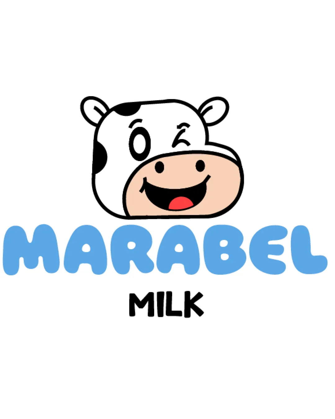
MARABEL MILK logo review
4.0 / 5
Logo score
Logo review of

Marabel Milk

Memorable, playful mark well-suited for dairy or family brands; minor tweaks will fully optimize it.

Objective AI feedback. Your creative decision.

Combination Mark Playful Illustrative Mascot Dairy
4.5/5
Legibility
4/5
Originality
5/5
Misread
4/5
Balance
4/5
Scale
Action plan

What to fix first

The most important fixes to handle before polishing the full presentation.

1

Increase space between cow mascot and wordmark

Medium priority

Currently feels a bit cramped visually.

Impact: Improves Composition And Breathing Room. · Effort: Low

2

Prepare a simplified mascot version for very small sizes

Medium priority

Some facial features may lose clarity when scaled down.

Impact: Enhances Versatility And Ensures Recognizability At All Scales. · Effort: Medium

Detailed review

Logo performance breakdown

4.5/5

Legibility

Checkmark icon Main wordmark is large, clear, and highly readable.
Checkmark icon Tagline is bold and maintains contrast.

4/5

Originality

Checkmark icon Cow head design is friendly and memorable.
Checkmark icon Distinctive expression adds character.

Warning icon Cow mascots are common in dairy; idea could be further distinguished.

4/5

Color harmony

Checkmark icon Sky blue evokes freshness and dairy.
Checkmark icon Palette feels playful and modern.

Warning icon Slightly more contrast for the tagline might strengthen hierarchy.

LightBlue
#69CAFF

Black
#000000

Beige
#E3BFA8

White
#FFFFFF

Red
#FF2028

Your palette is close. Refine the color roles and combinations before updating the logo.

Build brand colors
4/5

Balance alignment

Checkmark icon Balanced vertical stacking of mascot, wordmark, and tagline.
Checkmark icon Wordmark is centered under mascot.

Warning icon Spacing between mascot and wordmark is a bit tight.

logo 200x250 pixels scalability test alignment grid overlay
4/5

Scalability

Checkmark icon Mascot and text keep clarity at moderate sizes.
Checkmark icon Simple linework supports reproduction.

Warning icon Mascot's facial details could lose definition at tiny sizes.

logo 200x250 pixels scalability test

200x250 px

logo 100x125 pixels scalability test

100×125 px

logo 50x62 pixels scalability test

50×62 px

5/5

Misinterpretations

Checkmark icon No apparent ambiguous or offensive readings.

4 / 5

Logo structure & brief match

Checkmark icon Mascot style matches playful typeface.
Checkmark icon Color palette is consistent throughout.

Checkmark icon Target Audience: Child-friendly, approachable; fits family or youth-oriented milk product branding.
Checkmark icon Industry Relevance: Obvious dairy cues with cow mascot and light blue palette.

Try your own review

Wondering how your logo performs?

Get a clear logo score, key risks, and priority fix ideas before your client or audience sees it.

Review my logo