ARNO PIETERSE logo review
4/5
Logo score
Logo review of

Arno Pieterse

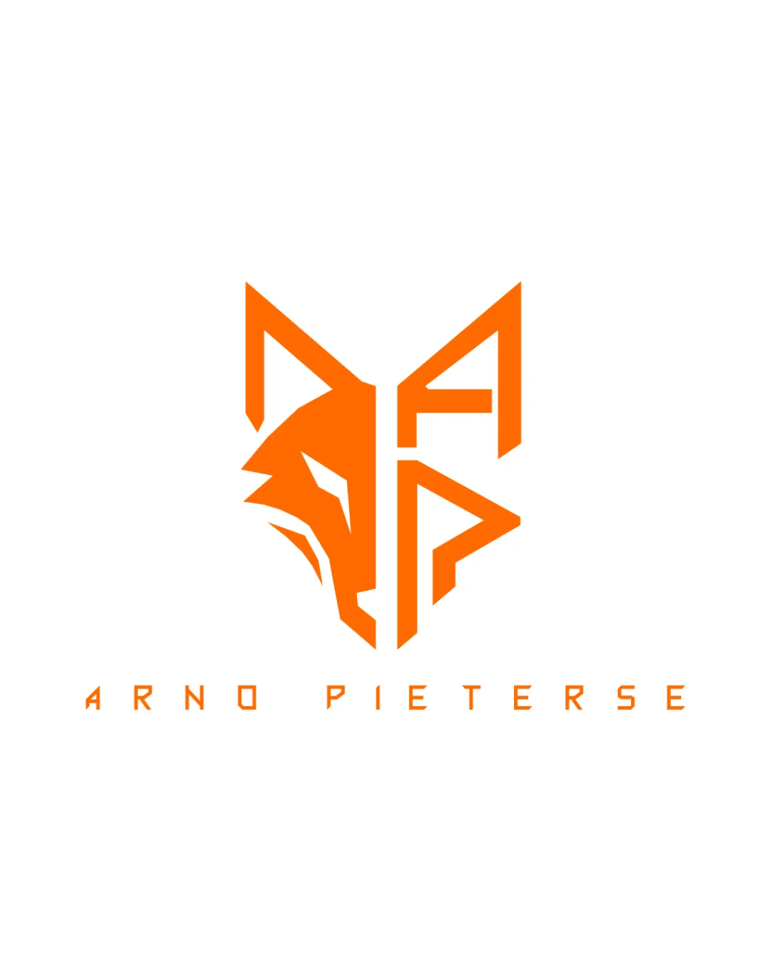
A strong, modern personal brand logo with well-integrated elements and high visual impact; some consideration for small-scale clarity is recommended.

Combination Mark Modern Geometric, Angular, Monoline Personal Brand
4/5
Legibility
4/5
Originality
5/5
Misread
4/5
Balance
4/5
Scale
Action plan

What to fix first

The most important fixes to handle before polishing the full presentation.

1

Test scalability at favicon and embroidery sizes, simplifying inner detail if necessary.

High priority

Complex inner forms may reduce legibility at small scale.

Impact: Improves Clarity And Recognizability Across All Applications. · Effort: Medium

2

Explore a secondary black-and-white version for additional versatility.

Medium priority

Wordmark and mark would need to clearly reproduce in monochrome contexts.

Impact: Ensures The Logo Remains Impactful In Minimal Color Scenarios. · Effort: Low

Detailed review

Logo performance breakdown

4/5

Legibility

Checkmark icon Wordmark is readable and distinctive
Checkmark icon Typography complements symbol's geometry

Warning icon Unconventional letterforms may require a second glance

4/5

Originality

Checkmark icon Unique integration of initials and animal form
Checkmark icon Modern use of geometry and negative space

Warning icon Fox as a motif is not highly rare in personal branding

4/5

Color harmony

Checkmark icon Vivid orange stands out and suggests energy

Warning icon Single color may limit flexibility for some applications

Orange
#FF7300

White
#FFFFFF

Your palette is close. Refine the color roles and combinations before updating the logo.

Build brand colors
4/5

Balance alignment

Checkmark icon Strong symmetry and centered composition
Checkmark icon Consistent spacing between symbol and text

Warning icon Minor optical tension where initial overlaps occur

logo 200x250 pixels scalability test alignment grid overlay
4/5

Scalability

Checkmark icon Bold lines ensure visibility at small sizes
Checkmark icon Simple silhouette works well across usages

Warning icon Complex internal shapes could close up at extremely small scales

logo 200x250 pixels scalability test

200x250 px

logo 100x125 pixels scalability test

100×125 px

logo 50x62 pixels scalability test

50×62 px

5/5

Misinterpretations

Checkmark icon No visible risk of negative or confusing readings

5/5

Logo structure & brief match

Checkmark icon Wordmark style perfectly matches icon angularity

Checkmark icon Distinctive Personal Branding: Logo delivers a memorable and individual identity through stylized integration.
Checkmark icon Modernity And Professionalism: Angular geometry and bold color communicate a contemporary, confident tone.

Try your own review

Wondering how your logo performs?

Get a clear logo score, key risks, and priority fix ideas before your client or audience sees it.

Review my logo