Wondering how your logo performs? 🧐
Get professional logo reviews in seconds and catch design issues in time.
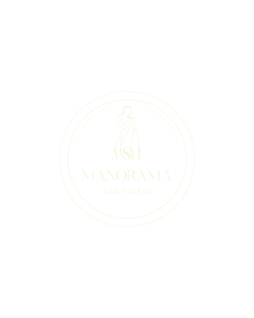
Try it Now!Logo review of ASI MANORAMA SARI HOUSE
 Logo analysis by AI
Logo type:
Style:
Detected symbol:
Detected text:
Business industry:
Review requested by Princeji
**If AI can recognize or misinterpret it, so can people.
Structured logo review
Legibility
![]() Text is extremely faint and blends with the background, making it almost impossible to read.
Text is extremely faint and blends with the background, making it almost impossible to read.![]() Low contrast results in poor visibility in both print and digital uses.
Low contrast results in poor visibility in both print and digital uses.![]() The font weight is too light for clear legibility.
The font weight is too light for clear legibility.
Scalability versatility
![]() Simple line art could scale well if made bolder.
Simple line art could scale well if made bolder.
![]() Thin lines are likely to disappear on small formats such as embroidery or business cards.
Thin lines are likely to disappear on small formats such as embroidery or business cards.![]() Low color contrast further reduces visibility in scaled-down applications.
Low color contrast further reduces visibility in scaled-down applications.![]() Does not work on colored or dark backgrounds due to lack of presence.
Does not work on colored or dark backgrounds due to lack of presence.
200x250 px
100×125 px
50×62 px
Balance alignment
![]() The elements are centered within the circular badge for a balanced layout.
The elements are centered within the circular badge for a balanced layout.
![]() Extremely light coloring makes the overall composition feel weightless and insubstantial.
Extremely light coloring makes the overall composition feel weightless and insubstantial.

Originality
![]() The line-art depiction of a woman in a sari provides some thematic relevance.
The line-art depiction of a woman in a sari provides some thematic relevance.
![]() The illustration is generic for the fashion industry and lacks a distinctive creative twist.
The illustration is generic for the fashion industry and lacks a distinctive creative twist.![]() No unique typographic treatment.
No unique typographic treatment.
Logomark wordmark fit
![]() The logomark and text share an elegant style suitable for the target market.
The logomark and text share an elegant style suitable for the target market.![]() Both elements are well integrated within the badge layout.
Both elements are well integrated within the badge layout.
![]() Both logomark and wordmark suffer the same faintness issue, reducing their impact together.
Both logomark and wordmark suffer the same faintness issue, reducing their impact together.
Aesthetic look
![]() Minimalistic and elegant form choices.
Minimalistic and elegant form choices.
![]() Severely lacking contrast or color, resulting in a washed-out, unfinished appearance.
Severely lacking contrast or color, resulting in a washed-out, unfinished appearance.![]() Not visually striking or memorable.
Not visually striking or memorable.
Dual meaning and misinterpretations
![]() No inappropriate or unintended symbolism present.
No inappropriate or unintended symbolism present.
Color harmony
![]() Design is nearly invisible due to extremely low contrast.
Design is nearly invisible due to extremely low contrast.![]() Single pale color undermines versatility and visibility.
Single pale color undermines versatility and visibility.
Very Light Ivory
#FCFCF0


