Manon Marc OSTÉOPHATE DRAINNAGE LYMPHATIQUE logo review
3.5/5
Logo score Combination category

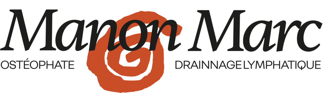
Manon Marc OSTÉOPHATE DRAINNAGE LYMPHATIQUE

creative913084 Essential logo review

A distinctive and appropriate logo with one critical text error and minor integration refinements needed.

Symbols recognized:
Hand-drawn spiral mark in orange, positioned between 'Manon' and 'Marc'.
Legible text:
Manon Marc OSTÉOPHATE DRAINNAGE LYMPHATIQUE
Combination Elegant Serif Wordmark With Hand-drawn Abstract Symbol Healthcare
3/5
Legibility
4/5
Originality
3/5
Balance
4/5
Scale
Your next steps

What to fix first

Focus on the changes that matter. Keep what makes the logo work.

Concept & direction

The logo combines an elegant serif wordmark with a hand-drawn spiral, suggesting organic movement and holistic care appropriate for an osteopath.

Spelling & grammar

Possible spelling or grammar issue

'DRAINNAGE' likely intended to be 'DRAINAGE'; extra 'N' appears to be a spelling error.
1

tagline

Correct the spelling to 'DRAINAGE'.

High priority Visible issue Low effort

'DRAINNAGE' contains an extra 'N', making the word appear incorrect in French.

See the category review
2

wordmark and spiral mark

Adjust overlap or integration to improve clarity and spatial harmony.

Medium priority Optional refinement Medium effort

The hand-drawn spiral overlaps with the wordmark, potentially reducing clarity and creating visual tension in the composition.

See the category review
Detailed review

Logo performance breakdown

4/5

Brief & logo match

Design appropriately expresses a healthcare/osteopath theme with a professional presence, but the spelling issue hinders full readiness.

3/5

Legibility

  • Main name is readable.
  • 'DRAINNAGE' contains an extra 'N', making the word appear incorrect in French.

    Visible issue tagline

    Try: Correct the spelling to 'DRAINAGE'.

3/5

Balance alignment

  • Mark placement adds focal interest.
  • The hand-drawn spiral overlaps with the wordmark, potentially reducing clarity and creating visual tension in the composition.

    Optional refinement wordmark and spiral mark

    Try: Adjust overlap or integration to improve clarity and spatial harmony.

Uploaded logoAlignment guide overlay

Inspect spacing with the guide. Optical balance may differ from geometric centering.

4/5

Originality

  • Hand-drawn spiral is distinctive.
  • Stylish serif wordmark.
4/5

Color harmony

  • Warm orange provides friendly contrast to classic black.
Black#232323
Orange#D0612B
White#FAFAFA

Estimated colors. Use the original design file for exact values.

Create a full color palette using these colors

Create new palette
4/5

Scalability

  • Simple and clear mark.
  • Wordmark scales well.
4/5

Symbol & text fit

  • Spiral complements holistic focus.
5/5

Misinterpretations

  • No plausible negative misreadings.
Try your own review

Wondering how your logo performs?

Get a clear logo score, key risks, and priority fix ideas before your client or audience sees it.

Review my logo