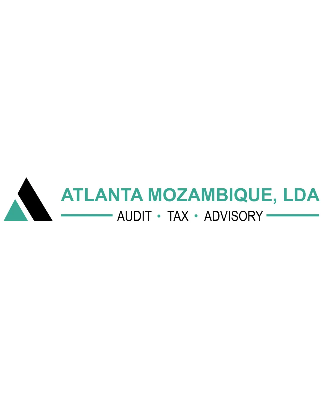
ATLANTA MOZAMBIQUE, LDA AUDIT · TAX · ADVISORY logo review
3.2 / 5
Logo score
Logo review of

Atlanta Mozambique, Lda Audit · Tax · Advisory

Logo is viable for professional context but needs significant improvement in uniqueness and layout adaptability to be truly client-ready.

Combination Mark Minimalist Geometric Audit, Advisory, Outsourcing, Accounting, Human Resources, Tax
5/5
Legibility
2.5/5
Originality
5/5
Misread
4/5
Balance
4/5
Scale
Action plan

What to fix first

The most important fixes to handle before polishing the full presentation.

1

Increase originality and visual distinction in the abstract mark or introduce a subtle, relevant visual twist.

High priority

Current mark is professional but easily lost among similar logos; opportunities for stronger brand differentiation.

Impact: Makes The Logo More Memorable And Less Generic Within A Competitive Industry. · Effort: Medium

2

Test stacked or square layout versions for better adaptability across digital and mobile use-cases.

Medium priority

Current layout is horizontally constrained, which may limit scalability in some formats.

Impact: Improves Logo Usability On Varied Platforms And Backgrounds. · Effort: Low

Detailed review

Logo performance breakdown

5/5

Legibility

Checkmark icon All text is clear and highly readable in both large and small formats.

2.5/5

Originality

Checkmark icon Abstract 'A' mark adds some distinction.

Warning icon Overall design is generic and uses standard geometric shapes common in the industry.

4.5/5

Color harmony

Checkmark icon Consistent, professional teal and black palette. Good contrast against white.

Warning icon Limited color range does not stand out strongly.

Teal
#38B29F

Black
#000000

White
#FFFFFF

Your palette is close. Refine the color roles and combinations before updating the logo.

Build brand colors
4/5

Balance alignment

Checkmark icon Text and mark have strong alignment; balanced negative space.

Warning icon Mark and wordmark are visually separated, reducing cohesion slightly.

logo 200x250 pixels scalability test alignment grid overlay
4/5

Scalability

Checkmark icon Minimalist design ensures good readability at small sizes.

Warning icon Horizontal layout may not adapt well to square/compact spaces.

logo 200x250 pixels scalability test

200x250 px

logo 100x125 pixels scalability test

100×125 px

logo 50x62 pixels scalability test

50×62 px

5/5

Misinterpretations

Checkmark icon No inappropriate or embarrassing alternate readings detected.

Beta

No AI design signals found

Likely designed by a human

No substantial evidence of AI-generated artifacts; construction and typography are coherent and deliberate.

  • Geometric shapes and letterforms are stable and logically built.

Visual assessment; not definitive proof of authorship.

3.5 / 5

Logo structure & brief match

Checkmark icon Mark reflects the 'A' in the company name, ties to 'Atlanta'.

Warning icon No direct visual integration or interplay between the symbol and the wordmark.

Checkmark icon Audit, Advisory, Outsourcing, Accounting, Human Resources, Tax: Minimalist, geometric approach and restrained colors fit the professional and trustworthy tone expected in these fields. However, generic style could be more distinctive for stronger brand impact.

Try your own review

Wondering how your logo performs?

Get a clear logo score, key risks, and priority fix ideas before your client or audience sees it.

Review my logo