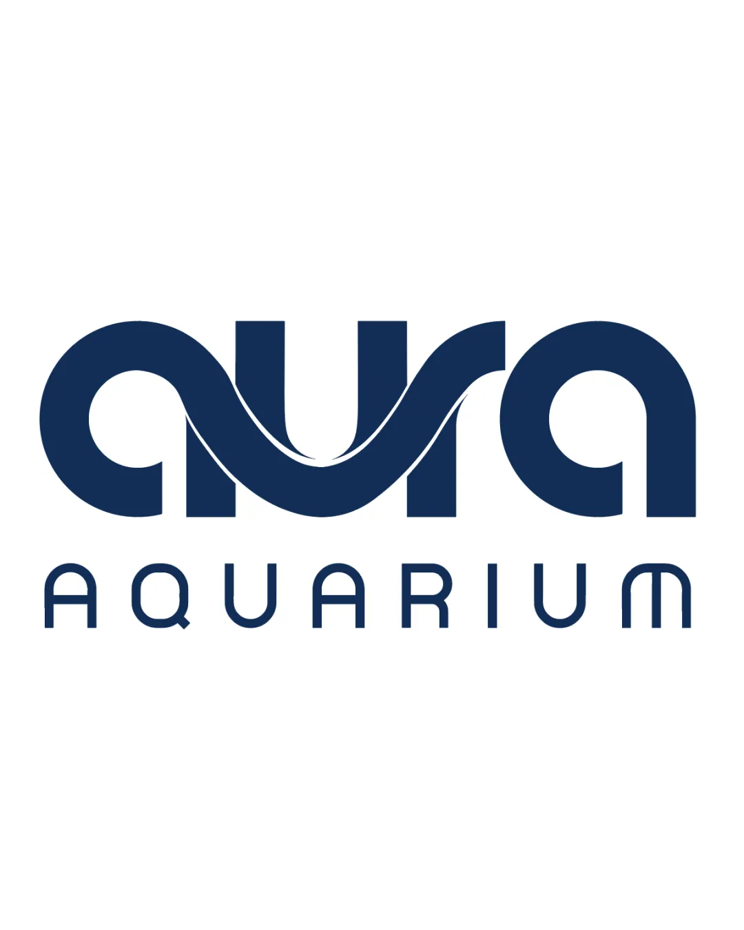
aura AQUARIUM logo logo review
4.1/5
Logo score Wordmark with supporting descriptor category

aura AQUARIUM logo

Phule Essential logo review

Distinctive, well-balanced logo with a strong aquatic reference and a minor legibility risk in the custom wordmark.

This logo lockup shows strong execution, supported by distinctive construction and text readability.

Wordmark With Supporting Descriptor Geometric, Stylized Sans-serif Aquatics / Aquarium
4.3/5
Legibility
4/5
Originality
4/5
Balance
4/5
Scale
4/5
Style consistency
Your next steps

What to fix first

Focus on the changes that matter. Keep what makes the logo work.

1

main wordmark (aura)

Validate at small and distant viewing sizes to ensure 'aura' remains legible.

High priority Worth testing Low effort

Custom lower-case 'u' and 'r' letterforms in 'aura' are abstracted and may require an extra moment to decode, especially at a glance or small sizes.

See the category review


Detailed review

Logo performance breakdown

5/5

Brief & logo match

The flowing, wave-like letterforms and aquatic theme in the wordmark are a strong, custom fit for an aquarium brand, expressing both uniqueness and industry relevance.

5/5

Misinterpretations

  • No evidence of confusion or unintended associations.
4.3/5

Legibility

Wordmark 4/5 · Layout 5/5

  • Readable with a unique style, though the wordmark requires a brief pause for full legibility.
  • Custom lower-case 'u' and 'r' letterforms in 'aura' are abstracted and may require an extra moment to decode, especially at a glance or small sizes.

    Worth testing main wordmark (aura)

    Try: Validate at small and distant viewing sizes to ensure 'aura' remains legible.

4/5

Originality

  • Custom lettershapes and wave motif provide clear brand distinction.
4/5

Balance alignment

Wordmark 4/5 · Layout 4/5

  • Layout is tidy and structurally balanced with the descriptor below.
  • The wave form linking the 'u' and 'r' is visually dynamic but creates a denser area in the middle, while the words above and below are otherwise well spaced.

    Optional refinement full lockup
Uploaded logoAlignment guide overlay

Inspect spacing with the guide. Optical balance may differ from geometric centering.

4/5

Scalability

Wordmark 4/5 · Layout 4/5

Available in Advanced logo reviews
4/5

Style consistency

Available in Advanced logo reviews
Try your own review

Wondering how your logo performs?

Get a clear logo score, key risks, and priority fix ideas before your client or audience sees it.

Review my logo