overall mark
Test the logo at smaller sizes and simplify the outline if legibility drops.
The gradient and fine outlines may lose clarity at very small sizes, making the design less recognizable on tiny applications.
See the category review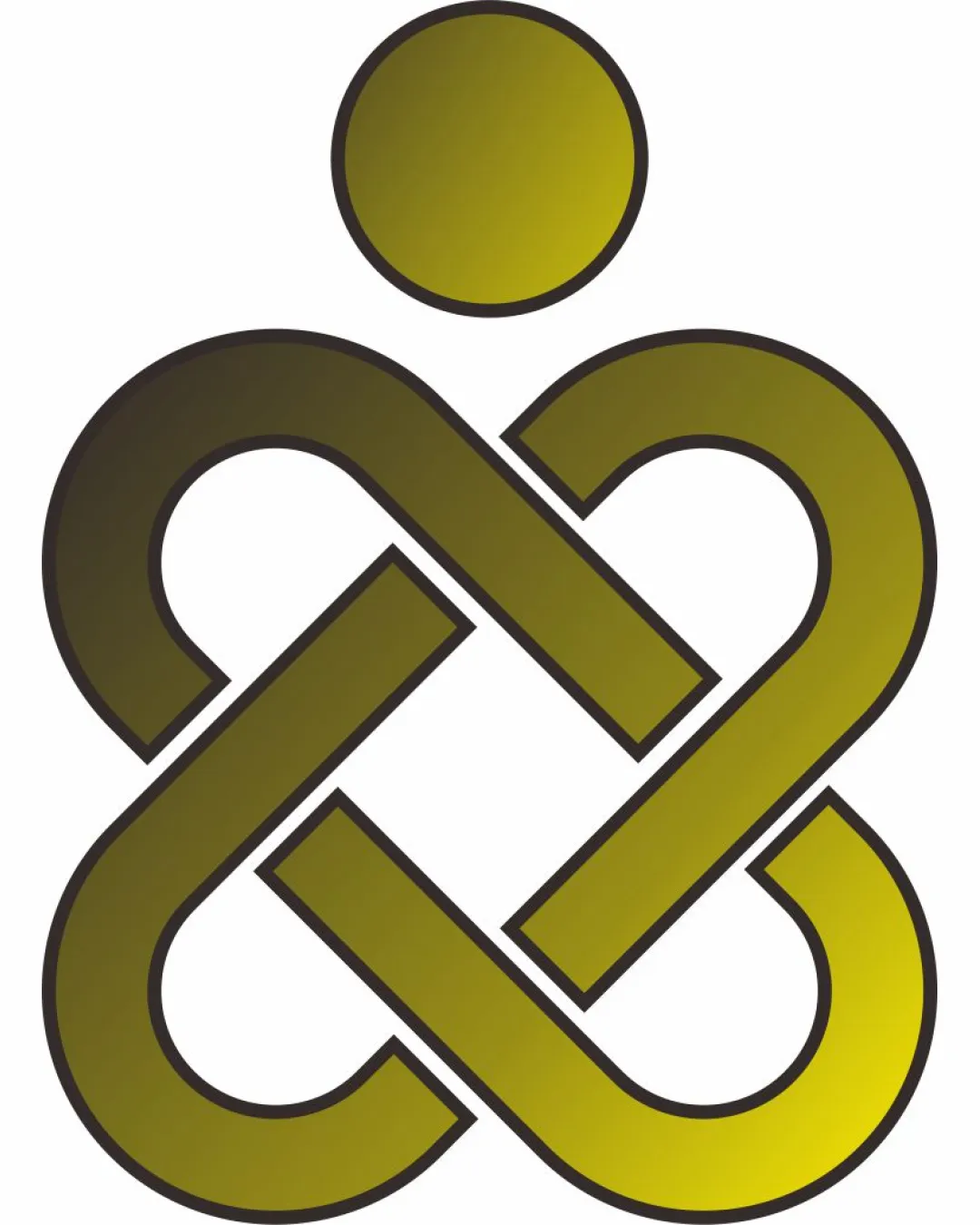
A professionally executed, flexible abstract symbol that clearly conveys unity or continuity, but could be further distinguished for stronger brand recognition.
This logomark has a workable foundation; improving distinctiveness is the clearest next step.
Focus on the changes that matter. Keep what makes the logo work.
overall mark
The gradient and fine outlines may lose clarity at very small sizes, making the design less recognizable on tiny applications.
See the category reviewThere isn't enough brand context to assess the match.
Estimated colors. Use the original design file for exact values.
Create a full color palette using these colors
Create new palette
Inspect spacing with the guide. Optical balance may differ from geometric centering.
Get a clear logo score, key risks, and priority fix ideas before your client or audience sees it.
More credits needed
Add credits to continue without losing your work.
Then $7/month. Cancel anytime.
Essential logo review with AI
Estimated progress