 View review
Logo score
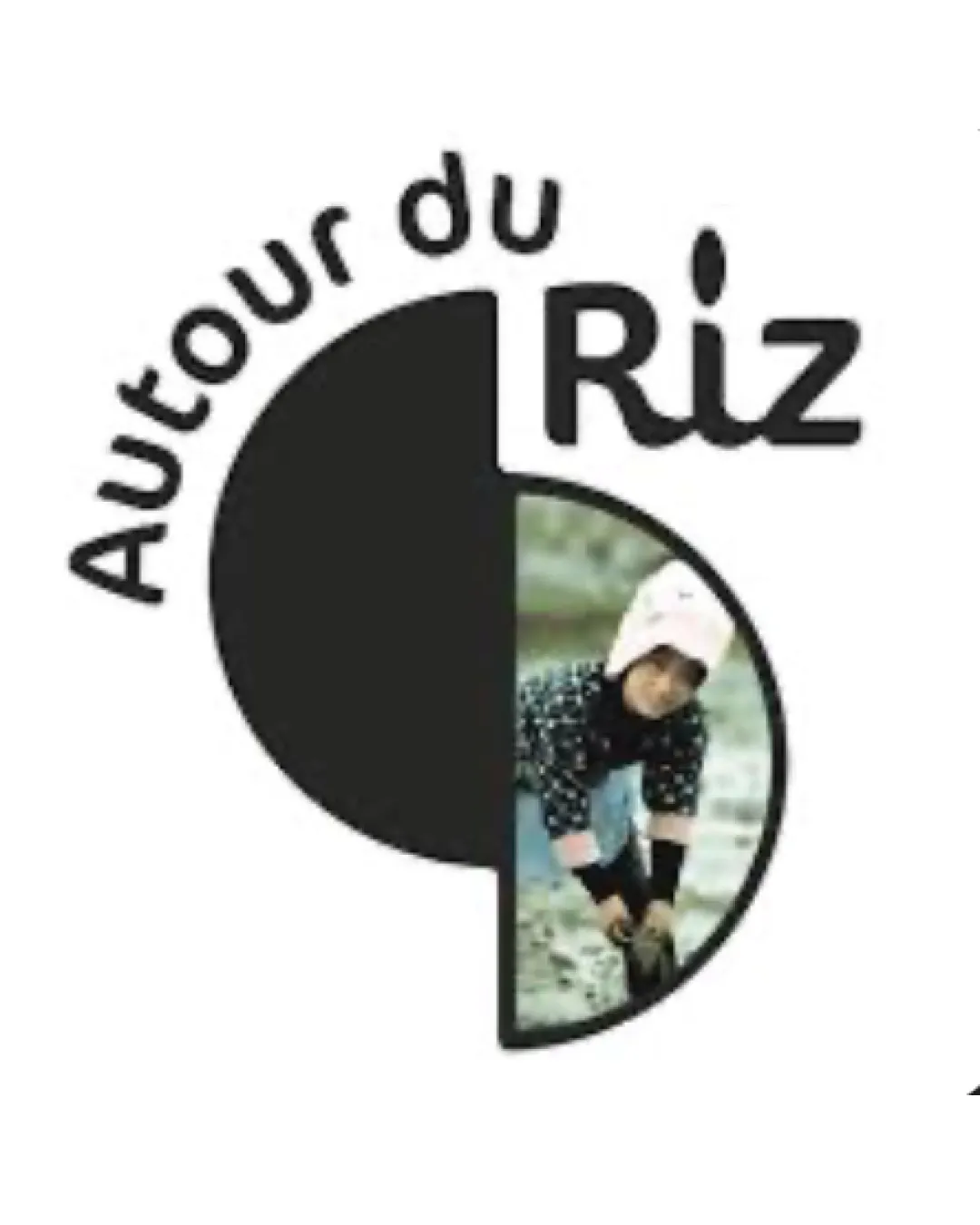
Logo review ofAutour Du Riz
Review the detailed scores below to see what is working and what should be refined first.
Legibility
Originality
Misread
Balance
Scale
Detailed review
Logo performance breakdown
Legibility
![]() Text 'Riz' is clear with sufficient contrast against the white background.
Text 'Riz' is clear with sufficient contrast against the white background.![]() 'Autour du' is legible and its curved placement follows the circular logo shape well.
'Autour du' is legible and its curved placement follows the circular logo shape well.
![]() The kerning and alignment of 'Riz' with the graphic element feels slightly forced; the dot on the 'i' mimics a rice grain but slightly disrupts cohesion.
The kerning and alignment of 'Riz' with the graphic element feels slightly forced; the dot on the 'i' mimics a rice grain but slightly disrupts cohesion.![]() 'Autour du' could suffer legibility loss when scaled down due to its curved arrangement and smaller font size.
'Autour du' could suffer legibility loss when scaled down due to its curved arrangement and smaller font size.
Originality
![]() Photo-in-circle approach is uncommon in food logos.
Photo-in-circle approach is uncommon in food logos.![]() Rice grain as dot on 'i' adds a slight conceptual touch.
Rice grain as dot on 'i' adds a slight conceptual touch.
![]() Logo relies on a generic split-circle shape.
Logo relies on a generic split-circle shape.![]() Photo is not a repeatable or uniquely ownable motif for branding consistency.
Photo is not a repeatable or uniquely ownable motif for branding consistency.![]() No strong distinctive mark that can stand alone recognizably.
No strong distinctive mark that can stand alone recognizably.
Color harmony
![]() Balanced use of monochrome for the left side and photo colors for the right.
Balanced use of monochrome for the left side and photo colors for the right.
![]() Color scheme is inconsistent due to photographic element, reducing brand cohesion on various backgrounds.
Color scheme is inconsistent due to photographic element, reducing brand cohesion on various backgrounds.![]() Multiple muted tones from the photo may not harmonize well in all applications.
Multiple muted tones from the photo may not harmonize well in all applications.
Black
#000000
White
#FFFFFF
Sage
#94AA9B
Beige
#EADCCB
Light Pink
#F9C8D0
Color may be holding this logo back. Explore stronger palette options with Colorfly.design before updating the logo.
Explore palettesBalance alignment
![]() Good visual weight between the left solid semi-circle and photo on the right.
Good visual weight between the left solid semi-circle and photo on the right.![]() Type aligns well with graphic circle.
Type aligns well with graphic circle.
![]() Visual imbalance from photo content and text curve makes logo feel busy versus a more streamlined block arrangement.
Visual imbalance from photo content and text curve makes logo feel busy versus a more streamlined block arrangement.![]() 'Riz' dominates the top right, slightly overshadowing circular device.
'Riz' dominates the top right, slightly overshadowing circular device.

Scalability
![]() Simple black and white component is versatile in large format uses.
Simple black and white component is versatile in large format uses.![]() Would work reasonably on signage, packaging, or a website masthead.
Would work reasonably on signage, packaging, or a website masthead.
![]() Photo half loses all clarity and meaning at small sizes (business cards, app icons, or embroidery).
Photo half loses all clarity and meaning at small sizes (business cards, app icons, or embroidery).![]() 'Autour du' text around the edge becomes illegible when reduced.
'Autour du' text around the edge becomes illegible when reduced.![]() Logo will not reproduce well in single color or without the photo (important for stamps, promotional items, or printing constraints).
Logo will not reproduce well in single color or without the photo (important for stamps, promotional items, or printing constraints).
200x250 px
100×125 px
50×62 px
Misinterpretations
![]() No questionable or inappropriate visual forms.
No questionable or inappropriate visual forms.
Symbol & text fit
![]() Wordmark is integrated into the overall circle and photo composition.
Wordmark is integrated into the overall circle and photo composition.
![]() Styling (rounded sans-serif) is fairly consistent.
Styling (rounded sans-serif) is fairly consistent.
![]() The visual disconnect between the hard split of circle/photo and rounded type slightly interrupts harmony.
The visual disconnect between the hard split of circle/photo and rounded type slightly interrupts harmony.
![]() 'Riz' appears more dominant than the supporting 'Autour du' element, weakening balance.
'Riz' appears more dominant than the supporting 'Autour du' element, weakening balance.
Try your own review
Review my logo
Wondering how your logo performs?
Get a clear logo score, key risks, and priority fix ideas before your client or audience sees it.
Keep exploring