 View review
Logo score
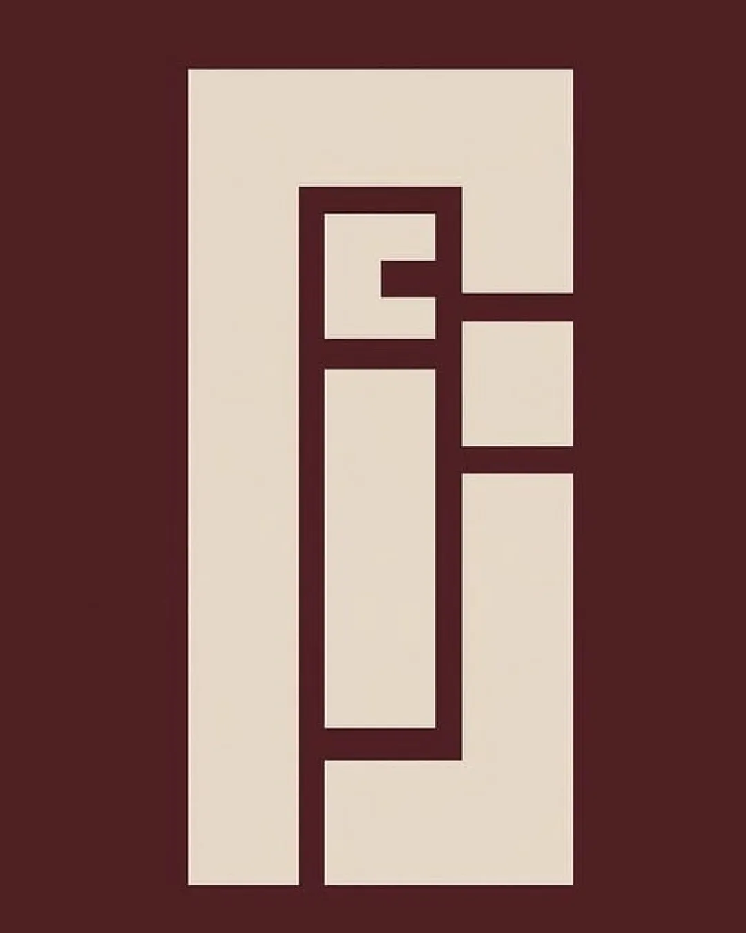
Logo review ofع ز ا ل (azal In Arabic)
Distinct and professional; ready for use with minor adjustments.
Legibility
Originality
Misread
Balance
Scale
Action plan
What to fix first
The most important fixes to handle before polishing the full presentation.
1
Slightly refine negative space and internal proportions so all Arabic letters read more clearly at smaller sizes.
High priorityDirect improvement to legibility for diverse professional audiences.
Impact: Ensures Brand Name Is Recognizable And Legible In All Applications. · Effort: Medium
2
Adjust right-aligned internal modules to create more visual harmony between shapes.
Medium priorityQuick tweaks that elevate perceived quality.
Impact: Enhances Balance And Optical Satisfaction For Brand Perception. · Effort: Low
Detailed review
Logo performance breakdown
Legibility
 Distinct geometric forms are visible
 Some letterforms merge and are not instantly readable for all audiences
Originality
Original monogram concept using Arabic geometric abstraction
Color harmony
High-contrast, harmonious two-tone palette
Bordeaux
#4F232A
Antique White
#E9DDC9
Balance alignment
Good overall symmetry and proportional balance
Minor optical imbalance in right compartments

Scalability
Bold, simple shapes retain integrity at many sizes
Small negative spaces may close up at tiny sizes
200x250 px
100×125 px
50×62 px
Misinterpretations
No evident inappropriate or embarrassing visual misreads
Brief match
Personal Brand For Graphic Designer Using Arabic Script For Professionals And Individuals: Geometric Arabic monogram fits a modern, professional design audience while showcasing cultural roots and creativity.
Try your own review
Review my logo
Wondering how your logo performs?
Get a clear logo score, key risks, and priority fix ideas before your client or audience sees it.
Keep exploring