Refine the integration between the leaf symbol and both scripts to improve visual cohesion and brand unity.
Currently, the leaf feels a bit separate from the word elements.
Stronger brand impression and professionalism.
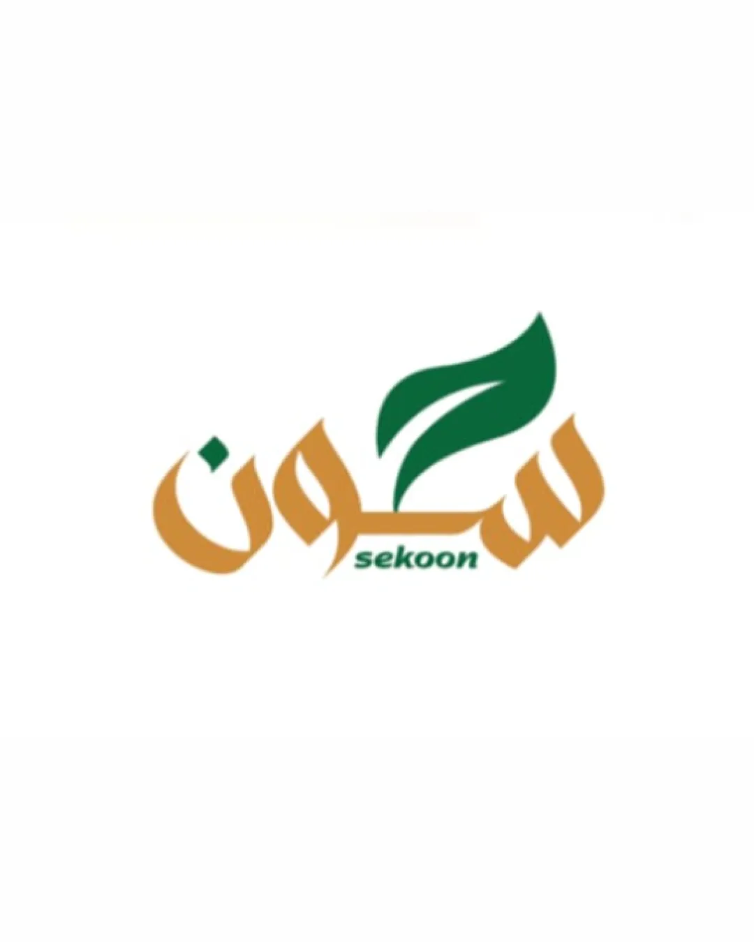
Attractive and relevant for a natural/wellness brand; with small integration and clarity tweaks, ready for high-end presentation.
Focus on the changes that matter. Keep what makes the logo work.
Currently, the leaf feels a bit separate from the word elements.
Stronger brand impression and professionalism.
Delicate curves may fade at small scales.
Better scalability and legibility in various applications.
Logo design is suitable for high-end, luxury brand application with realistic, professional mockups, provided refinements are made to increase the clarity and cohesion.
Estimated colors. Use the original design file for exact values.
Create a full color palette using these colors
Create new palette
Inspect spacing with the guide. Optical balance may differ from geometric centering.
Get a clear logo score, key risks, and priority fix ideas before your client or audience sees it.
More credits needed
Add credits to continue without losing your work.
Then $7/month. Cancel anytime.
Essential logo review with AI
Estimated progress