Wondering how your logo performs? 🧐
Get professional logo reviews in seconds and catch design issues in time.
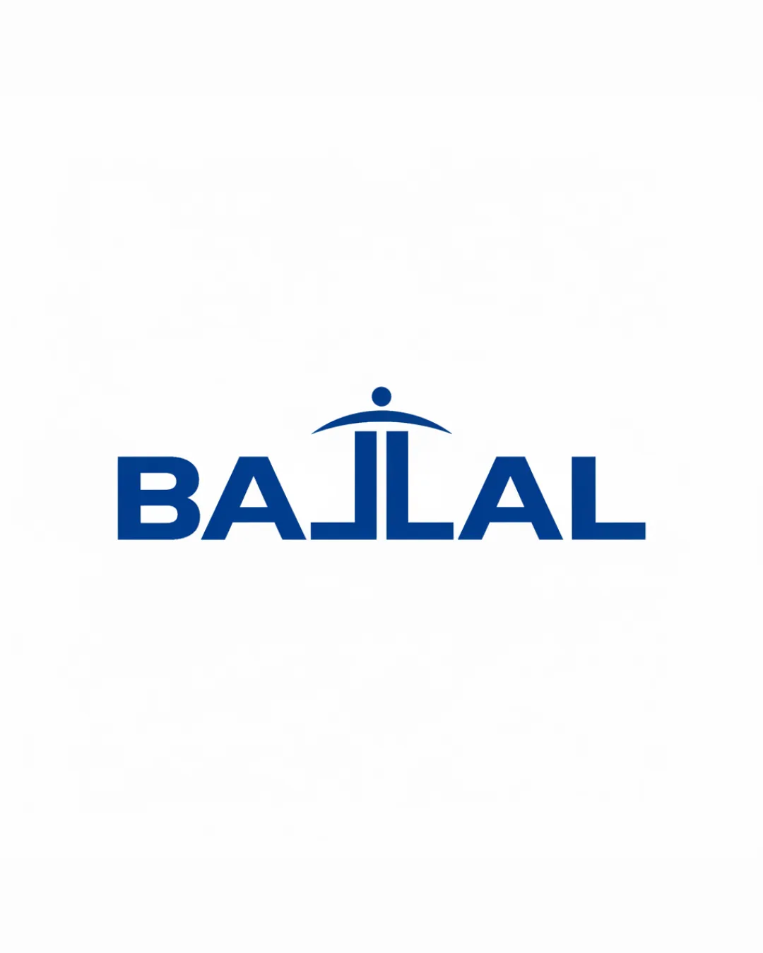
Try it Now!Logo review of BAJLAL
 Logo analysis by AI
Logo type:
Style:
Detected symbol:
Detected text:
Business industry:
Review requested by Bouba224
**If AI can recognize or misinterpret it, so can people.
Structured logo review
Legibility
![]() Text is clean, bold, and generally easy to read
Text is clean, bold, and generally easy to read![]() Letterspacing is even and consistent
Letterspacing is even and consistent
![]() The stylized 'J' may be momentarily confusing and could be misread, impacting ultra-quick recognition
The stylized 'J' may be momentarily confusing and could be misread, impacting ultra-quick recognition
Scalability versatility
![]() Simple, bold lines ensure good legibility at most sizes
Simple, bold lines ensure good legibility at most sizes![]() Logo should scale well for billboards and signage
Logo should scale well for billboards and signage
![]() The thin arc and dot above the 'J' might lose clarity at very small sizes, such as on a favicon or embroidery
The thin arc and dot above the 'J' might lose clarity at very small sizes, such as on a favicon or embroidery
200x250 px
100×125 px
50×62 px
Balance alignment
![]() Excellent symmetry: the central vertical axis is respected
Excellent symmetry: the central vertical axis is respected![]() All characters feel evenly weighted and well-aligned
All characters feel evenly weighted and well-aligned

Originality
![]() Creative and unique integration of the human figure with the letter 'J'
Creative and unique integration of the human figure with the letter 'J'![]() Umbrella/arc motif adds an extra signal, enhancing memorability
Umbrella/arc motif adds an extra signal, enhancing memorability
![]() The human-figure concept is somewhat familiar in hospitality but the execution is more original than typical
The human-figure concept is somewhat familiar in hospitality but the execution is more original than typical
Logomark wordmark fit
![]() Symbol is seamlessly integrated into the wordmark
Symbol is seamlessly integrated into the wordmark![]() Visual style and thickness are matching
Visual style and thickness are matching
Aesthetic look
![]() Modern, minimal, and easy-to-look-at composition
Modern, minimal, and easy-to-look-at composition![]() Strong, consistent color and geometric shapes
Strong, consistent color and geometric shapes
![]() The stylized 'J' is a bit heavy compared to the rest, slightly drawing too much attention to the center
The stylized 'J' is a bit heavy compared to the rest, slightly drawing too much attention to the center
Dual meaning and misinterpretations
![]() Abstract human/umbrella forms are positive and inoffensive
Abstract human/umbrella forms are positive and inoffensive![]() No unfortunate shapes detected
No unfortunate shapes detected
Color harmony
![]() Monochromatic scheme feels professional and is harmonious
Monochromatic scheme feels professional and is harmonious![]() Strong contrast between text and background ensures visibility
Strong contrast between text and background ensures visibility
Dark Blue
#144A9A
White
#FFFFFF