View review
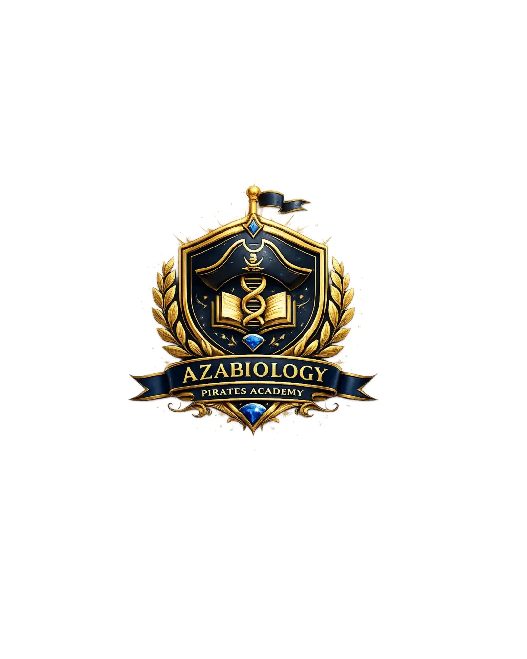
Azabiology Pirates Academy
Logo is compelling and thematic for the audience, but needs simplification and hierarchy refinement before broad rollout, especially for digital/print flexibility and small sizes.
What to fix first
The most important fixes to handle before polishing the full presentation.
Simplify intricate details, especially around the caduceus, book, and ribbon, to improve small-size clarity and versatility.
High priorityCurrent crest detail blurs and text loses clarity below medium size.
Impact: Logo Will Scale To Digital/small Uses, Increase Readability, And Avoid Detail Loss. · Effort: Medium
Increase the size or contrast of the 'PIRATES ACADEMY' subtext for better hierarchy and readability at smaller scales.
Medium prioritySecondary text is currently weak and blends into the ornate background at distance.
Impact: Overall Readability And Sub-brand Recall Will Improve Significantly. · Effort: Low
Logo performance breakdown
Legibility
Main name 'AZABIOLOGY' is readable
Distinct ribbon division aids visibility
'PIRATES ACADEMY' text is small and may blur at reduced size
Busy background details impact word clarity
Originality
Pirate and academic mashup is engaging and unexpected
Emblem crest with laurel is a common educational trope
Caduceus and book pairing lack strong custom twist
Color harmony
Elegant blue, gold, and black palette fits educational and premium positioning
Contrast aids main hierarchy
Heavy gold use risks being dated or gaudy if overused
MidnightBlue
#11284C
Gold
#F6C056
White
#FDFCFF
Black
#000000
Your palette is close. Refine the color roles and combinations before updating the logo.
Build brand colorsBalance alignment
Symmetrical composition with balanced laurel and shield
Main elements are visually centered
Text/ribbon slightly overlaps lower shield detail, creates mild crowding
Scalability
Bold core silhouette is clear at medium/large size
Complex details lose definition at small size
Thin lines, gradients, and embellishments hinder single-color use
200x250 px
100×125 px
50×62 px
Misinterpretations
No inappropriate or embarrassing shapes detected
Logo structure & brief match
Ribbon integrates text smoothly with emblem structure
Wordmark not highly distinctive from crest graphic
Educational, Professional, Encouraging, And Clear Identity For High School Biology Students: Crest composition and academic elements convey professionalism and focus. Pirate motif fosters engagement and memorability for younger audience, but potential clarity trade-off with detail.
Aim To Simplify Biology Concepts For Academic Success: Book and caduceus clearly reference science/biology. Heavy ornamentation may compete with message of 'simplifying' content.
Wondering how your logo performs?
Get a clear logo score, key risks, and priority fix ideas before your client or audience sees it.