Wondering how your logo performs? 🧐
Get professional logo reviews in seconds and catch design issues in time.
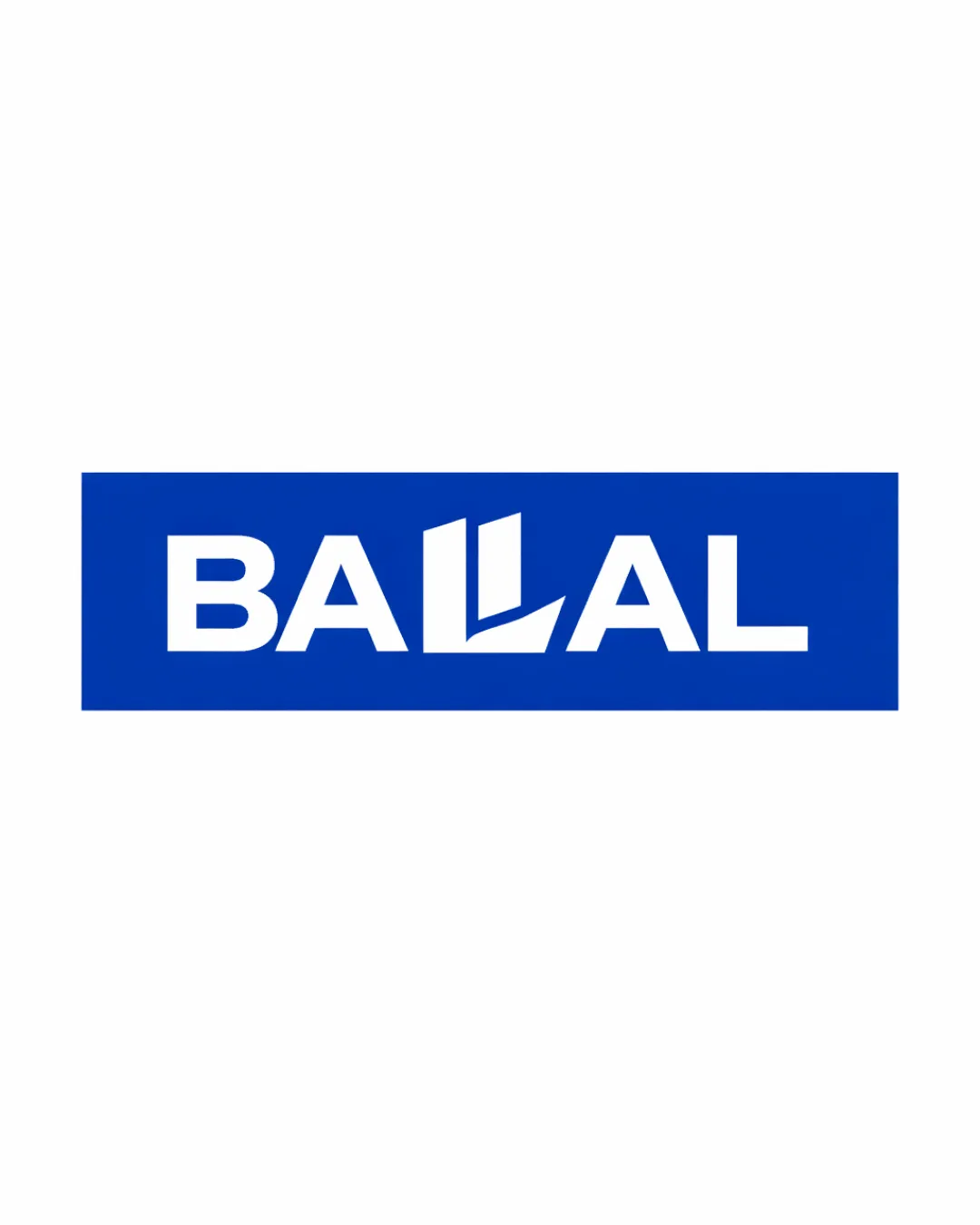
Try it Now!Logo review of BALLAL
 Logo analysis by AI
Logo type:
Style:
Detected symbol:
Negative space:
Detected text:
Business industry:
Review requested by Bouba224
**If AI can recognize or misinterpret it, so can people.
Structured logo review
Legibility
![]() Strong contrast between white text and blue background improves readability.
Strong contrast between white text and blue background improves readability.![]() All letters except the stylized 'LL' are immediately clear.
All letters except the stylized 'LL' are immediately clear.
![]() The highly stylized 'LL' could cause slight hesitation in reading, as it almost resembles an abstract symbol instead of letters.
The highly stylized 'LL' could cause slight hesitation in reading, as it almost resembles an abstract symbol instead of letters.
Scalability versatility
![]() Bold font and shapes ensure the logo remains clear at smaller sizes.
Bold font and shapes ensure the logo remains clear at smaller sizes.![]() Simple color scheme helps with reproduction on print and digital mediums.
Simple color scheme helps with reproduction on print and digital mediums.
![]() The detailed angular shapes within the 'LL' might blur at micro sizes (e.g., favicons, embroidery).
The detailed angular shapes within the 'LL' might blur at micro sizes (e.g., favicons, embroidery).![]() White-on-blue requirement may limit flexibility across different backgrounds; a plain version might be needed for monochrome or reversed applications.
White-on-blue requirement may limit flexibility across different backgrounds; a plain version might be needed for monochrome or reversed applications.
200x250 px
100×125 px
50×62 px
Balance alignment
![]() Even spacing and alignment of characters within the blue rectangle.
Even spacing and alignment of characters within the blue rectangle.![]() The stylized 'LL' is centrally positioned, giving good visual weight distribution.
The stylized 'LL' is centrally positioned, giving good visual weight distribution.

Originality
![]() Creative integration of industry-related imagery (buildings) into letterforms.
Creative integration of industry-related imagery (buildings) into letterforms.![]() Distinctive and relevant for real estate.
Distinctive and relevant for real estate.
![]() The skyscraper motif has been used before, though not commonly integrated with the double-L motif.
The skyscraper motif has been used before, though not commonly integrated with the double-L motif.
Aesthetic look
![]() Clean, modern, and bold appearance.
Clean, modern, and bold appearance.![]() Professional and industry-appropriate.
Professional and industry-appropriate.
![]() Logo feels slightly boxy and rigid due to all caps and rectangular bounding box.
Logo feels slightly boxy and rigid due to all caps and rectangular bounding box.
Dual meaning and misinterpretations
![]() No obvious inappropriate shapes or unintended meanings.
No obvious inappropriate shapes or unintended meanings.![]() Industry reference is clear and suitable.
Industry reference is clear and suitable.
Color harmony
![]() Simple blue and white palette is classic and trustworthy.
Simple blue and white palette is classic and trustworthy.![]() Good contrast and appropriate for the real estate sector.
Good contrast and appropriate for the real estate sector.
Science Blue
#0154B4
White
#FFFFFF