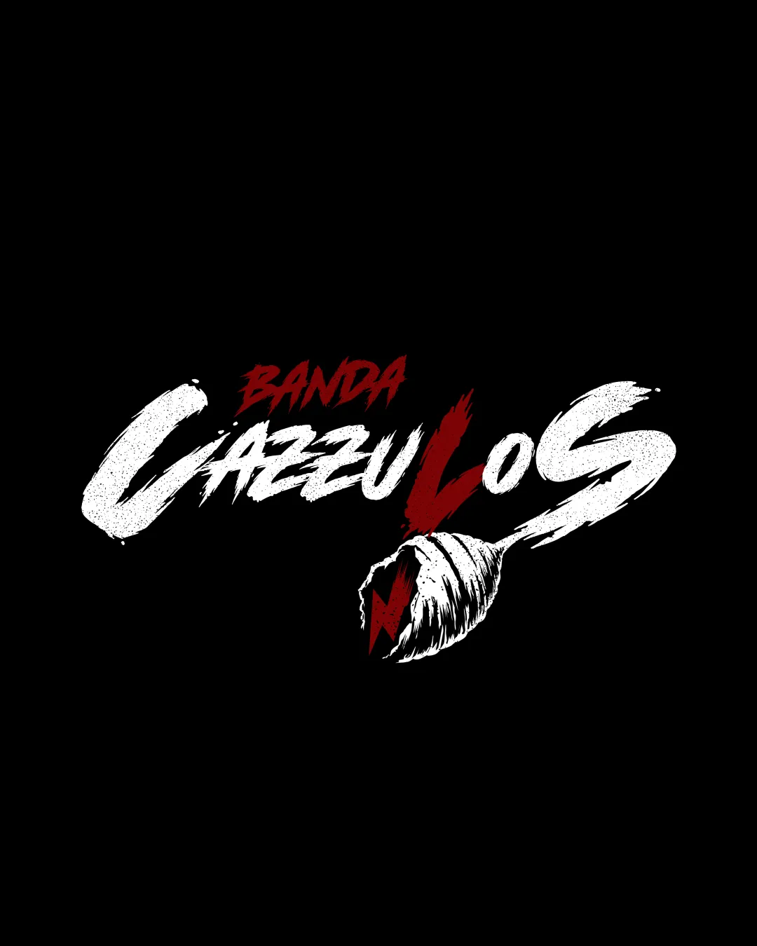
BANDA CAZZULOS logo review
3.6/5
Logo score
Logo review of

Banda Cazzulos

Strong, energetic branding asset for a band; considered and distinctive, with minor legibility and detail risks to resolve for full professional deployment.

Combination Mark Grunge Brush Script, Aggressive, High-contrast Music
3.5/5
Legibility
4/5
Originality
4/5
Misread
3.5/5
Balance
3/5
Scale
Action plan

What to fix first

The most important fixes to handle before polishing the full presentation.

1

Slightly refine texture and weights, especially in the shell and wordmark integration

High priority

Addresses most practical and readability concerns while respecting the original energetic intent

Impact: Improves Clarity, Legibility, And Practical Use In Small Sizes · Effort: Medium

Detailed review

Logo performance breakdown

3.5/5

Legibility

Checkmark icon Large text is readable despite distressed effect

Warning icon Brush effect creates minor difficulty for quick recognition, especially for the word 'BANDA' and some internal spacing issues

4/5

Originality

Checkmark icon Unique combination of texturing, hand-painted style, and shell/bolt mark stands out

Warning icon Brushed script with red accent is slightly common in rock/metal genres

4/5

Color harmony

Checkmark icon Limited palette provides strong contrast and memorable presence

Warning icon Color range is slightly harsh but effective for genre

White
#FFFFFF

Dark Red
#B2000B

Black
#000000

Your palette is close. Refine the color roles and combinations before updating the logo.

Build brand colors
3.5/5

Balance alignment

Checkmark icon Dynamic, visually engaging composition with good optical weight balance

Warning icon Text and mark integrate tightly, but the energy may distract from immediate clarity; lower shell edge feels a bit heavy

logo 200x250 pixels scalability test alignment grid overlay
3/5

Scalability

Checkmark icon Bold lines and minimal color palette aid recognition at smaller sizes

Warning icon Fine texture and distressed details may lose clarity at very small sizes; shell illustration may be hard to read under 2cm

logo 200x250 pixels scalability test

200x250 px

logo 100x125 pixels scalability test

100×125 px

logo 50x62 pixels scalability test

50×62 px

4/5

Misinterpretations

Checkmark icon Energetic mark and no obvious inappropriate shapes

4/5

Logo structure & brief match

Checkmark icon Illustrated shell and script style are visually unified and fit the aggressive tone

Warning icon Shell's placement merges with the 'L', which can cause confusion about where the word ends

Checkmark icon Industry: Style and energy clearly target entertainment or band identity
Checkmark icon Audience: Aggressive grunge style likely appeals to rock/alternative music fans

Try your own review

Wondering how your logo performs?

Get a clear logo score, key risks, and priority fix ideas before your client or audience sees it.

Review my logo