 View review
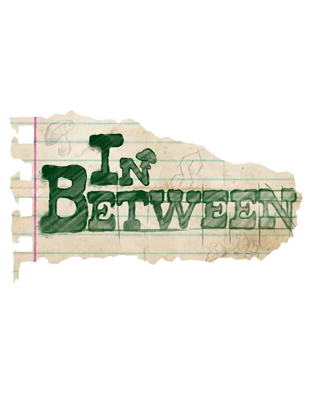
Logo score
Logo review of
In Between
Strong originality but needs refinement in scalability and balance before wide use.
Legibility
Originality
Misread
Balance
Scale
Action plan
What to fix first
The most important fixes to handle before polishing the full presentation.
1
Simplify or clarify the shapes and edges for improved small-scale usage.
High priorityThe rough, detailed texture collapses in small sizes and is a core legibility risk.
Impact: Improves Scalability And Visibility Across Digital And Print Contexts. · Effort: Medium
2
Tweak spacing and alignment for more balance between 'IN' and 'BETWEEN'.
Medium priorityCurrent layout is top-heavy and visually tips to the left, hurting harmony.
Impact: Enhances Aesthetic Balance And Optical Centering. · Effort: Low
Detailed review
Logo performance breakdown
Legibility
 Text is mostly clear and distinct
 Watercolor texture and hand-drawn style slightly affect crispness, especially on smaller screens
Originality
Hand-drawn paper and font are unique, avoids generic templates
Color harmony
Natural green and beige palette fits hand-drawn/school concept
Contrast could be improved on some backgrounds; aged paper color can muddy if printed poorly
Green
#265936
LightBeige
#F6E3B3
Tan
#E2CBAF
LightTan
#D6C6B2
Your palette is close. Explore sharper color combinations with Colorfly.design before updating the logo.
Explore palettesBalance alignment
Centered, visually weighty 'BETWEEN' anchors the layout
Top-heavy with 'IN'; rough notebook tear creates imbalance and uneven whitespace

Scalability
Unique texture and illustration style
High detail and rough edges lose clarity at small sizes; thin line background and sketch elements risk disappearance
200x250 px
100×125 px
50×62 px
Misinterpretations
No inappropriate or confusing shapes detected
Brief match
Indie Show Logo: Hand-drawn notebook motif and unique style create an indie, creative, and informal tone, fitting a show with a personal or alternative theme.
Try your own review
Review my logo
Wondering how your logo performs?
Get a clear logo score, key risks, and priority fix ideas before your client or audience sees it.
Keep exploring