MOGADISHU LIGHT HOUSE PIZZA logo review
3.5 / 5
Logo score
Logo review of

Mogadishu Light House Pizza

Distinctive but needs refinement to ensure usability and modern visual appeal.

Emblem Vintage Badge Food And Beverage
4/5
Legibility
3/5
Originality
4/5
Misread
4/5
Balance
3/5
Scale
Action plan

What to fix first

The most important fixes to handle before polishing the full presentation.

1

Fix possible misinterpretation

High priority

Shape of the combined element could be slightly ambiguous without context
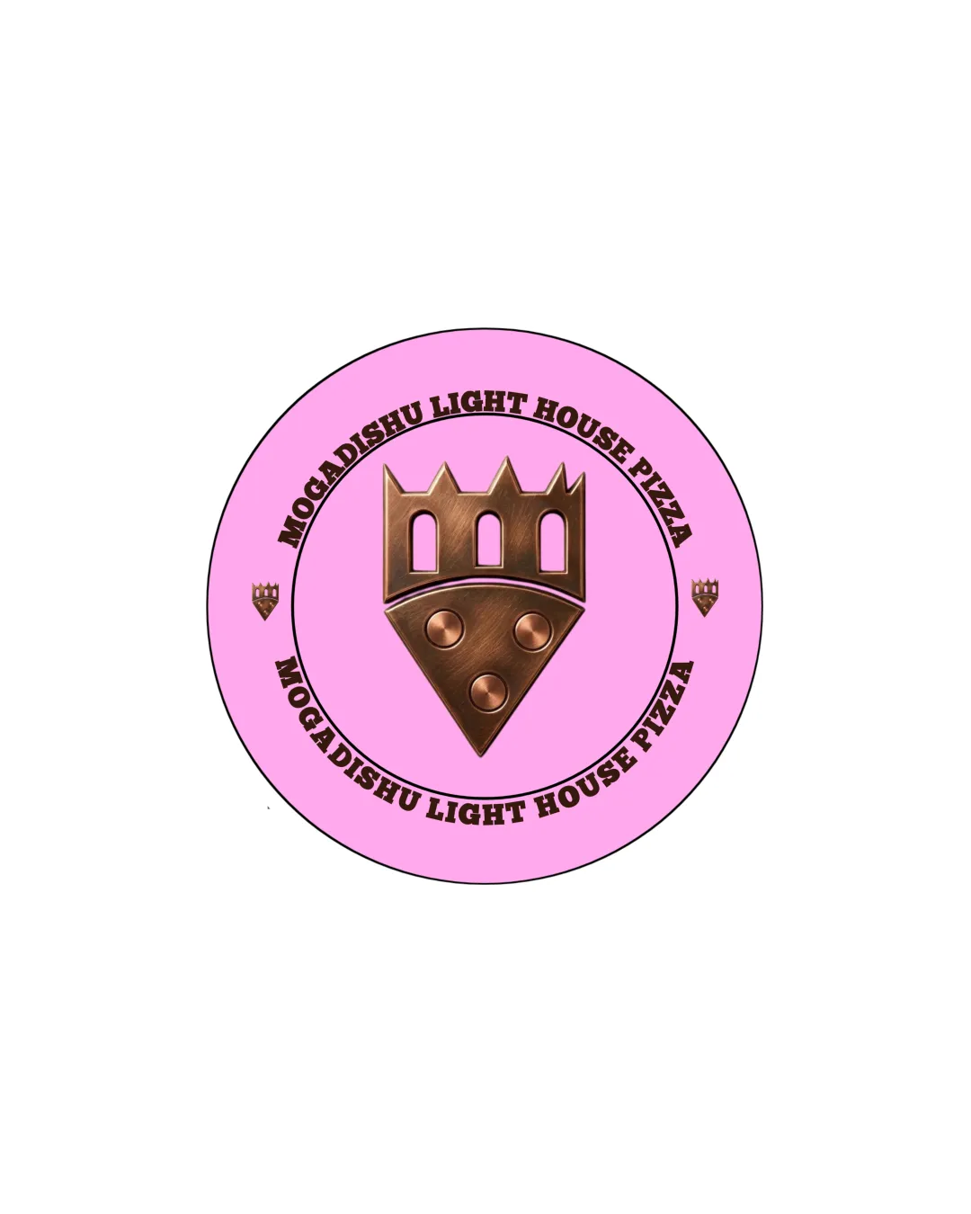
Impact: High · Effort: Medium

2

Enhance scalability by simplifying the small details and ensuring all text is legible at small sizes.

High priority

Small details and text can become illegible when scaled down.

Impact: Improves Functional Use Across Different Applications And Increases Clarity. · Effort: Medium

3

Refine the color palette for better harmony and modern appeal; consider colors more directly associated with pizza or restaurant brands.

Medium priority

Current pink and bronze combination may not be ideal for broad food branding.

Impact: Enhances Brand Appeal And Makes The Logo More Versatile. · Effort: Medium

Detailed review

Logo performance breakdown

4/5

Legibility

Checkmark icon Text is bold and generally easy to read

Warning icon Curved arrangement may slightly reduce quick readability

3/5

Originality

Checkmark icon Pizza slice merged with lighthouse is a distinctive concept

Warning icon Use of generic emblem format and badge style is somewhat common

3/5

Color harmony

Checkmark icon Good contrast between bronze symbol and pink background

Warning icon Pink may not complement bronze for a wide audience; color scheme feels dated

Pink
#FBB3E9

Bronze
#8B5E3C

Black
#000000

Color may be holding this logo back. Explore stronger palette options with Colorfly.design before updating the logo.

Explore palettes
4/5

Balance alignment

Checkmark icon Overall circular structure is well-centered

Warning icon Text alignment on curves could be more even; slight imbalance with side icons

logo 200x250 pixels scalability test alignment grid overlay
3/5

Scalability

Checkmark icon Central symbol keeps detail moderate

Warning icon Small embellishments and small text at the bottom may be lost at small sizes

logo 200x250 pixels scalability test

200x250 px

logo 100x125 pixels scalability test

100×125 px

logo 50x62 pixels scalability test

50×62 px

4/5

Misinterpretations

Checkmark icon No inappropriate or offensive visual resemblances

Warning icon Shape of the combined element could be slightly ambiguous without context

4 / 5

Logo structure & brief match

Checkmark icon Logomark (pizza-lighthouse) and wordmark are thematically aligned

Warning icon Minor mismatch between realistic emblem and playful pizza concept

Checkmark icon Detected Industry: The pizza and lighthouse elements directly reference the industry and name, making the logo conceptually relevant for a food and beverage brand.

Try your own review

Wondering how your logo performs?

Get a clear logo score, key risks, and priority fix ideas before your client or audience sees it.

Review my logo