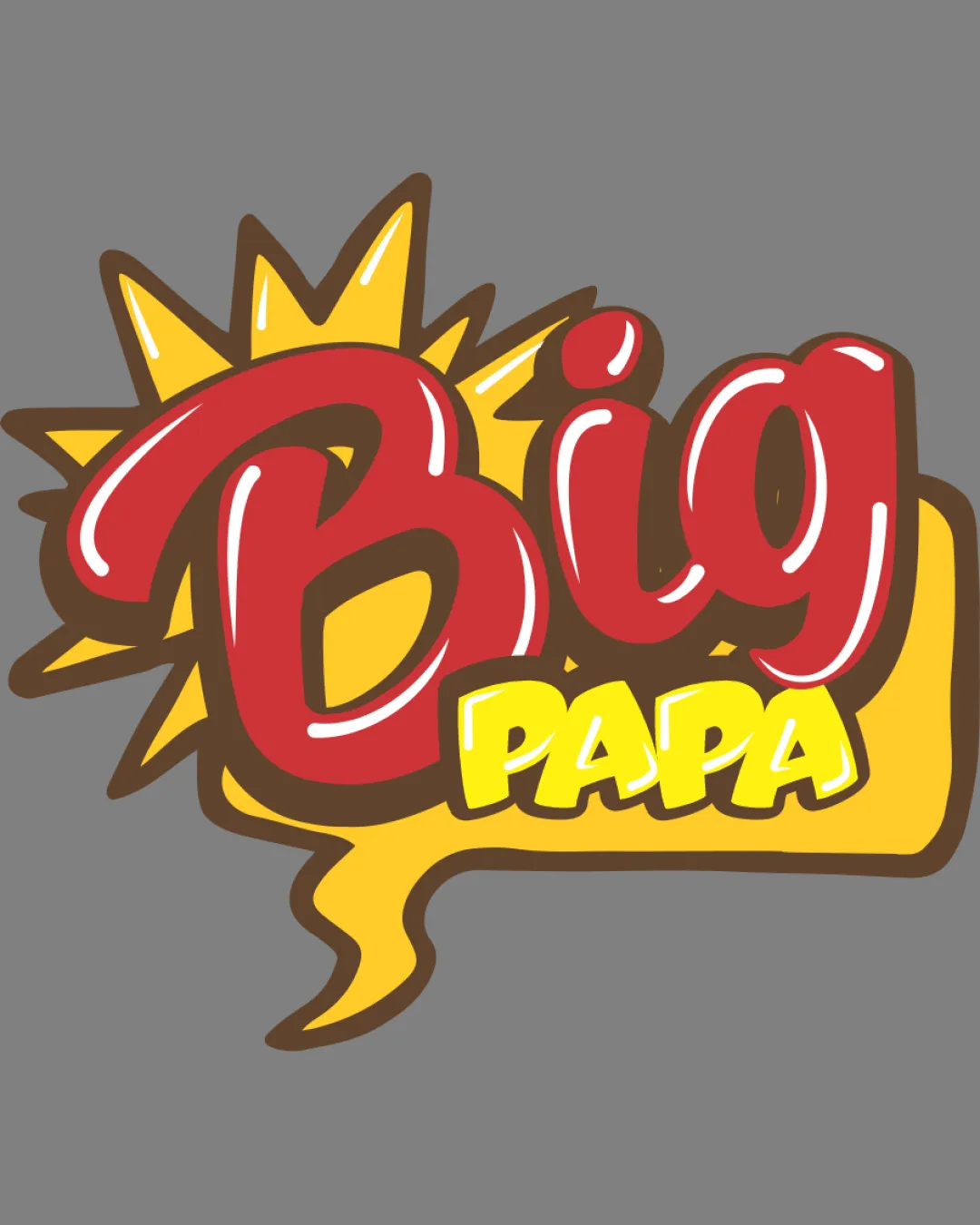
Big PAPA logo review
3/5
Logo score
Logo review of

Big Papa

Lively and fun but lacks clarity and unique brand presence; needs refinement for confident use.

Wordmark Playful Cartoon, Comic Pop-art Restaurant/fast Food
2.5/5
Legibility
3/5
Originality
5/5
Misread
3/5
Balance
2.5/5
Scale
Your next steps

What to fix first

Focus on the changes that matter. Keep what makes the logo work.

1

wordmark

Refine the script to improve separation and clarity between letterforms.

Visible issue High priority Medium effort
Area to inspectApproximate location

Overlapping and thick, stylized lettering on 'Big' reduces readability, especially at small sizes or from a distance.

How to check

Test readability on smaller applications and digital screens.

See the category review
2

whole logo

Create a simplified version for small-scale and single-color applications.

Worth testing Medium priority Medium effort

Comic burst with jagged outlines and layered type may not reproduce cleanly at reduced sizes or in single-color/monochrome uses.

How to check

Verify minimal form remains legible and retains energy at various sizes.

See the category review
Detailed review

Logo performance breakdown

3.5/5

Brief & logo match

Based on your brief
Compared with

burguer restaurant

Captures fun fast food energy but is generic and stretches legibility.

  • Restaurant Energy And Approachability

    Comic burst and bold script evoke a fun, lively dining experience suitable for casual burger restaurants.

  • Category Connection

    Pop colors and playful font are customary for fast food logos but lack direct burger cues or unique brand story.

2.5/5

Legibility

  • Large letters, vibrant colors.
  • Overlapping and thick, stylized lettering on 'Big' reduces readability, especially at small sizes or from a distance.

    Visible issue wordmark

    Try: Refine the script to improve separation and clarity between letterforms.

    Check: Test readability on smaller applications and digital screens.
    Area to inspectApproximate location
3/5

Originality

  • Comic style attracts attention.
  • Comic-style energy is lively but follows familiar burger/fast food tropes; style is generic within this niche.

    Optional refinement whole logo

    Try: Integrate a subtle burger or unique mark to add proprietary distinctiveness.

    Check: Assess whether revised version better stands out among fast food brands.

4/5

Color harmony

  • Vivid, appetizing palette.
Yellow#F5DF39
Red#C34E42
White#FFFFFF
Brown#775135

Estimated colors. Use the original design file for exact values.

Create a full color palette using these colors

Create new palette
3/5

Balance alignment

  • Playful composition.
  • The 'Big' text feels visually heavier on the left and crowds the burst shape, reducing overall harmony and breathing space.

    Optional refinement wordmark and burst

    Try: Adjust letter positioning and burst spacing for better visual balance.

    Check: Check for improved weight distribution and negative space.

Uploaded logoAlignment guide overlay

Inspect spacing with the guide. Optical balance may differ from geometric centering.

2.5/5

Scalability

  • Energetic shape.
  • Comic burst with jagged outlines and layered type may not reproduce cleanly at reduced sizes or in single-color/monochrome uses.

    Worth testing whole logo

    Try: Create a simplified version for small-scale and single-color applications.

    Check: Verify minimal form remains legible and retains energy at various sizes.

Uploaded logo at 200 pixels wide
200 × 250 px
Uploaded logo at 100 pixels wide
100 × 125 px
Uploaded logo at 50 pixels wide
50 × 63 px

Compare the detail at different sizes. Labels show the full image dimensions.

5/5

Misinterpretations

  • No negative alternate readings.

Black & white

Does the shape still work without color?

These tests are available only for logos uploaded in vector (SVG) format.

Background contrast

Find the surfaces where your logo stays clear.

These tests are available only for logos uploaded in vector (SVG) format.

Blur & silhouette

A 3px blur softens fine details so you can check whether the overall shape stays recognizable. If key gaps close or elements merge, the logo may rely too heavily on detail.

These tests are available only for logos uploaded in vector (SVG) format.

Try your own review

Wondering how your logo performs?

Get a clear logo score, key risks, and priority fix ideas before your client or audience sees it.

Review my logo