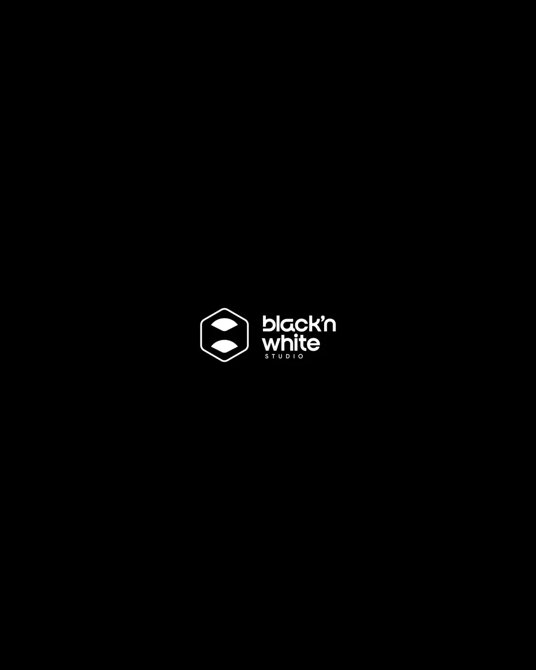
black'n white STUDIO logo review
3.5 / 5
Logo score
Logo review of

Black'n White Studio

Functional and modern, but requires refinement to improve uniqueness and versatility for client-ready status.

Combination Mark Minimalist Geometric Creative/photography/design Studio
4/5
Legibility
3/5
Originality
5/5
Misread
4/5
Balance
3/5
Scale
Action plan

What to fix first

The most important fixes to handle before polishing the full presentation.

1

Increase the size or weight of the 'STUDIO' text for better legibility at small scales.

High priority

Current small type risks losing legibility at practical logo sizes.

Impact: Improves Scalability And Clarity In Web And Print Use · Effort: Low

2

Explore subtle bridging elements or slight font/mark adjustments to better unify the geometric mark and wordmark aesthetic.

Medium priority

Current separation between mark and wordmark may dilute brand cohesion at a glance.

Impact: Enhances Visual Coherence And Brand Distinctiveness · Effort: Medium

Detailed review

Logo performance breakdown

4/5

Legibility

Checkmark icon Main text 'black'n white' is clear against the background.

Warning icon 'STUDIO' is small and might lose clarity at reduced sizes.

3/5

Originality

Checkmark icon Abstract hexagonal shape isn't overly common.

Warning icon Hexagon-with-internal-shapes is a familiar motif; doesn't break new ground.

4/5

Color harmony

Checkmark icon Monochromatic scheme fits the 'black'n white' theme and is high-contrast.

Warning icon Highly dependent on a black background; may lose effectiveness if not inverted when used on white.

Black
#000000

White
#FFFFFF

Your palette is close. Refine the color roles and combinations before updating the logo.

Build brand colors
4/5

Balance alignment

Checkmark icon Mark and wordmark have cohesive visual weight.
Checkmark icon Left alignment provides stable composition.

Warning icon Slight visual disconnect between the geometric mark and rounded font.

logo 200x250 pixels scalability test alignment grid overlay
3/5

Scalability

Checkmark icon Simple mark with no gradients or detail-heavy elements.

Warning icon Thin text for 'STUDIO' and small mark details could be lost at small sizes.

logo 200x250 pixels scalability test

200x250 px

logo 100x125 pixels scalability test

100×125 px

logo 50x62 pixels scalability test

50×62 px

5/5

Misinterpretations

Checkmark icon No obvious inappropriate or confusing alternate readings.

Beta

No AI design signals found

Likely designed by a human

Clean geometric construction and consistent letterforms indicate deliberate human design.

  • Precise geometry in the mark
  • Consistent type without AI-like artifacts

Visual assessment; not definitive proof of authorship.

3 / 5

Logo structure & brief match

Checkmark icon Both components are clear, separate, and the combination is legible.

Warning icon Geometric mark feels a bit disconnected visually from the rounded letterforms.

Checkmark icon Web Design, Graphic Design, Brando Design: Strong fit due to minimalist, modern approach, geometric abstraction, and clear visual hierarchy.

Try your own review

Wondering how your logo performs?

Get a clear logo score, key risks, and priority fix ideas before your client or audience sees it.

Review my logo