 View review
Logo score
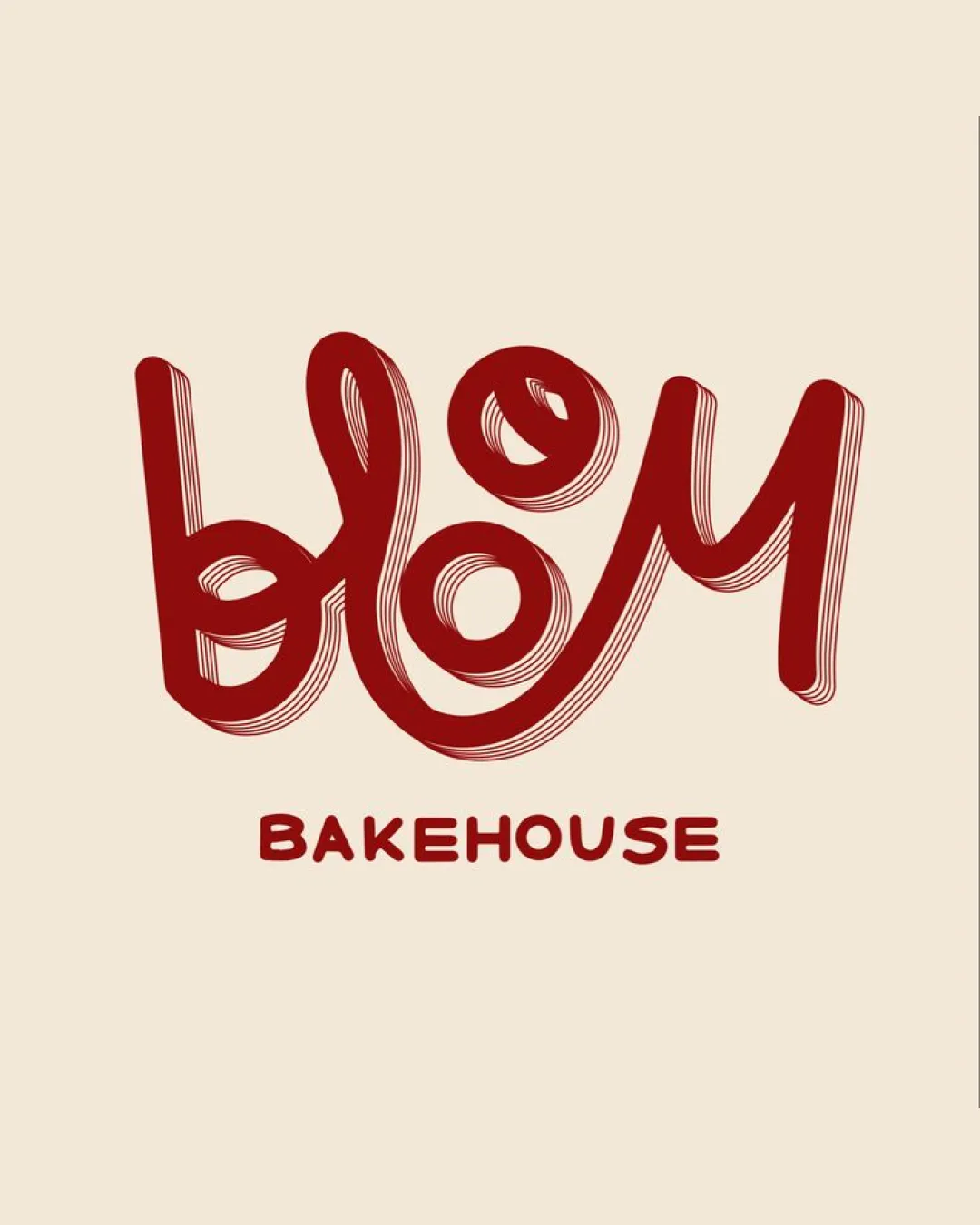
Logo review ofBlom, Bakehouse
Review the detailed scores below to see what is working and what should be refined first.
Legibility
Originality
Misread
Balance
Scale
Detailed review
Logo performance breakdown
Legibility
![]() The 'BAKEHOUSE' subtext is clear, bold, and easy to read.
The 'BAKEHOUSE' subtext is clear, bold, and easy to read.![]() Color contrast between text and background is strong.
Color contrast between text and background is strong.
![]() The main 'blom' wordmark is challenging to read due to excessive linework and non-standard letterforms.
The main 'blom' wordmark is challenging to read due to excessive linework and non-standard letterforms.![]() The overlapping strokes and uneven spacing reduce quick readability, especially at a glance.
The overlapping strokes and uneven spacing reduce quick readability, especially at a glance.
Originality
![]() Distinctive hand-drawn quality that is not generic.
Distinctive hand-drawn quality that is not generic.![]() Unique interpretation of bakery themes with playful, dough-like letters.
Unique interpretation of bakery themes with playful, dough-like letters.
![]() While playful, the style risks illegibility and could be polarizing for some audiences.
While playful, the style risks illegibility and could be polarizing for some audiences.![]() The motif is not completely new for artisanal bakery brands.
The motif is not completely new for artisanal bakery brands.
Color harmony
![]() Strong color harmony with only two well-coordinated colors.
Strong color harmony with only two well-coordinated colors.![]() Contrast is effective, improving overall legibility.
Contrast is effective, improving overall legibility.
Tall Poppy
#A32421
Beige
#F7E9D0
Balance alignment
![]() The central placement and organic flow create a dynamic visual effect.
The central placement and organic flow create a dynamic visual effect.![]() The subtext 'BAKEHOUSE' anchors the logo.
The subtext 'BAKEHOUSE' anchors the logo.
![]() The letterforms of 'blom' are uneven in weight and spacing, causing a top-heavy, lopsided overall composition.
The letterforms of 'blom' are uneven in weight and spacing, causing a top-heavy, lopsided overall composition.![]() The whimsical linework results in inconsistent negative space between letters, disrupting visual balance.
The whimsical linework results in inconsistent negative space between letters, disrupting visual balance.

Scalability
![]() Simple color palette supports clear printing in solid color.
Simple color palette supports clear printing in solid color.![]() Would be recognizable on large signage due to its eccentric style.
Would be recognizable on large signage due to its eccentric style.
![]() Thin, multi-line details in the 'blom' wordmark will lose clarity and become illegible at small sizes (e.g., business cards, web favicons, embroidery).
Thin, multi-line details in the 'blom' wordmark will lose clarity and become illegible at small sizes (e.g., business cards, web favicons, embroidery).![]() The intricate texture does not translate well to small or single-color versions.
The intricate texture does not translate well to small or single-color versions.
200x250 px
100×125 px
50×62 px
Misinterpretations
![]() No inappropriate or ambiguous symbols detected.
No inappropriate or ambiguous symbols detected.
Symbol & text fit
![]() 'BAKEHOUSE' uses a geometric, bold sans-serif, which grounds the whimsical script above.
'BAKEHOUSE' uses a geometric, bold sans-serif, which grounds the whimsical script above.
![]() Both elements use the same color, creating cohesion.
Both elements use the same color, creating cohesion.
![]() The difference in type styles between the wordmark and supportive text can feel disjointed.
The difference in type styles between the wordmark and supportive text can feel disjointed.
![]() The graphic weight of the upper element overpowers the subtext with its complexity.
The graphic weight of the upper element overpowers the subtext with its complexity.
Try your own review
Review my logo
Wondering how your logo performs?
Get a clear logo score, key risks, and priority fix ideas before your client or audience sees it.
Keep exploring