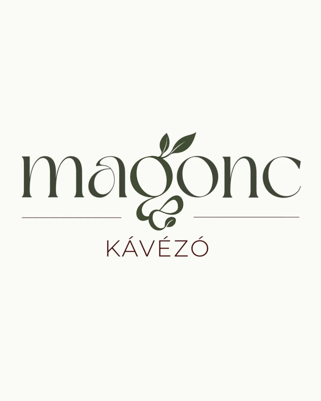
magonc KÁVÉZÓ logo review
4.8 / 5
Logo score

Logo review ofMagonc Kávézó

Strong visual and conceptual fit. Minor refinement will yield a highly professional, industry-appropriate logo.

Combination Mark Modern Serif With Organic Touches Coffee Shop
5/5
Legibility
4/5
Originality
5/5
Misread
4/5
Balance
5/5
Scale
Review next
Action plan

What to fix first

The most important fixes to handle before polishing the full presentation.

1

Fine-tune balance between the descender flourish of 'g' and overall horizontal alignment for optimal symmetry.

Medium priority

The current flourish under 'g' is slightly heavy relative to text, mildly impacting the symmetry and alignment.

Impact: Enhances Optical Balance And Logo Polish, Reducing Subtle Visual Tension. · Effort: Low

Detailed review

Logo performance breakdown

5/5

Legibility

Checkmark icon Both 'magonc' and 'KÁVÉZÓ' are clearly readable; display type feels approachable.

4/5

Originality

Checkmark icon Integrating leaves with the 'g' is conceptually fitting and adds uniqueness.

Warning icon Serif treatment generally familiar for café industry; not entirely distinctive.

5/5

Color harmony

Checkmark icon Earthy green and brown tones fit organic, natural, and coffee shop themes; harmonious and restrained palette.

DeepOlive
#31372A

DarkChestnut
#5F352E

OffWhite
#F9F9F4

4/5

Balance alignment

Checkmark icon Text is mostly well spaced and optically balanced; 'g' and leaves are well centered.

Warning icon Long descender and flourish under 'g' lightly disrupt horizontal symmetry; minor weight difference between main and subtext.

logo 200x250 pixels scalability test alignment grid overlay
5/5

Scalability

Checkmark icon Clean shapes and solid lines enhance scaling; minimal detail will work small and in one color if needed.

logo 200x250 pixels scalability test

200x250 px

logo 100x125 pixels scalability test

100×125 px

logo 50x62 pixels scalability test

50×62 px

5/5

Misinterpretations

Checkmark icon No inappropriate or confusing misread detected.

5 / 5

Logo structure & brief match

Checkmark icon The 'g' mark organically connects to the wordmark; strong conceptual link.

Checkmark icon Hungarian Coffee Shop With Earthy Natural Tones: The design uses warm olive and brown-green hues, clean serifed lettering, and a plant motif, fulfilling the brief for natural earthiness in a café context.
Checkmark icon ‘g’ Represents Plants And Trees Growing Out From Seeds: The stylized 'g' with leaves visually suggests growth from a seed, aptly representing the intended concept.

Try your own review

Wondering how your logo performs?

Get a clear logo score, key risks, and priority fix ideas before your client or audience sees it.

Review my logo