What to preserve
A bold, Western-themed logo integrates a cowboy hat and star with the event name, clearly conveying a country music vibe.
Spelling & grammar
No obvious issue foundNo text errors detected; spelling and grammar fit context.
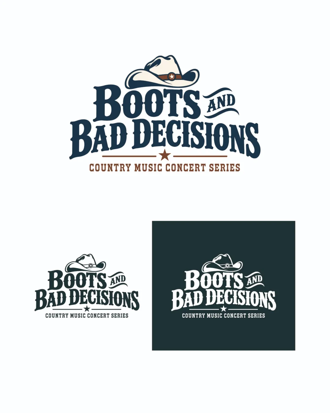
A professionally composed Western event logo with minor scalability and distinctiveness tweaks recommended.
Focus on the changes that matter. Keep what makes the logo work.
A bold, Western-themed logo integrates a cowboy hat and star with the event name, clearly conveying a country music vibe.
No text errors detected; spelling and grammar fit context.
Logo preview unavailable. The written feedback is still available on this card.
Standalone mark (cowboy hat and star)
Fine details in the hat and small star may lose clarity at very small sizes.
See the category reviewPrimary lockup
The gap between the cowboy hat and the wordmark feels slightly large, interrupting the visual flow.
See the category reviewThe logo matches country music event expectations with clear theme cues and strong readability.
The combination of a cowboy hat and star with Western type is familiar for country music, limiting distinctiveness.
Try: Explore subtle custom elements, such as a unique hat silhouette or accent, for added character.
Check: Compare current logo silhouette and styling with category peers for more distinctive detail.
The gap between the cowboy hat and the wordmark feels slightly large, interrupting the visual flow.
Try: Decrease vertical space between the hat and text for tighter integration.

Inspect spacing with the guide. Optical balance may differ from geometric centering.
Fine details in the hat and small star may lose clarity at very small sizes.
Try: Test legibility of the hat and star at small icon sizes.
Logo preview unavailable. The written feedback is still available on this card.
Get a clear logo score, key risks, and priority fix ideas before your client or audience sees it.
More credits needed
Add credits to continue without losing your work.
Then $7/month. Cancel anytime.
Essential logo review with AI
Estimated progress