BOUDEKAH Wearable Art logo review
4/5
Logo score
Logo review of

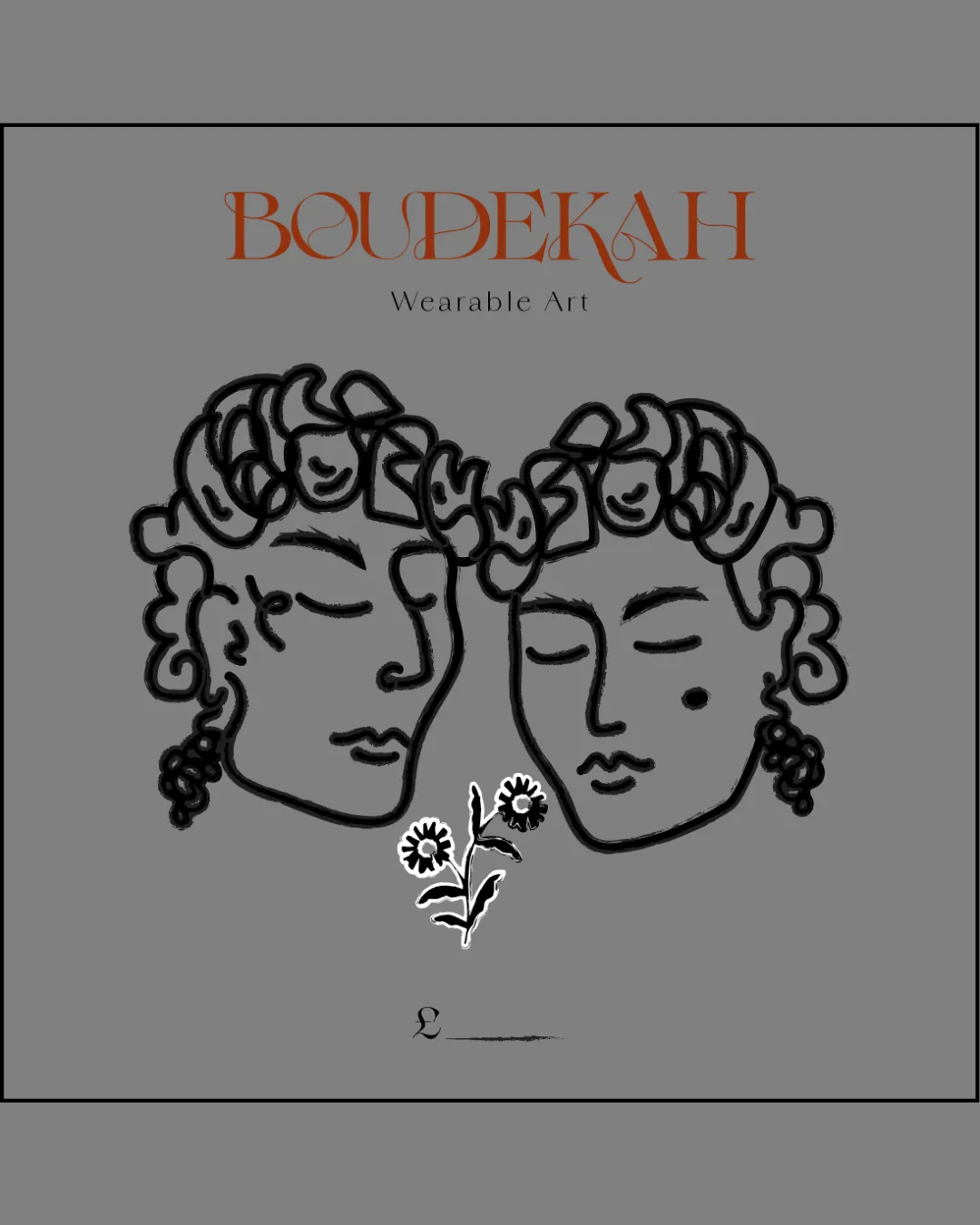
Boudekah Wearable Art

A distinctive, artistic concept that conveys handmade luxury but needs refinement for practical legibility and size range.

Combination Artistic, Illustrative, Hand-drawn, Classical Handmade Jewelry
3.5/5
Legibility
4.5/5
Originality
5/5
Misread
3.5/5
Balance
3/5
Scale
Your next steps

What to fix first

Focus on the changes that matter. Keep what makes the logo work.

1

wordmark

Refine the wordmark to balance character with improved immediate legibility.

Visible issue High priority Medium effort
Area to inspectApproximate location

The artistic flourishes in the wordmark, especially in the letter 'D' and 'K', reduce the speed of recognition and may slightly challenge legibility at a glance or small sizes.

How to check

Confirm readability in scaled-down and digital uses.

See the category review
2

Standalone mark

Test the standalone mark at small sizes or create a simplified version for tiny applications.

Worth testing Medium priority Medium effort
Area to inspectApproximate location

The detailed, overlapping lines in the hand-drawn faces may become hard to distinguish at very small sizes.

How to check

Verify clarity in favicon and jewelry tag scales.

See the category review
Detailed review

Logo performance breakdown

4.5/5

Brief & logo match

Based on your brief
Compared with

handmade jewellery. demographic is middle aged women

The logo convincingly communicates artisanal jewelry with maturity and sophistication, matching the brand's narrative and demographic.

  • Handmade/artisan Quality

    The hand-drawn faces and loose linework reinforce an artisanal, bespoke feel ideal for handmade jewelry.

  • Appeals To Middle-aged Women

    Classical portraiture and elegant typography feel mature and sophisticated, resonating with the target demographic.

3.5/5

Legibility

  • Distinctive typographic personality.
  • Tagline is clear.
  • The artistic flourishes in the wordmark, especially in the letter 'D' and 'K', reduce the speed of recognition and may slightly challenge legibility at a glance or small sizes.

    Visible issue wordmark

    Try: Refine the wordmark to balance character with improved immediate legibility.

    Check: Confirm readability in scaled-down and digital uses.

    Area to inspectApproximate location
4.5/5

Originality

  • Illustrative dual face mark is highly original and memorable.
  • Typographic style is uncommon.
4/5

Color harmony

  • Warm orange type contrasts well with the grey-black artwork.
BurntOrange#B9552A
DarkGray#444444
White#FFFFFF
Black#000000

Estimated colors. Use the original design file for exact values.

Create a full color palette using these colors

Create new palette
3.5/5

Balance alignment

  • Thoughtful arrangement of components.
  • There is a slight imbalance between the height of the wordmark/tagline and the density of the illustration, which may affect overall harmony.

    Optional refinement overall composition

    Try: Fine-tune proportion between wordmark, tagline, and illustration for improved visual equilibrium.

    Check: Evaluate overall hierarchy and optical centering.

Uploaded logoAlignment guide overlay

Inspect spacing with the guide. Optical balance may differ from geometric centering.

3/5

Scalability

  • Illustrative mark expresses craftsmanship.
  • The detailed, overlapping lines in the hand-drawn faces may become hard to distinguish at very small sizes.

    Worth testing Standalone mark

    Try: Test the standalone mark at small sizes or create a simplified version for tiny applications.

    Check: Verify clarity in favicon and jewelry tag scales.

    Area to inspectApproximate location
Uploaded logo at 200 pixels wide
200 × 250 px
Uploaded logo at 100 pixels wide
100 × 125 px
Uploaded logo at 50 pixels wide
50 × 63 px

Compare the detail at different sizes. Labels show the full image dimensions.

5/5

Misinterpretations

  • No unintended or problematic readings.
4/5

Symbol & text fit

  • Artistic style is cohesive between mark and wordmark.

Black & white

Does the shape still work without color?

These tests are available only for logos uploaded in vector (SVG) format.

Background contrast

Find the surfaces where your logo stays clear.

These tests are available only for logos uploaded in vector (SVG) format.

Blur & silhouette

A 3px blur softens fine details so you can check whether the overall shape stays recognizable. If key gaps close or elements merge, the logo may rely too heavily on detail.

These tests are available only for logos uploaded in vector (SVG) format.

Try your own review

Wondering how your logo performs?

Get a clear logo score, key risks, and priority fix ideas before your client or audience sees it.

Review my logo