Wondering how your logo performs? 🧐
Get professional logo reviews in seconds and catch design issues in time.
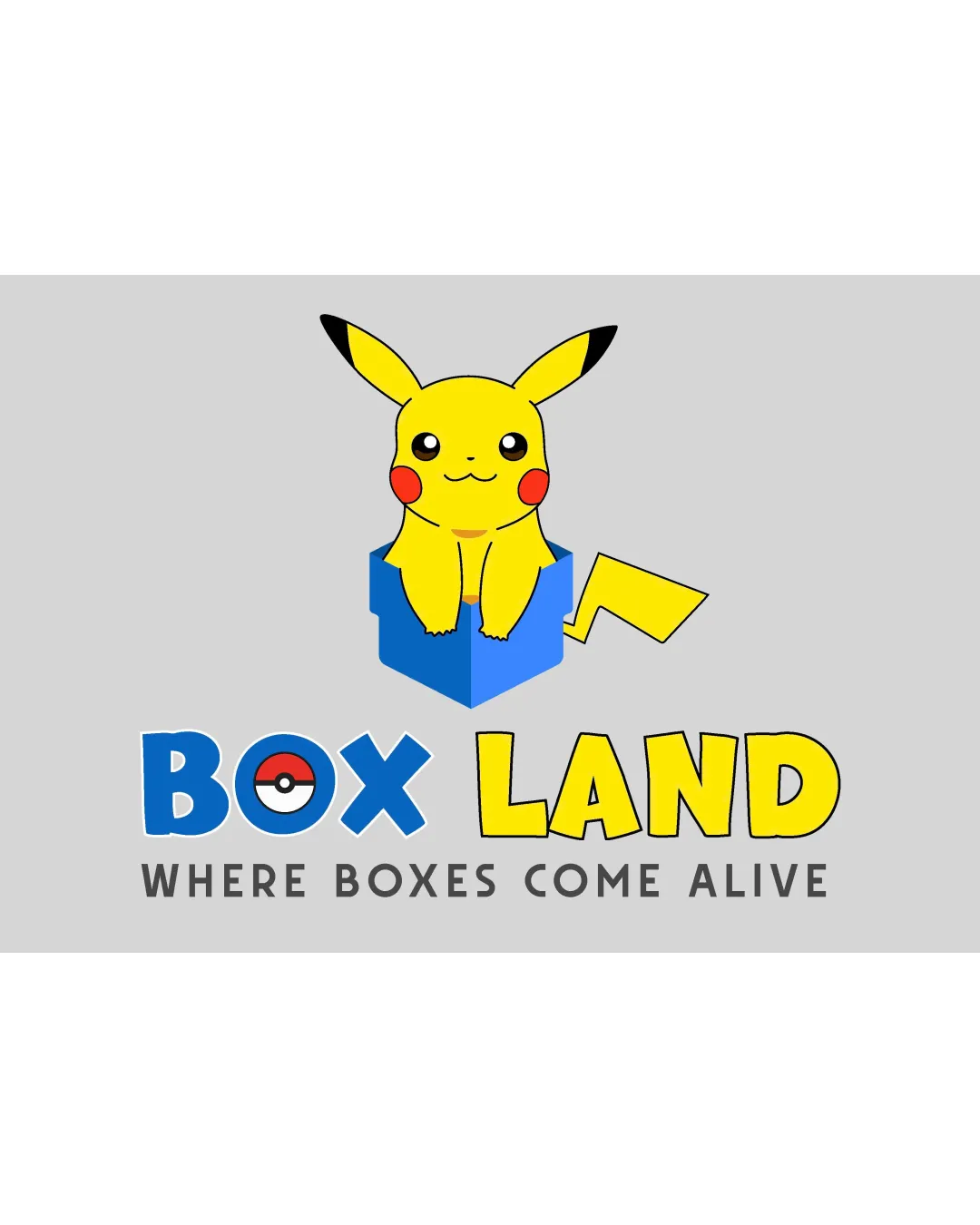
Try it Now!Logo review of BOX LAND WHERE BOXES COME ALIVE
 Logo analysis by AI
Logo type:
Style:
Detected symbol:
Detected text:
Business industry:
Review requested by Proqua123
**If AI can recognize or misinterpret it, so can people.
Structured logo review
Legibility
![]() Text is large, bold, and easily readable.
Text is large, bold, and easily readable.![]() Sub-slogan uses a legible sans-serif font.
Sub-slogan uses a legible sans-serif font.
![]() Contrast between blue 'BOX' and gray background could be stronger for better legibility.
Contrast between blue 'BOX' and gray background could be stronger for better legibility.
Scalability versatility
![]() Large elements might work on signage or posters.
Large elements might work on signage or posters.
![]() Thin outlines and small features on Pikachu will lose clarity at smaller sizes.
Thin outlines and small features on Pikachu will lose clarity at smaller sizes.![]() Complex color gradients in Pikachu would not translate well to embroidery or small print.
Complex color gradients in Pikachu would not translate well to embroidery or small print.![]() Complexity hinders use as a favicon, mobile app icon, or on pens/stickers.
Complexity hinders use as a favicon, mobile app icon, or on pens/stickers.
200x250 px
100×125 px
50×62 px
Balance alignment
![]() Logo has a central alignment with imagery above the text.
Logo has a central alignment with imagery above the text.
![]() The Pikachu and box symbol dominate the composition and feel oversized compared to the text.
The Pikachu and box symbol dominate the composition and feel oversized compared to the text.![]() Visual weight is top-heavy, creating imbalance.
Visual weight is top-heavy, creating imbalance.

Originality
![]() Idea of combining character and box is playful.
Idea of combining character and box is playful.
![]() Direct use of Pikachu and Pokéball (copyrighted characters and elements) makes the logo unoriginal and likely infringing.
Direct use of Pikachu and Pokéball (copyrighted characters and elements) makes the logo unoriginal and likely infringing.![]() Typography is generic and not custom.
Typography is generic and not custom.
Logomark wordmark fit
![]() Both logomark (illustration) and wordmark are placed together.
Both logomark (illustration) and wordmark are placed together.
![]() Playful, cartoonish logo mark does not match the rigid, blocky type of the slogan.
Playful, cartoonish logo mark does not match the rigid, blocky type of the slogan.![]() Size of logomark overwhelms the accompanying wordmark.
Size of logomark overwhelms the accompanying wordmark.
Aesthetic look
![]() Bright and lively, which appeals to children.
Bright and lively, which appeals to children.
![]() The logo is busy with too many elements (character, box, specialized O in BOX, tagline), resulting in visual clutter.
The logo is busy with too many elements (character, box, specialized O in BOX, tagline), resulting in visual clutter.![]() Mix of fonts and elements decreases overall sophistication.
Mix of fonts and elements decreases overall sophistication.
Dual meaning and misinterpretations
![]() No inappropriate or potentially offensive shapes detected.
No inappropriate or potentially offensive shapes detected.
Color harmony
![]() Colors are well-coordinated and vibrant, targeting a youthful audience.
Colors are well-coordinated and vibrant, targeting a youthful audience.
![]() Too many saturated colors in logomark; could become overwhelming on some backgrounds.
Too many saturated colors in logomark; could become overwhelming on some backgrounds.![]() Gradient and shading may not translate well across different media.
Gradient and shading may not translate well across different media.
Supernova
#FFD800
Dodger Blue
#3776C6
Red
#F44336
Black
#000000
Pearl Bush
#E3DED7