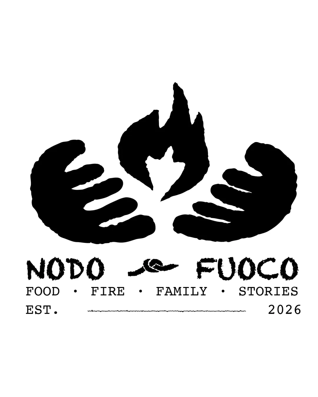
NODO FUOCO FOOD FIRE FAMILY STORIES EST. 2026 logo review
4.0 / 5
Logo score
Logo review of

Nodo Fuoco Food Fire Family Stories Est. 2026

Distinctive, warm, and on-brief—minor design tweaks will maximize versatility.

Combination Mark Hand-drawn, Minimal, Rustic, Organic Hospitality
4/5
Legibility
4/5
Originality
4/5
Misread
4/5
Balance
3.5/5
Scale
Action plan

What to fix first

The most important fixes to handle before polishing the full presentation.

1

Improve scalability for small usages by refining hand/flame silhouette clarity and knot symbol legibility.

High priority

Dense hand details may collapse at small sizes.

Impact: Ensures Strong Presence And Recognizability Across Applications. · Effort: Medium

2

Tighten spacing and connection between supporting text elements and main lockup.

Medium priority

Supporting text currently feels somewhat detached.

Impact: Creates A More Cohesive, Professional Mark For Menus And Signage. · Effort: Low

Detailed review

Logo performance breakdown

4/5

Legibility

Checkmark icon Main names and supporting text are clear and readable

Warning icon Knot symbol between main text may be slightly ambiguous at small size

4/5

Originality

Checkmark icon Hand-flame composition and rough handmade style are distinctive

Warning icon Hand and flame motif is not entirely unique in hospitality, but handled with character

4/5

Color harmony

Checkmark icon High contrast black and white fits minimal, homely, and stylish brief

Warning icon Single color limits adaptation to some modern applications

Black
#000000

White
#FFFFFF

Your palette is close. Refine the color roles and combinations before updating the logo.

Build brand colors
4/5

Balance alignment

Checkmark icon Symmetry and centered composition are strong
Checkmark icon Text and symbol are optically balanced

Warning icon Supporting text spacing feels disconnected from the primary lockup

logo 200x250 pixels scalability test alignment grid overlay
3.5/5

Scalability

Checkmark icon Bold forms scale down fairly well

Warning icon Some hand and flame details may blur or lose clarity at small sizes

logo 200x250 pixels scalability test

200x250 px

logo 100x125 pixels scalability test

100×125 px

logo 50x62 pixels scalability test

50×62 px

4/5

Misinterpretations

Checkmark icon No offensive or awkward referrals detected; hands and flame are clear

Beta

No obvious AI design signals

No visible generative artifacts detected

Layout, brush texture, and symbol construction are consistent with deliberate human design.

Visual assessment; not definitive proof of authorship.

4 / 5

Logo structure & brief match

Checkmark icon Handmade effect ties wordmark and symbol together well

Warning icon Visual weight of the symbol slightly overpowers text

Checkmark icon Tradition And Family: Warmth and generosity are effectively symbolized by the hands and fire, with clear family and gathering resonance.
Checkmark icon Stylish Minimalism: Rough brushwork and monochrome palette deliver a minimal yet expressive presence, fitting the stylish establishment angle.
Checkmark icon Homely Atmosphere: Handmade shapes, fire, and type add approachable, welcoming character.

Try your own review

Wondering how your logo performs?

Get a clear logo score, key risks, and priority fix ideas before your client or audience sees it.

Review my logo