Brown coffee logo review
4.5/5
Logo score
Logo review of

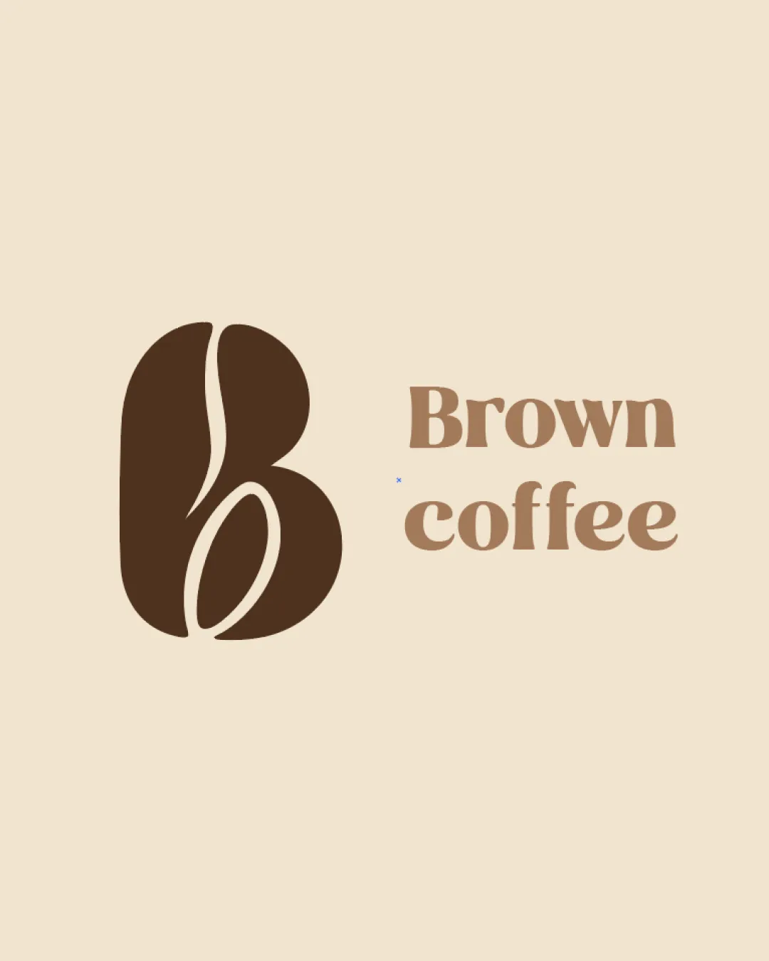
Brown Coffee

A thoughtful, category-appropriate mark with high impact and minimal refinements needed.

Combination Mark Modern Monogram With Organic Shape Coffee Shop/cafe
5/5
Legibility
4/5
Originality
5/5
Misread
4/5
Balance
4/5
Scale
Your next steps

What to fix first

Focus on the changes that matter. Keep what makes the logo work.

1

monogram

Test the mark at small sizes to ensure inner details remain distinct and crisp.

Worth testing Medium priority Low effort
Area to inspectApproximate location

The thin inner curves of the 'B' may become less clear at very small sizes.

How to check

Preview the logo at small digital sizes (e.g., favicon, app icon) and assess clarity.

See the category review
2

combination lockup

Reduce the gap between the monogram and the wordmark to create a more unified lockup.

Optional refinement Medium priority Low effort

The spacing between the monogram and the wordmark is slightly wide, causing mild disconnect between the elements.

How to check

Compare before/after spacing visually to ensure the elements are perceived as a single unit.

See the category review
Detailed review

Logo performance breakdown

5/5

Brief & logo match

Based on your brief
Compared with

Specialty coffee shop targeting coffee lovers with a modern, cozy, premium, and authentic brand using a 'B' monogram and earthy tones.

Logo perfectly aligns with the brand's vision for modern, warm, and coffee-focused identity.

  • Warm, Earthy Aesthetic

    Palette and shapes capture the desired warmth and organic quality for a coffee brand.

  • Modern Monogram 'B' + Coffee Bean

    Monogram efficiently merges 'B' and coffee bean for unique category signaling.

5/5

Legibility

  • Wordmark is clear and highly readable.
  • Monogram's 'B' shape is obvious.
4/5

Originality

  • Creative integration of 'B' and coffee bean.
  • Relevant concept for the category.
5/5

Color harmony

  • Earthy browns feel warm and inviting.
  • Palette expresses coffee theme elegantly.
Beige#EADDC7
Brown#68412E
Light Brown#B9936E

Estimated colors. Use the original design file for exact values.

Create a full color palette using these colors

Create new palette
4/5

Balance alignment

  • Both elements are visually weighted and do not compete.
  • Clean modern alignment.
  • The spacing between the monogram and the wordmark is slightly wide, causing mild disconnect between the elements.

    Optional refinement combination lockup

    Try: Reduce the gap between the monogram and the wordmark to create a more unified lockup.

    Check: Compare before/after spacing visually to ensure the elements are perceived as a single unit.

Uploaded logoAlignment guide overlay

Inspect spacing with the guide. Optical balance may differ from geometric centering.

4/5

Scalability

  • Simple, bold bean shape supports small-scale use.
  • The thin inner curves of the 'B' may become less clear at very small sizes.

    Worth testing monogram

    Try: Test the mark at small sizes to ensure inner details remain distinct and crisp.

    Check: Preview the logo at small digital sizes (e.g., favicon, app icon) and assess clarity.
    Area to inspectApproximate location
Uploaded logo at 200 pixels wide
200 × 250 px
Uploaded logo at 100 pixels wide
100 × 125 px
Uploaded logo at 50 pixels wide
50 × 63 px

Compare the detail at different sizes. Labels show the full image dimensions.

5/5

Misinterpretations

  • No conflicting alternate readings found.
5/5

Symbol & text fit

  • Coffee bean monogram harmonizes with wordmark mood.
  • Visual theme matches the text.

Black & white

Does the shape still work without color?

These tests are available only for logos uploaded in vector (SVG) format.

Background contrast

Find the surfaces where your logo stays clear.

These tests are available only for logos uploaded in vector (SVG) format.

Blur & silhouette

A 3px blur softens fine details so you can check whether the overall shape stays recognizable. If key gaps close or elements merge, the logo may rely too heavily on detail.

These tests are available only for logos uploaded in vector (SVG) format.

Try your own review

Wondering how your logo performs?

Get a clear logo score, key risks, and priority fix ideas before your client or audience sees it.

Review my logo