View review
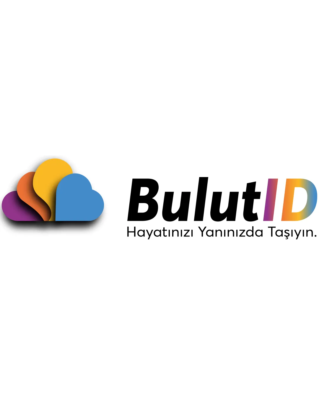
Bulutid Hayatınızı Yanınızda Taşıyın.
Visually clear and functional; lacks originality—prioritize unique brand mark features before final delivery.
What to fix first
The most important fixes to handle before polishing the full presentation.
Refine the cloud symbol to be more unique and less generic, possibly adding a distinctive element related to NFC/identity.
High priorityCloud is a tech cliché; tailoring it would enhance memorability.
Impact: Increases Original Brand Recognition And Removes Risk Of Blending With Industry Competitors. · Effort: Medium
Unify the 'ID' color style with 'Bulut' or make the transition between them smoother.
Medium priorityCurrent color change may feel visually abrupt.
Impact: Improves Cohesion Between Logomark And Wordmark For Polished Delivery. · Effort: Low
Logo performance breakdown
Legibility
Text is clear and high-contrast on white background
Font is bold and easily readable
Originality
Layered multi-color cloud adds some unique character
Cloud shape is very common in tech and IT logos; feels generic
Color harmony
Colors are vibrant and harmonious within the gradient
Colorful accents add energy
Colorful gradients may be challenging for some print/applications
Eminence
#544191
Flame
#E76835
Goldenrod
#F8C143
Steel Blue
#4B93CF
Kobi
#E179AC
Medium Aquamarine
#7FD7C4
Your palette is close. Refine the color roles and combinations before updating the logo.
Build brand colorsBalance alignment
Good left-right balance between icon and typography
Well-aligned overall
Cloud and text have slightly disconnected feel due to spacing
Scalability
Simple cloud shapes translate well to small sizes
Text remains legible at reduced scale
Gradient layering in symbol may lose detail at very small sizes
200x250 px
100×125 px
50×62 px
Misinterpretations
No inappropriate or confusing visual resemblance detected
No AI design signals found
Likely designed by a human
Logo elements appear deliberately crafted and well-aligned without generative artifacts.
- Consistent geometry in cloud layers
- Clean, readable letterforms and color application
Visual assessment; not definitive proof of authorship.
Logo structure & brief match
Color accent in 'ID' mirrors colors in cloud mark
Font weight matches the solid presence of the icon
Colorful 'ID' may feel inconsistent with monochrome 'Bulut'
NFC, Tech For Cars/kids/pets/people/business: Cloud symbol fits technology and digital identity sector; energetic colors suggest versatility for various users. Could increase uniqueness for stronger industry distinction.
Wondering how your logo performs?
Get a clear logo score, key risks, and priority fix ideas before your client or audience sees it.