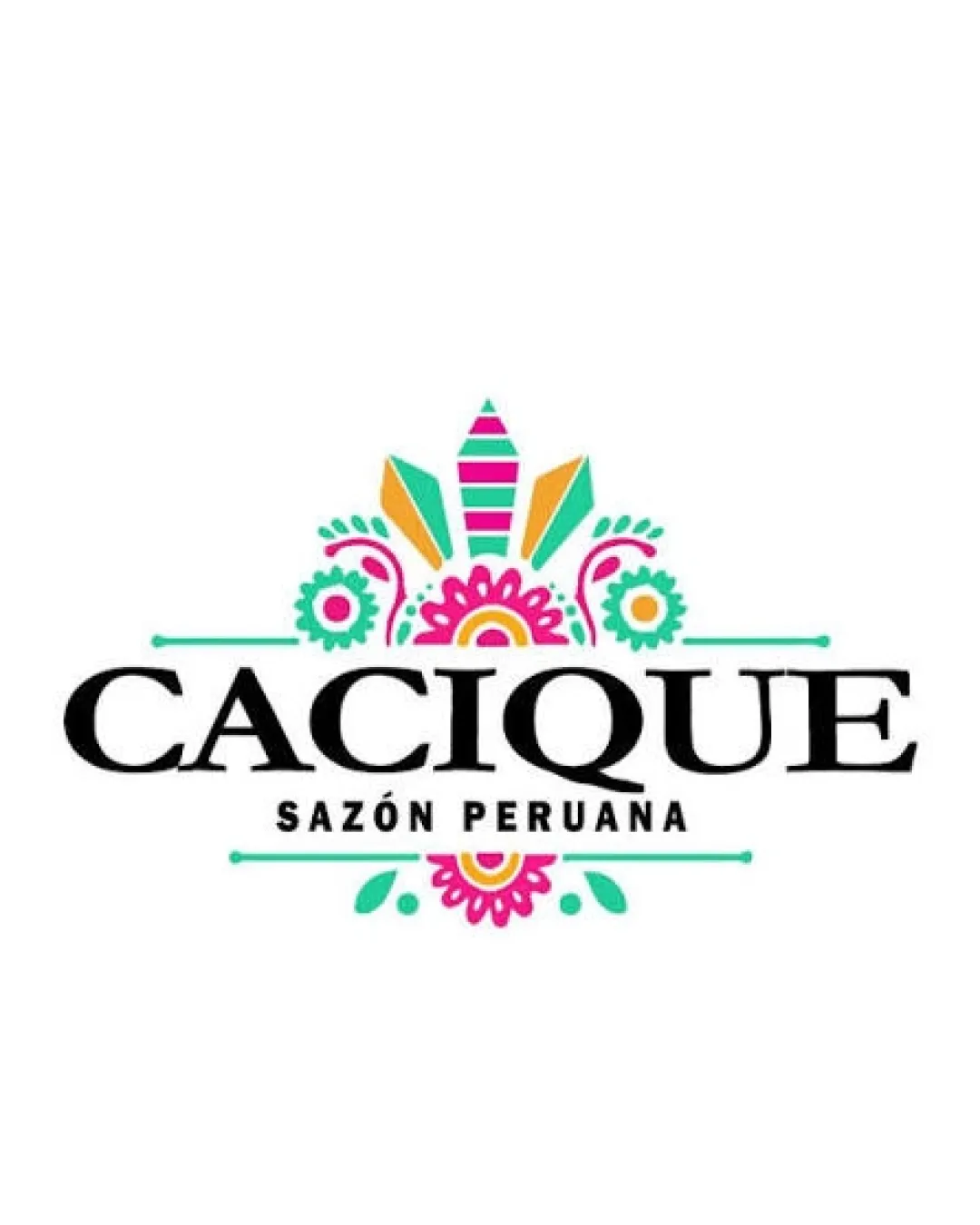
CACIQUE SAZÓN PERUANA logo review
4.2 / 5
Logo score

Logo review ofCacique Sazón Peruana

Visually appealing and on-brand for Peruvian cuisine; suitable for presentation but refinement is recommended for versatility.

Combination Mark Ornamental Ethnic Restaurant/food
5/5
Legibility
4/5
Originality
5/5
Misread
4/5
Balance
3/5
Scale
Review next
Action plan

What to fix first

The most important fixes to handle before polishing the full presentation.

1

Simplify intricate details in the floral/headdress motif for improved legibility at smaller sizes.

High priority

Fine decorative lines could blur or disappear at small scales, reducing brand effectiveness.

Impact: Ensures Logo Versatility For Various Applications Like Small Print And Digital Icons. · Effort: Medium

2

Explore a monotone or reduced color version to ensure logo maintains impact when color cannot be used.

Medium priority

Current palette is vivid, but logo should hold up in black and white or limited color environments.

Impact: Improves Logo's Adaptability Across Diverse Media And Keeps Visual Identity Strong. · Effort: Medium

Detailed review

Logo performance breakdown

5/5

Legibility

Checkmark icon Large, bold serif font for main name is highly readable
Checkmark icon Supporting text is clear and well-contrasted

4/5

Originality

Checkmark icon Motif clearly references Peruvian/ethnic style, adding distinction

Warning icon Headdress/floral arrangements are common in ethnic branding

4/5

Color harmony

Checkmark icon Bright, cheerful palette suits thematic intent
Checkmark icon Colors contrast well for visibility

Warning icon Multiple bright colors might not translate as well in monotone versions

Turquoise
#00CFC1

Pink
#F70086

Yellow
#FFD600

Black
#000000

White
#FFFFFF

Your palette is close. Explore sharper color combinations with Colorfly.design before updating the logo.

Explore palettes
4/5

Balance alignment

Checkmark icon Symmetrical design with good centering of mark above text
Checkmark icon Elements maintain proper spacing

Warning icon Vertical stacking with dense details may feel slightly top-heavy

logo 200x250 pixels scalability test alignment grid overlay
3/5

Scalability

Checkmark icon Main text is clear and mark is simple enough to scale reasonably well

Warning icon Decorative motif contains fine details that may be lost at small sizes

logo 200x250 pixels scalability test

200x250 px

logo 100x125 pixels scalability test

100×125 px

logo 50x62 pixels scalability test

50×62 px

5/5

Misinterpretations

Checkmark icon No inappropriate or offensive misreads detected

5 / 5

Logo structure & brief match

Checkmark icon Floral mark and text integrate cohesively around central axis

Checkmark icon Industry: Visually fits a Peruvian or Latin restaurant/food product, leveraging ornamental motifs and bold flavor representation.

Try your own review

Wondering how your logo performs?

Get a clear logo score, key risks, and priority fix ideas before your client or audience sees it.

Review my logo