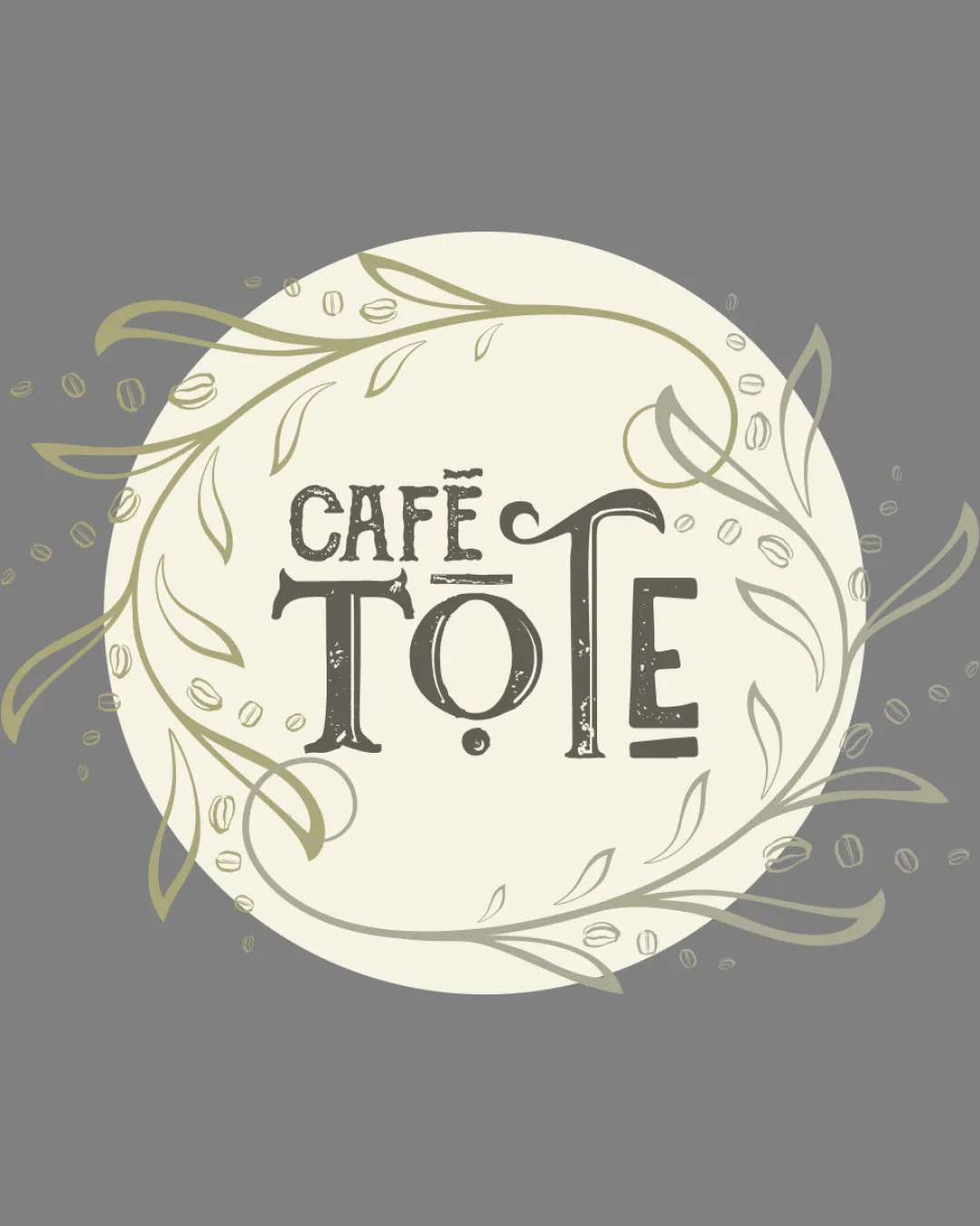
CAFÉ TOTE logo review
4/5
Logo score

CAFÉ TOTE

@creative528589 Essential logo review

A charming, cohesive coffee shop logo with distinct personality and minor refinements needed for optimal use.

Combination Vintage Decorative Coffee Shop
3.5/5
Legibility
4/5
Originality
4/5
Balance
3/5
Scale
Your next steps

What to fix first

Focus on the changes that matter. Keep what makes the logo work.

1

Standalone mark

Prepare a simplified small-scale variant with fewer, bolder details.

High priority Worth testing Medium effort

Fine leaf lines and small coffee beans in the border may blur or disappear at small sizes.

See the category review

2

wordmark

Slightly refine letter shapes for quicker recognition while retaining decorative flair.

Medium priority Visible issue Medium effort

The decorative font, particularly the exaggerated arm on the 'T' and mixed heights, slightly impairs at-a-glance readability.

See the category review
Detailed review

Logo performance breakdown

4/5

Brief & logo match

Logo is well suited for a café, but ornate features need refinement for practical clarity.

3.5/5

Legibility

  • Distinctive retro typeface.
  • The decorative font, particularly the exaggerated arm on the 'T' and mixed heights, slightly impairs at-a-glance readability.

    Visible issue wordmark

    Try: Slightly refine letter shapes for quicker recognition while retaining decorative flair.

4/5

Originality

  • Playful custom typography integrated with botanical theme.
4.5/5

Color harmony

  • Muted natural palette, friendly and inviting.
Olive#928C7C
Eggshell#F2EFE3
Gray#767676
Charcoal#383636

Estimated colors. Use the original design file for exact values.

Create a full color palette using these colors

Create new palette
4/5

Balance alignment

  • Circle format with lively internal rhythm.
  • Slight asymmetry in the circle frame and loose leaf placement mildly affects overall harmony.

    Optional refinement primary composition

    Try: Adjust foliage for slightly more balanced distribution.

Uploaded logoAlignment guide overlay

Inspect spacing with the guide. Optical balance may differ from geometric centering.

3/5

Scalability

  • Main shapes recognizable; detailed outer mark risks loss.
  • Fine leaf lines and small coffee beans in the border may blur or disappear at small sizes.

    Worth testing Standalone mark

    Try: Prepare a simplified small-scale variant with fewer, bolder details.

5/5

Misinterpretations

  • No plausible negative interpretations.
4.5/5

Symbol & text fit

  • Decorative elements and type are stylistically well matched.
Try your own review

Wondering how your logo performs?

Get a clear logo score, key risks, and priority fix ideas before your client or audience sees it.

Review my logo